While there are numerous data visualization tools available, GGPlot still stands as one of the more comprehensive and creatively flexible platforms. GGPlot is a data visualization package for R, a widely used statistical computing program. Compared to tools like popular visualization tools like Tableau, GGPlot is much harder to understand (it’s syntax/structure can be frustrating to code and debug) but allows for not only more consistent reproducibility, but also more aesthetic flexibility. In the following tutorial, I will create a couple of basic charts that highlight, in a general sense, how GGPlot works as a package.
Step 1: Download R and R Studio
I mean, you can’t really use GGPlot until you download these two packages. Download and install R first before downloading and installing R Studio. R is a programming language and environment while R Studio is the platform that allows you to code and compile R scripts. I’m assuming you are adept enough to download software off the web, so have at it. I’d be disappointed if you need an image for this one.
Step 2: Set up an RMD and GGPlot
While there are many ways to begin coding in R, we will go through the most basic and commonly used format; the rmd file. An RMD (or R Markdown file) is composed of chunks and is run like a script; that is, each chunk has code that is run only in that chunk itself.
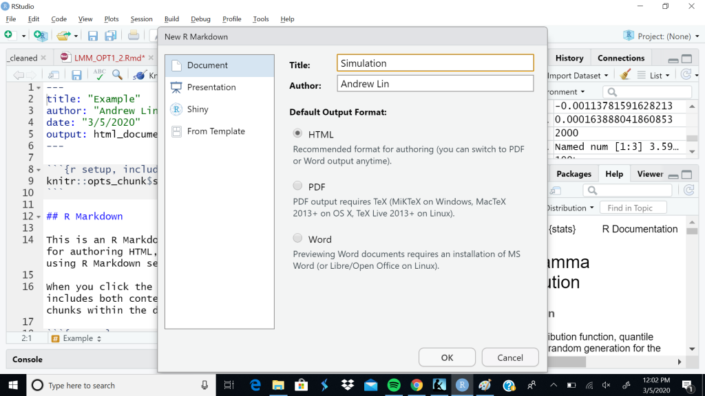
Open up R Studio, navigate to File, scroll over to New File, and click on R Markdown. You will be prompted with the following window. For the sake of simplicity, we will select our default output format as HTML as it does not require TeX to compile.
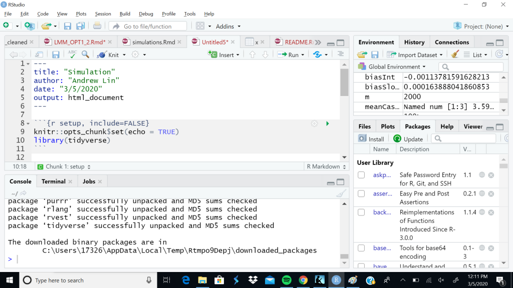
Once in your rmd, Install Tidyverse. In order to do this, scroll over to the Packages tab on the bottom right of your screen. After clicking on the tab, you will notice a little symbol that says Install. Click that. Type in tidyverse and hit enter. This should automatically install the tidyverse package. GGplot is included within tidyverse and uses a similar syntax.
Once you are finished installing the Tidyverse package, under the first chunk (the first gray block in your rmd), type the following: library(tidyverse). Click on the Green Triangle on the type right corner of the chunk in order to run everything in that chunk. If you only want to run a single line, navigate your blinking typing cursor to that line and hit ctrl+enter.
Congrats! GGPlot is loaded!
Step 3: Importing Data
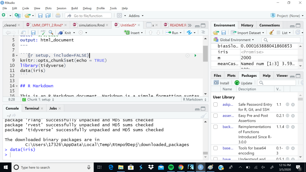
Download a usable data set of your interest. Note that while GGPlot can visualize data points, it cannot clean up your data for you. For this example, I am going to use the base R data set, Iris. Underneath your library(tidyverse) statement, type the following: data(iris), and hit ctrl+enter. While this is not how the majority of data is imported into R Studio, we utilize this process so as to focus on the use of GGPlot itself.
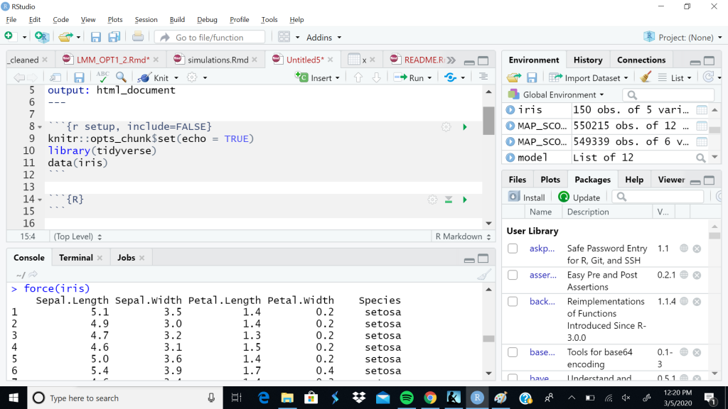
Looking through the Iris data set (click on iris in your environment window or, in the console (Tab on the bottom that says Console), type view(iris) and hit enter to see the data. We will be building a simple scatter-plot with our data.
Step 4-5: Making a new Graph
Now that our data is loaded, we can begin to visualize our data! Create a new chunk by typing “`{R} after any other chunk (in the white space) and “` at the end of the chunk.
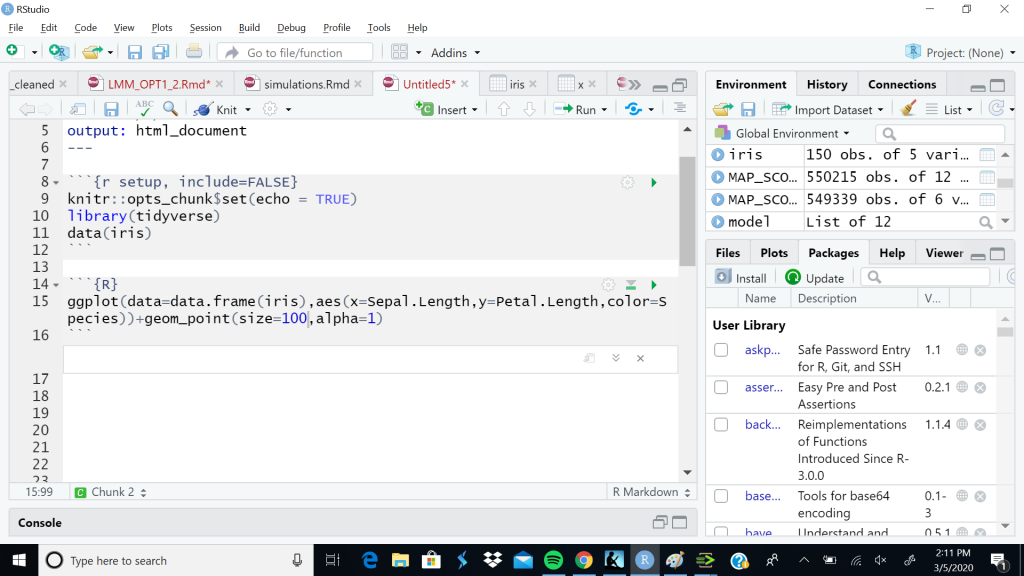
In order to initialize GGPlot and create a basic scatter plot, we type the following and run:
We end up with this graphic:
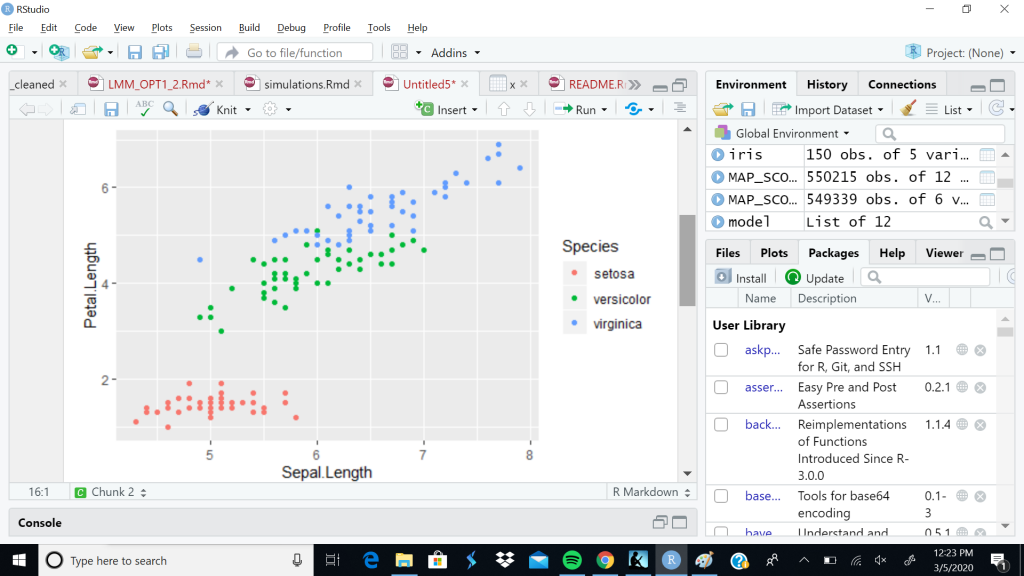
Not bad! Now, we break down the code in order to understand what is doing what:
ggplot(….) creates the basic ggplot object
data=data.frame(iris) converts the iris data set into a data frame (the basic table format in R studio), and tells the ggplot object that we are looking at the resulting iris data frame
aes(x=Sepal.Length, y=Petal.Length, color=Species) tells the ggplot object what columns or vectors we are using to construct the layout of the graphic itself. For example, the value x is the actual x-axis; by setting it equal to Sepal.Length, we are saying that our independent variable, our x values, will be the values in the Sepal.Length vector/column. The same thought process applies for our y value (the dependent variable, our y values, will take on the values given in the Petal.Length vector/column). The term color is one of the many grouping functions native to GGPlot. It is essentially telling us that we want to group our values by Species and that we want to visualize our groupings by use of color. Other examples that you could use are shape, size, density (fill), etc. Here is a link to the ggplot documentation: https://ggplot2.tidyverse.org/reference/ggplot.html
The following documentation goes into more detail about aesthetic mapping and the options you have in terms of constructing your graphic itself.
+geom_point() is telling ggplot to represent our points as point objects (geom_point()). In order for every ggplot graphic to properly run, we need to specifically tell ggplot what kind of shapes or visuals we want it to output. For example, bar charts would use the geom_bar() object whereas line graphs would utilize the geom_line() object. Within each geom object exists a set of mappings that apply to each of the geom objects shown. geom_point() does not require any additional mappings, but objects like geom_bar() do. We include the mappings size (set to 100 as the base point values are super small) and alpha (in order to give the points more density).You can find out what mappings need to filled out by finding the documentation for your respective geom object.
Final Thoughts
While the example above is overly simplistic, I hope it gives you an idea as to how ggplot generally works. While difficult to initially understand, once you understand how the language of ggplot (and tidyverse) works, you will be able to create graphics like the following:
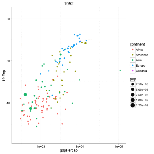
The code for the above image is as follows:
# Source: https://github.com/dgrtwo/gganimate
# install.packages("cowplot")  # a gganimate dependency
# devtools::install_github("dgrtwo/gganimate")
library(ggplot2)
library(gganimate)
library(gapminder)
theme_set(theme_bw())  # pre-set the bw theme.

g <- ggplot(gapminder, aes(gdpPercap, lifeExp, size = pop, frame = year)) +
  geom_point() +
  geom_smooth(aes(group = year),
              method = "lm",
              show.legend = FALSE) +
  facet_wrap(~continent, scales = "free") +
  scale_x_log10()  # convert to log scale

gganimate(g, interval=0.2)
One reply on “GGPlot Visualization Tutorial”
Nice tutorial! I am in intro stats right now and I am in the process of learning how to use R. The code break down is very helpful in understanding what the code is actually doing, instead of just copying what is written.