What is Palladio?
Palladio is an online tool that allows users to visualize data in the form of maps, graphs, timelines, and tables. With many different ways to manipulate the data, Palladio specializes in showing data that has many attributes. However, because of the many different features, Palladio users often experience bugs. In order to reduce the amount of bugs, users should make sure that their data is as clean as possible. (If you’re looking for an easy way to clean data, here is a link to OpenRefine). If used correctly, Palladio has the potential to show data in incredible ways.
Tutorial
Note: The dataset used in this tutorial contains information about artists from the 19th century.
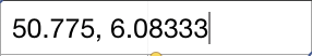
Tip: One of the best parts of Palladio is its ability to create visually impressive maps. In order to properly use this feature, your dataset needs to have a column that contains Geocoordinates. This means that each cell in the column should be filled with a latitude value, followed by a comma (,), followed by a longitude value.
Step 1: Opening Palladio and Uploading Your Dataset
First, open up Palladio on a browser. Once you get to the home screen, press the start button.

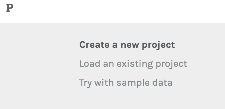
After pressing start, Palladio will ask what type of data you would like to use. Click “Create a new project”.
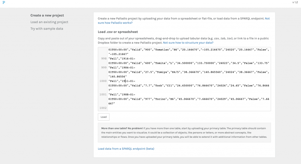
Once you are ready, you can drag and drop your csv file into the box on the screen.
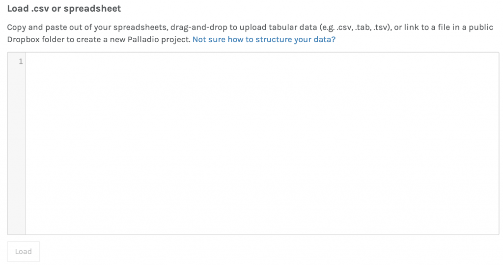
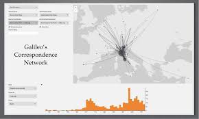
After you’ve uploaded the csv file, your screen should look like this:
Now, we’re ready to create data visualizations! Click the load button.
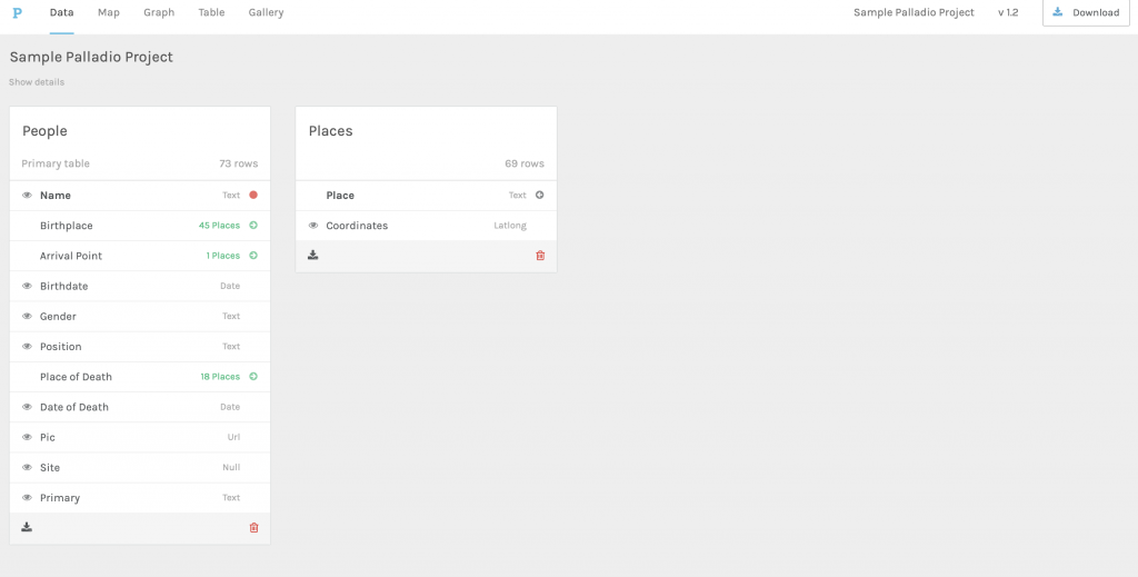
Step 2: Vetting Data
Keeping in mind Palladio’s “buggy” nature, it’s necessary to get rid of all the elements of your data that you will not be using so that the program runs fast enough. In our case, we will not be using the names or the pictures of our artist data. So, we click the “eye” icon to the left of each of these categories.
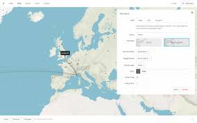
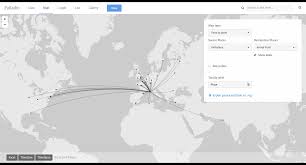
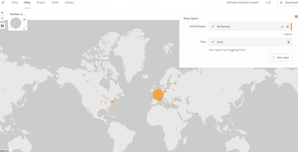
Step 3: Creating a Map
After vetting the data, you are ready to create a map. First, click the “map” button in the upper left corner of the screen. This will bring up a new window in the right corner of the map:
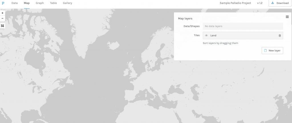
Click “new layer” in the new window to create a layer of data points. After clicking “new layer”, you will be able to choose how to display the data.
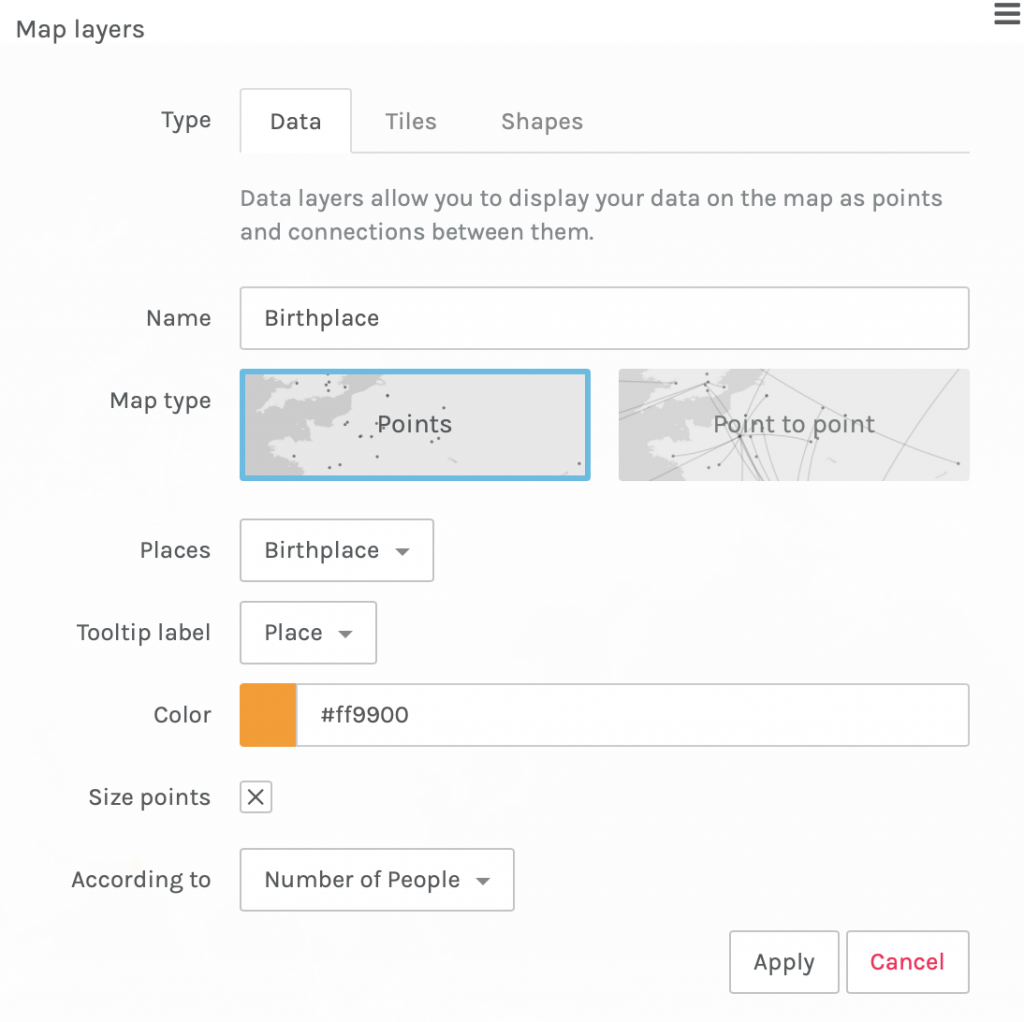
From our sample data, we have information about the birthplaces of the people and the number of people that were born in each place. So, with this data, we will create a map that shows the frequency of the people’s birthplaces.
The “places” tab should have the row of data that contains the Geocoordinates of each place. In the case of this data, the title of the column is “Birthplace”. The “According to” tab should have the column that contains data about how many people were born in each place.


Once you’ve entered in your data, click “apply”.
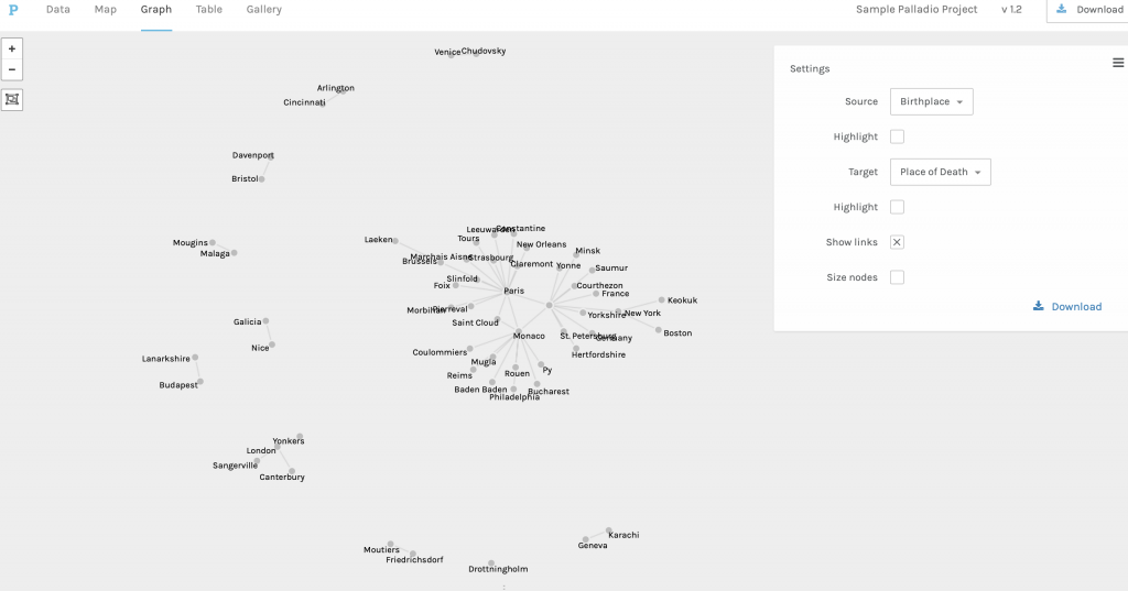
Step 4: Creating a Graph
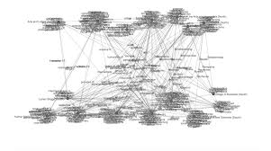
Creating maps is only one of Palladio’s many tools. You can also create graphs that show the relationship between elements of data. This comes in handy when you have two different elements of data that relate to the same objects. For example, one element of data could be where a person was born, and another element of data could be where a person died.
Now, we will create a graph of the relationship between where people were born and where they died. To do this, click the “graph” button in the upper left corner. Then, make the source the name one column (in this case, it will be “Birthplace”) and the target the name of another column (in this case, it will be “Place of Death”).
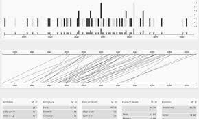
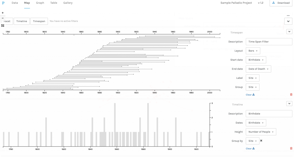
Step 5: Creating a Timeline
Lastly, we are going to create a timeline. Palladio’s timeline feature is useful when there are two dates that apply to the same object. For example, a birthdate and a date of death apply to the same person.
While in the map tab, click “timeline” in the lower left corner. Then, in the settings, make sure the start date and the end date are represented by the dates that you want to be displayed. In our example, our start dates will be represented by the birthdates of the people, while our end dates will be represented by the dates of death.
Sources
I used Miriam Posner’s blog about Palladio to help guide me through the process of using Palladio. It was extremely helpful, and I highly recommend that you take a look at it to solidify your understanding of Palladio and all of its incredible potential. Along with Posner’s blog, I used a tutorial page from Baylor University. This tutorial gave a more basic understanding of Palladio, but was still very helpful.
5 replies on “Tutorial: Palladio”
What a wonderful tutorial – it was easy to follow, especially since there was some “dummy data” readily available. It’s funny how accomplished you can feel just by making a grey map covered in orange dots! 🙂
Thanks for making this!
Great tutorial Teagan, very easy to follow and a simple way to familiarize yourself with the basics
Your tutorial was not only really clear, but I think the screenshots were super effectively chosen to show the steps. It’s also really helpful that you’ve chosen a program that can represent data in so many different ways.
Thank you very much for your post! Great work! Palladio is a really useful tool as it can combine the timeline, maps, text, and the connections of those data.
Great tutorial. It really helped me visualize the strength of a platform like this relative to other web mapping tools out there like ArcGIS.