The internet is full of data processing and visualization software packages that allow people with relatively little computing experience to create polished looking digital projects. However, these softwares often want data in a very specific format which differs from package to package. Each new tool is like a keyhole that necessitates reshaping the data in order to fit past its opening and align with the pins inside.
In order to use these “out of the box” tools, digital humanists often have to modify their data, and having run across this issue myself, I’ve put together a tutorial describing some ways to make humanistic data fit the formats required by different software packages.
One of the more powerful tools for cleaning data, a web-based app called Open Refine gives you the maximum amount of power and customization, but works best when paired with regular expressions, which may be foriegn to those unfamiliar with CS. Instead of trying to explain those topics here, I will direct you to Austin Mason’s tutorial on Open Refine and Doug Knox’s tutorial on using Regular Expressions with historical documents, which is part of his blog, The Programming Historian, available in three languages.
At a more basic level, spreadsheet management software like Microsoft Excel or Google Sheets can be just as useful for a more “quick and dirty” reshaping of data that has a shallower learning curve. This is the type of cleaning I’m going to be describing in the steps below.
1. Determine how your chosen software wants the data formatted
After you have chosen which software package you want to use, which is a whole process probably worthy of a tutorial in it of itself, you beed to determine what format your data will need to be in to be usable. Below are two examples of software an aspiring digital humanist may want to use, and some observations about their structure.
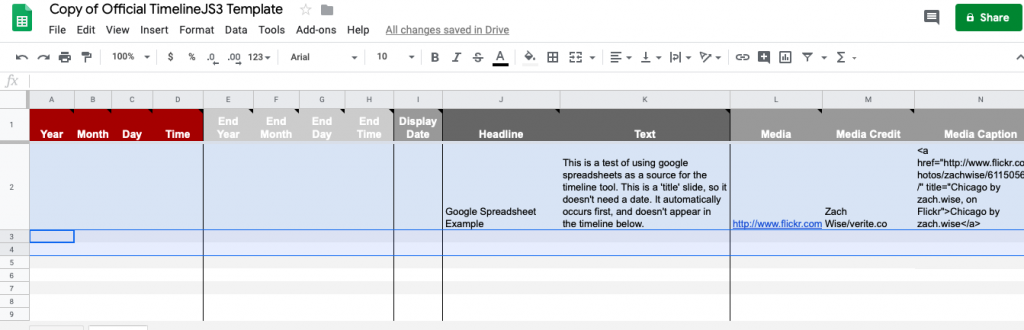
Note how the sheet’s date fields are broken up into year/month/day/time and how it has separate fields for start and end dates. It also has two text fields, one for a headline and one for filler text, and several fields for a medial url, credit, and caption.
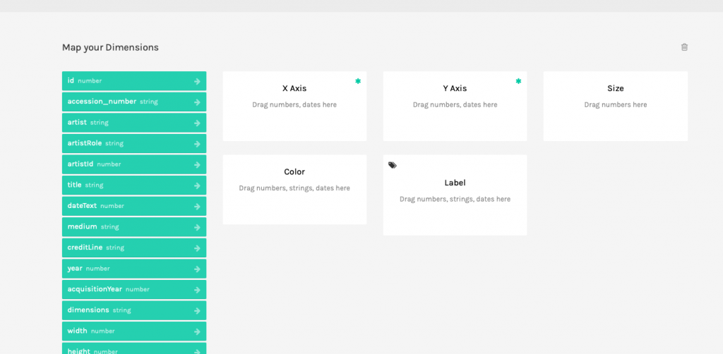
Here the parameters are different, and rather opaque if you haven’t worked with graphing software before. This might be an opportunity to read the RAWgraphics documentation or search out another software if you are unable to determine what needs to go in each field.
2. Determine the areas where your data deviates from this structure
Data takes many forms. CSV, TSV, flat spreadsheets, and more besides, all may have quirks that prevent it from meshing nicely with the software package you have at your disposal.
In the example of timelineJS, your temporal data may be more or less specific than the format required by the google sheet. You may also have many fields you want to put in the text field.
For RAWgraphics, a different set of problems may be the case. Some of the buckets require string or integer inputs when your data may be cast differently. You may not have all of the different parameters, or multiple that you could want to combine into a single value.
Regardless of which software you are using, there will likely be varying degrees of difference between your data and the format it needs to be in. This step isn’t as much a prescription to ‘do these things and it’ll all work out’ as it is an encouragement to look at the tool you are using and determine what you need to make it work. An added bonus of this is that you will likely learn more about the tool itself which is always fun
3. Ask “Is this process worth it?”
Continuing on from the last step, this step wont look the same fro every project. There isn’t really a formula for whether or not data processing is worth it. However, if you reach this step and are already daunted by the sheer number of changes that you will need to apply to your original data, it could be a good idea to look for a different software that works better with what you have. The idea behind “hacking” the humanities is less to exhaustively learn technical tricks to make any data work with any software, but rather to figure out ways to tweak data to fit into a software built to handle data of its type.
4. If yes, try to determine what types of changes you’ll need to make to your data
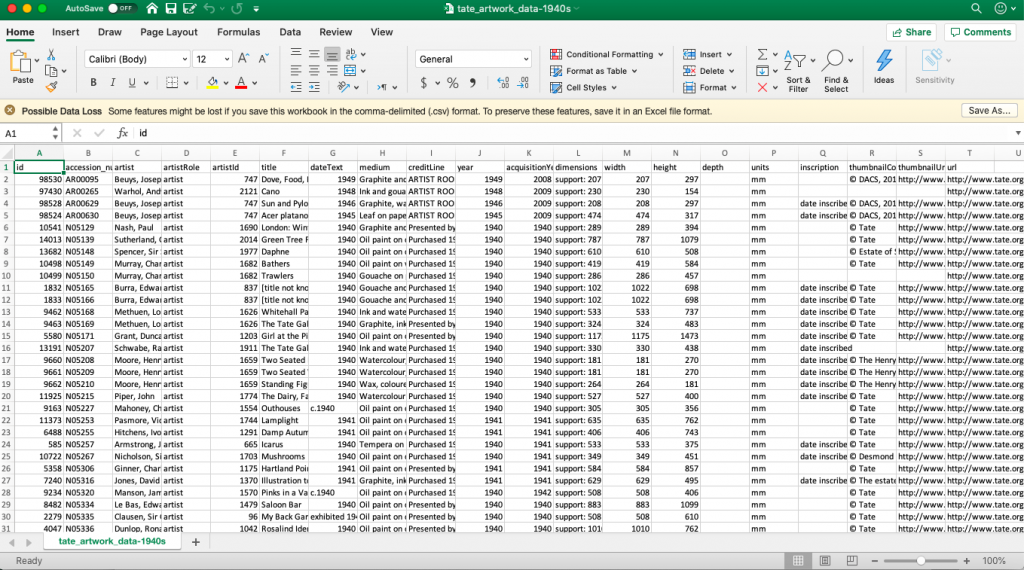
Determining what changes need to be made is an important prerequisite to making them, as is knowing how to make those changes. Using the sample data related to the TATE collection in the UK below, let’s think through some potential changes needed to fit the previously mentioned templates (timelineJS & RAWgraphics.io)
Depending on your research question, a large sheet of metadata like this may have extraneous information. A good first step is to somehow reduce the data in order to assist in visualizing it. NOTE: This step is highly dependent on what it is you are asking the data to do. It isn’t helpful to throw out data indiscriminately to make it smaller, but calculated reductions may assist in your ability to process.
For example, when I processed this data I was only interested in oil paintings, and so I made a new sheet with only works that were of that medium.
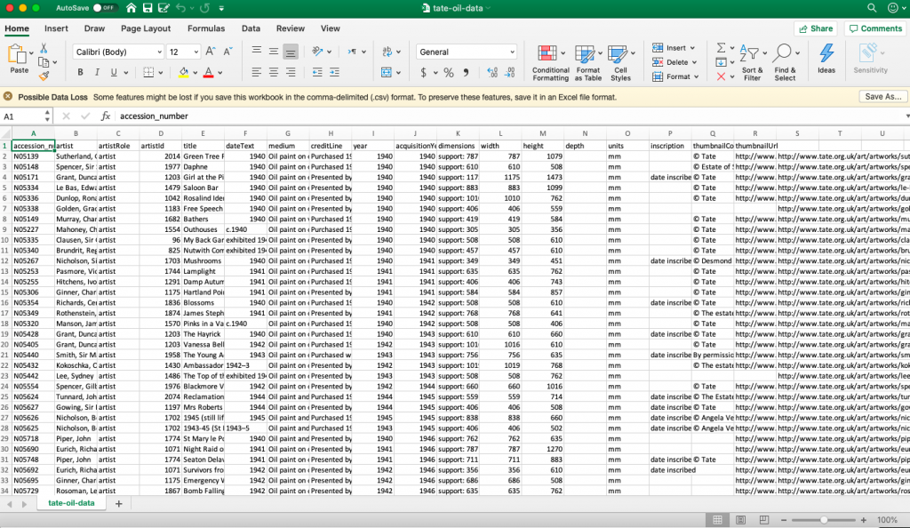
In addition to number of entries, another location where you can reduce complexity in visualization is by removing extraneous fields. In sheets with very detailed metadata, some fields may not help your visualization. As before, making a new copy with slightly less information (while still preserving the prevues versions) may be helpful.
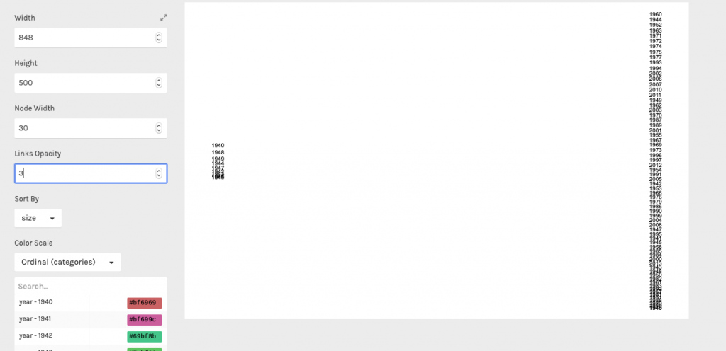
With this higher level, generalized cleaning done, it’s time to consider the software you want to use. Sometimes the only way to determine what you need is trueing (and potentially failing) to make a visualization. For example, RAWgraphics doesn’t make it abundantly clear that their alluvial program can only handle about 30 entries. Because if you pass it more data that that…
This would be an instance where you need to change the data to fit the software better.
You may also run into issues like the one I mentioned above where your data has many fields you want to put in the text field of timelineJS, and so you would need to combine them into a single field to avoid large amount of tedious clicking and pasting.
Determining what you need to do is half the battle, after that the how is what’s important.
5. If you know how to make those changes, great!
This is the ideal scenario, but also understandably not always the case. If it’s your first time working with a program and aren’t used to the processes you might use to adapt data to it, that’s totally fine. There are numerous resources across the internet, especially for common software such as Excel that can get you started on learning skills that will become useful as you undertake more digital projects.
6. Once you know how to make the changes, do so
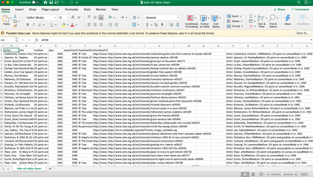
This process may reacquire some trial and error, so as an example I’m going to walk through implementing the concatenation formula in Excel, it allows you to merge different cells into a single cell (sound like something we wanted to do earlier?).
The =CONCATENATE formula takes input from several cells and meters them into a single cell. The syntax is fiddly, but one example of it might look like this:
=CONCATENATE(“Artist: ” , A3, ” “, “Medium: “, C3, ” “, “Made in in: “, D3)
Where the springs (enclosed by ” “) are text that gets added to the information in the relevant cells (columns A, C and D).
The first time using this formula the one major issue I ran into was how to get that formula to generalize to each line, and not just row 3 of the sheet. But after some research, and help from Carleton’s in-house tech support, discovered the simple click-and-drag interface to apply a formula to every line in a sheet.
While not groundbreaking in it of itself, this exercise in thinking through one possible data transmutation is helpful in considering what you’ll need to do to your own data. You may beed to see out tutorials or outside help, but you will then have that skill available for you when you go to process data in the future.
7. At the end of this process, critically ask “Has my data changed in a way that obscures/changes its meaning?”
This isn’t a question that can be answered by a Google search or a new digital tool. You as the scholar need to look at the results of your technological machinations and question whether or not it was the correct decision. Sometimes it isn’t and restitching your data into a different form irreparably changes it, but hopefully more often than not you will be satisfied with the transformation you have wrought and will be ready to use your software to create an amazing digital project.
If you’ve gotten this far, thank you. I realized that this tutorial has perhaps waxed a little more towards the theoretical and away from the practical, but I hope you’ll forgive me this excess and hope you’ve gleand some information about the process behind preparing data for use in visualization software. Happy cleaning!
2 replies on “Tutorial: Cleaning Data for Software Packages”
Love the vast applicability of this tutorial Spencer! Not a big excel guy, but I know who to call if I need one!
I really appreciated the universality of this tutorial since it was not centered around any one piece of software in particular. I also liked how the steps were very clearly labeled which made the text very easy to follow in conjunction with the different images of the process. The images themselves complemented the text very well and made the instructions from the steps much clearer. Overall, great job with your tutorial!