Flourish Studio is a web-based data visualization tool born out of developers Duncan Clark and Robin Houston’s desires to create a visualization tool easily accessible and usable for non-coders. After creating a free account (with paid options available), users of Flourish gain access to dozens of templates for data visualization, from simple bar graphs to 3D globe templates capable of displaying movement and flows across the world. Similarly to other data visualization tools we’ve used in this class, Flourish allows users to import data from CSV files, which it then presents in a spreadsheet to be interpreted in the template. Furthermore, Flourish enables users to incorporate their visualizations into Stories, which may be animated or displayed in slides, making it a great resource for narrative DH projects. It is important to note that free accounts require you to publish your data publicly when using a template, so it would behoove users to seek other tools for more sensitive or private data. That being said, Flourish is an incredibly powerful and easy-to-use tool perfect for many of the data visualization pursuits we have attempted so far and more, with a learning curve only in the sense of figuring out which template will best suit your data.
In the following video tutorial, I demonstrate how to do the following:
- Beginning a Data Visualization
- Choosing a template
- Importing CSV data
- Coordinating the data columns to aspects of the visualization
- Stylistically editing your data visualization, and
- Exporting your visualization
Click Here to View the Video Tutorial (I had trouble exporting and saving it from the editing program I used so the file type is only supported on Google Drive; I will try to edit it again and re-upload it here before class, but I will post it like this for now!)
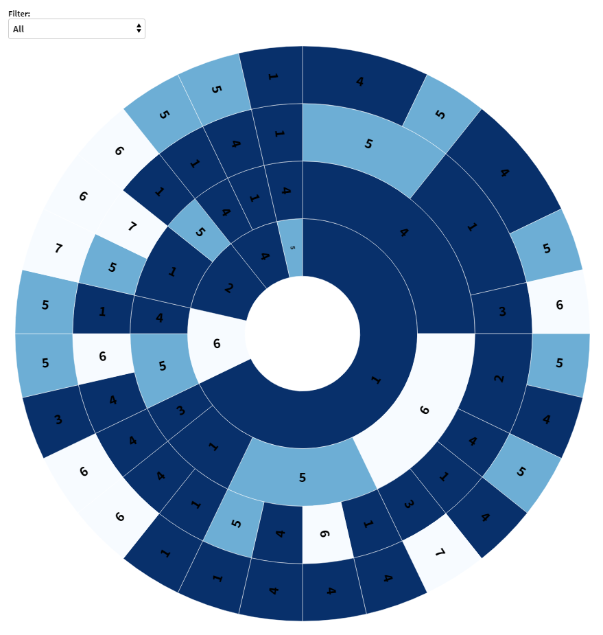
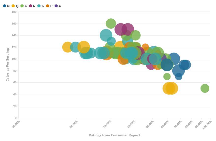
In particular, this tutorial walks you through using two specific templates, the Sunburst and Hans Rosling Chart templates, but the process described in the video varies only slightly between templates. The sample CSV data I used for each template can be found below:
For more information and resources, check out this review of Flourish Studio’s mapping and data spatialization tools, and this blog post tutorial of data storytelling using Flourish templates. Additionally, view samples of each of Flourish Studio’s templates on their website here.
2 replies on “Flourish Studio Tutorial”
Wow, I had no idea this tool existed! It seems really powerful and I might incorporate it into my final project.
This tutorial was really easy to follow! I never knew this tool existed but now that I do I will definitely use it in the future. It was really amazing to see so many options on how to present the data!