Gephi is free network creation and visualization software available on Windows, Mac OS X, and Linux operating systems. It also provides infrastructure for network analysis and the Java-based code is open-source and available on GitHub. It has been used in a wide variety of academic projects and is especially popular in digital humanities work. A popular use for it is the visualization of social networks but it is helpful for representing any data that can be meaningfully interpreted as a graph. In this tutorial I will be demonstrating how to create a graph from an edge table and perform some basic analysis on it.
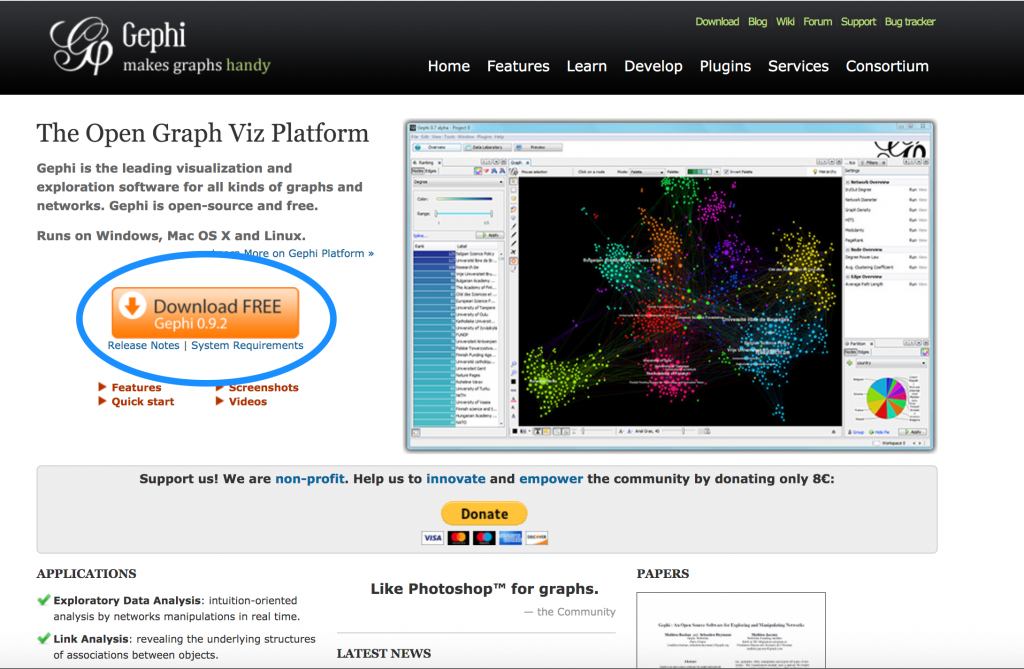
The software itself is easy to download. Googling “Gephi” will lead you to gephi.org. The homepage will look like the screenshot above, and by simply clicking the orange download button and following the normal procedures for downloading applications off of the web, you will get an updated copy of the Gephi software on your machine.
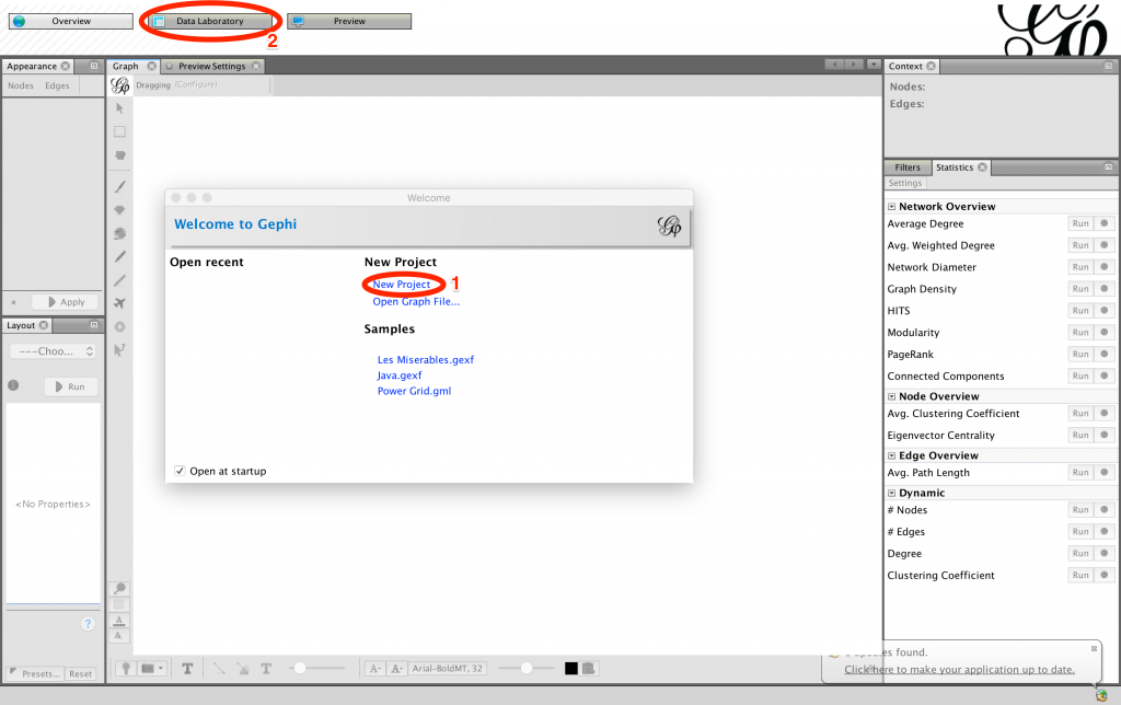
Once you’ve opened Gephi, you will see a popup window welcoming you to the program. If you want to explore some of the things you can do with Gephi, you can click on the projects listed under Samples. However, to create your own graph you should select New Project. This will take you to a blank workspace. Click Data Laboratory in the top bar of your window to begin importing data.

I will be showing you how to input data that is formatted as an adjacency list. An adjacency list contains only two columns. Each row of the list must represent one edge and contain the nodes that edge is between. In my example data, a section of which is above, each edge is between an artist and a medium and the edge exists if there is an artwork from the 1940s in that medium by that artist in the Tate collection.
If your graph is undirected, it does not matter which node you put in which column, but if you want to create a directed graph the origin node of your edge must be in the first column and the destination node in the second column. You can represent multiple instances of the same edge simply by having an entry for each instance. (For example, in the screenshot above there are two entries for ‘Burra, Edward → Gouache and watercolour on paper’ because there are two pieces of art done by this artist in this medium.)
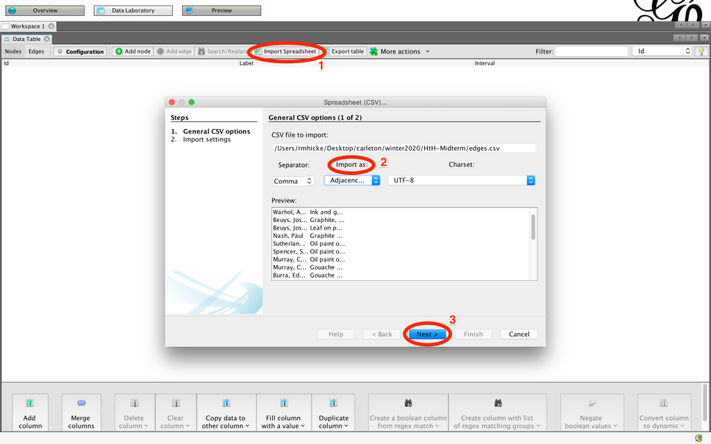
In your Data Laboratory click Import Spreadsheet. A popup window should appear and let you navigate to where your data is stored. It is preferable if your data is saved as a .csv file. Once you’ve chosen your document, click Next and change Import as… to Adjacency list. If your file is a csv, you can keep the Separator as comma, if not change it to whatever delimiter your data is using. Click Next then Finish then Okay to upload the data.
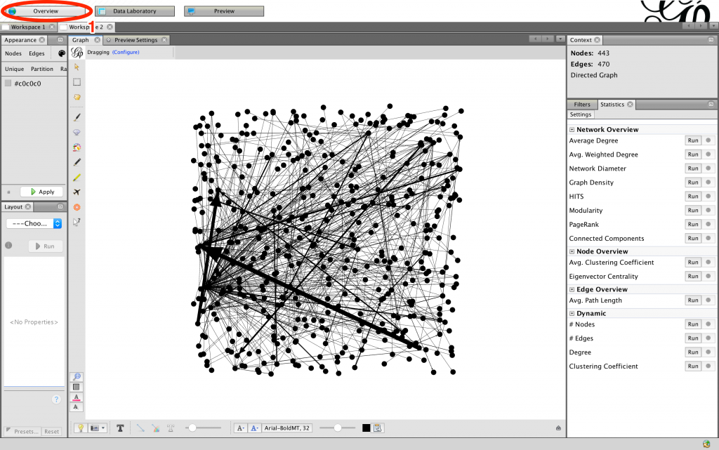
The program will have automatically created node and edge tables for you from the adjacency list which you can look over to confirm that your data has imported as you intended it to. Clicking over to Overview in the top navigation bar you should see that Gephi has created a graph for you with the data you input. However, the graph in this state isn’t very legible, so let’s add in some analysis that will make it easier for us to interpret.
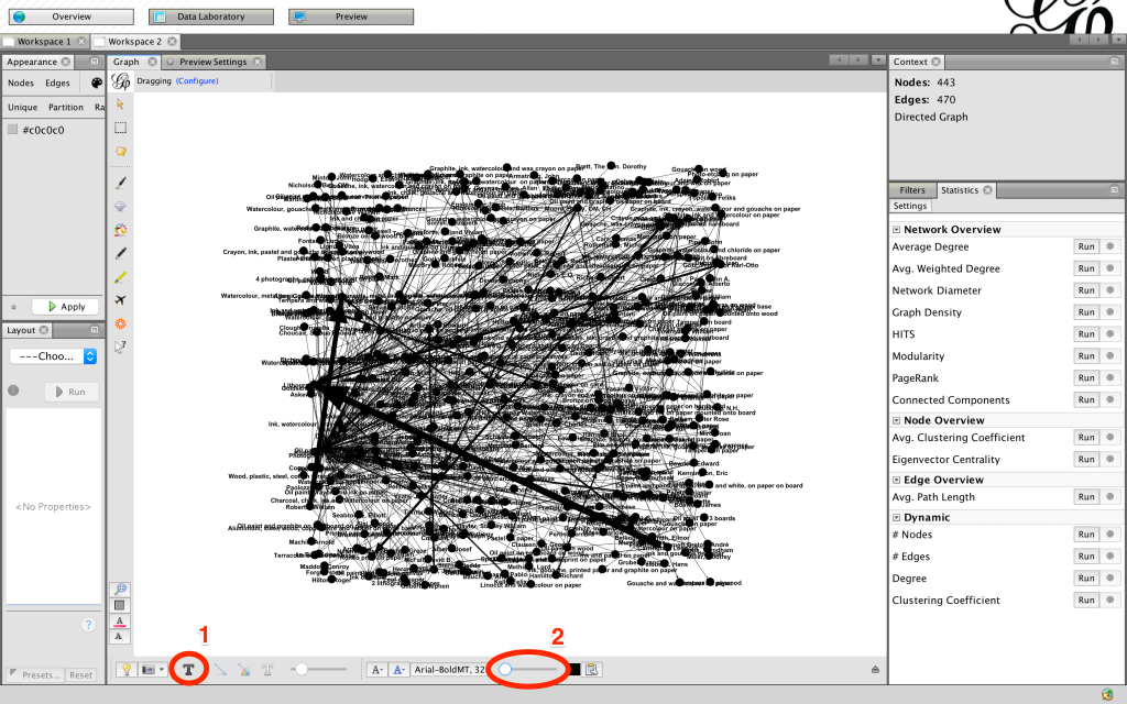
By clicking the T at the bottom of the screen we can label the nodes. If the labels aren’t the right size (on mine they show up giant), you can use the sliding bar on the right to adjust. Depending on how your graph is formatted these may not be helpful, so you can turn them on and off as needed.
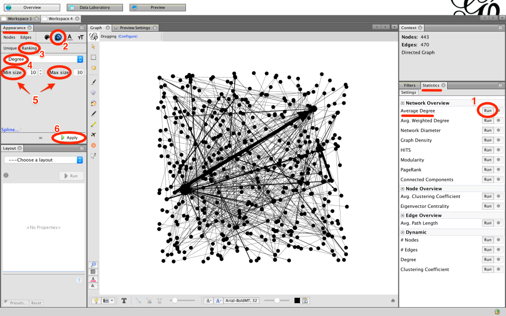
You’ll notice that Gephi has pre-weighted the edges for us. Let’s try weighting the nodes as well to see which mediums and artists are most common in the Tate collection. On the right side of your screen you will see the Statistics page. Click the Run next to Average Degree and close the window that pops up. Now go to the left-hand side of the screen under Appearance and click the concentric circles. Select Ranking. Then, under Choose an attribute select Degree. You can adjust your range of node sizes under Min Size and Max Size. Finally, run Apply.
You’ll see that the nodes with more edges are now larger than the others! But this is only one of many things you can do with Gephi. For more information on how to use Gephi you can visit their tutorials here and for instructions on how to embed a Gephi graph in a WordPress site go here