For this tutorial, I selected Stanford’s Palladio tool. I was interested in learning about this tool for my final project and also because I find the mapping aspect of the digital humanities very interesting. Palladio can be used for many different data displays. It can show movement between points on a map, link maps together, and generally show the relationships between data points in interesting ways. This display of relationships is where Palladio is the strongest. It can also offer simple tables and charts, although the program is not strongest in this regard. The problem with Palladio is that it requires very specific data sets organized into spreadsheets. It is also very buggy and takes a long time to process large files. I ran into many problems while learning Palladio and making this tutorial, but I was able to sort out most of them and now know how to avoid the rest on the front end in the future.
Step 1: Data Cleaning
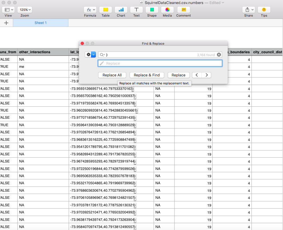
In order to be successful with Palladio, it is essential that you clean your data. One issue I ran into is that unlike ArcGIS, Palladio does not recognize place names. Instead, it operates off of Geocoordinates. Make sure your place data is in the coordinate form #,# otherwise the program will not be able to map it. I used the squirrel census data from earlier in this class for this tutorial as it provided easily accessible coordinates. I had to delete the parentheses and add commas in numbers in order for the data to be recognizable by Palladio, as it is very finicky.
Step 2: Uploading the CSV
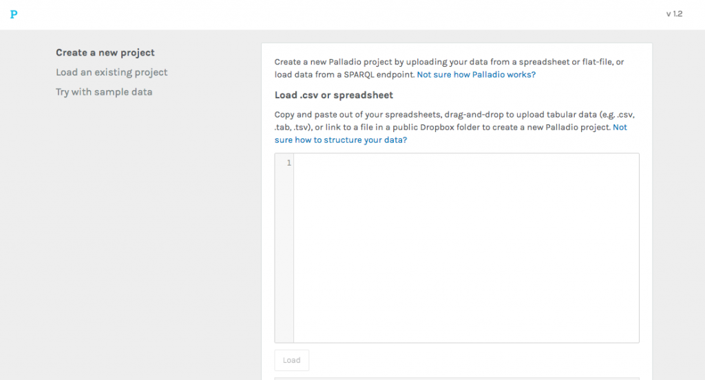
Next, you open Palladio on your computer and click Start. This will take you here:
You then drag and drop the saved and cleaned CSV file with all your data into the square, where it will display this screen:
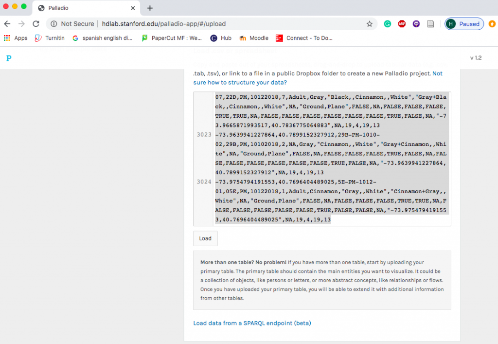
Then, you click Load in order to start your project process with Palladio.
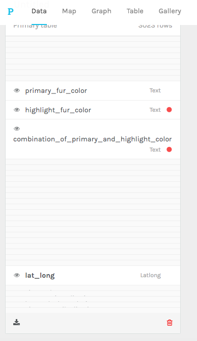
Step 3: Hiding Unnecessary Components
Because Palladio is so buggy, it is necessary to hide certain components of your data so they do not have to processed. Otherwise, the program will freeze and you will be sitting there for a very, very long time. To hide some of your unnecessary data, you hover of the eye icon to the left and click on it so it has a slash through it:
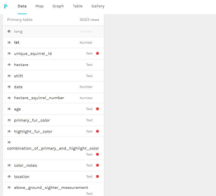
After doing this for many of the categories, your data will be much more manageable and should look something like this:
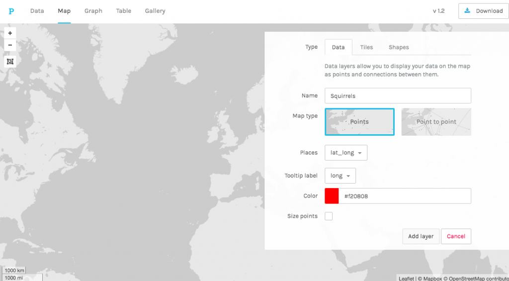
Step 4: Mapping!
Next, you click on the Map tab next to the Data tab you are currently on. This will display a map with an option to Add Layer. Palladio functions with layers, meaning you can add many sets of data as well as alter the map to highlight the areas of the data you are analyzing. After clicking Add Layer, you can name your layer whatever you want. If your coordinates were inputted right, they should have been tagged “Latlong” in the data portion and will appear as Geocoordinates in the layer. You can then select what color you want your points to be and select Add Layer.
Step 5: Congratulations, You Have a Map!
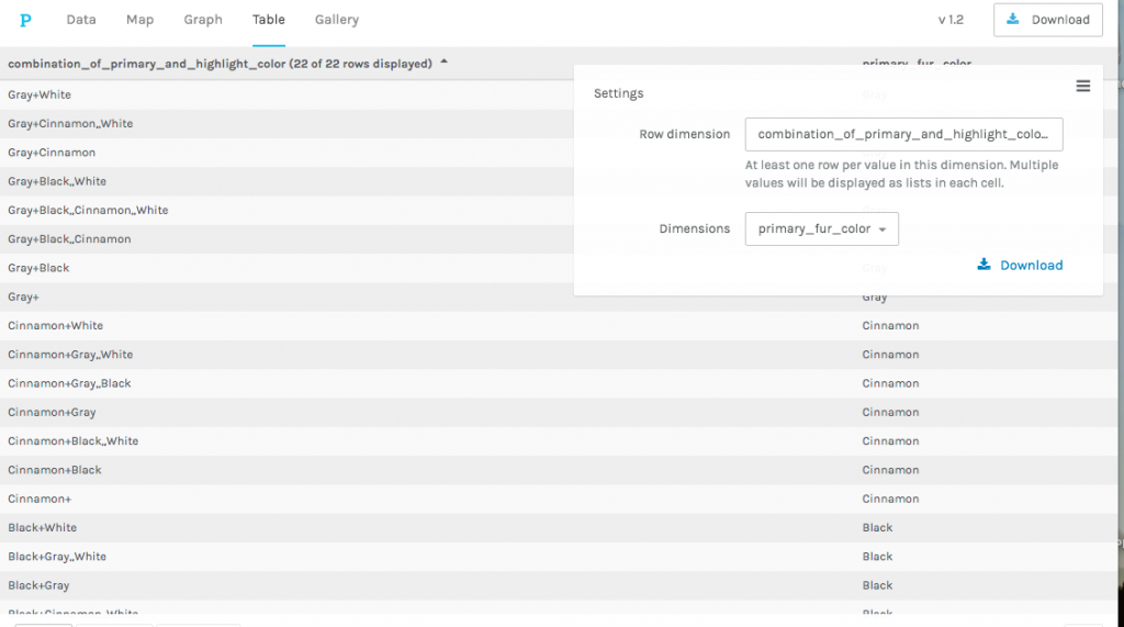
From here, you can expand on your map with other kinds of data displays. For instance, you can organize your data into a table or a graph by using those options next to the Map tab. I will include an example here but it is very rough as I mostly focused on mapping in this tutorial.
Palladio is a very finicky tool that has some strong capabilities in showing relationships and mapping data. It can also be very buggy so make sure to be patient and slowly work through the rough patches.
Sources and Other Tools
I relied heavily on Miriam Posner’s blog in order to teach myself how to use Palladio and to create this tutorial. Another good resource when it comes to Palladio. Another interesting tool related to this tutorial is the Programming Historian’s article on data extraction from historical sources and how to transfer this information to Palladio.