As part of the New Deal, the federal government commissioned The Home Owners’ Loan Corporation (HOLC) to appraise homes in almost 250 cities and create “security maps” to display their findings. This led to a series of redlining in several of these cities. In 2015, a team at the University of Richmond created Mapping Inequality: Redlining in New Deal America displays these maps visually. I’m going to break down this digital humanities project using Miriam Posner’s method.
- Source:
- Process:
- Presentation:
The four universities which created this site discovered the maps at the National Archives. The University of Richmond teamed up with three other universities to analyze all of these maps.
In order to digitize all of this hardcopy data, they split into several teams. The first, from the University of Richmond, georeferenced the HOLC maps, recreated the shapes of neighborhoods, and transcribed area descriptions. The University of Maryland team followed the same process, except to add several California cities to the digital map. Two more teams from Virginia Tech and Johns Hopkins University followed suit.
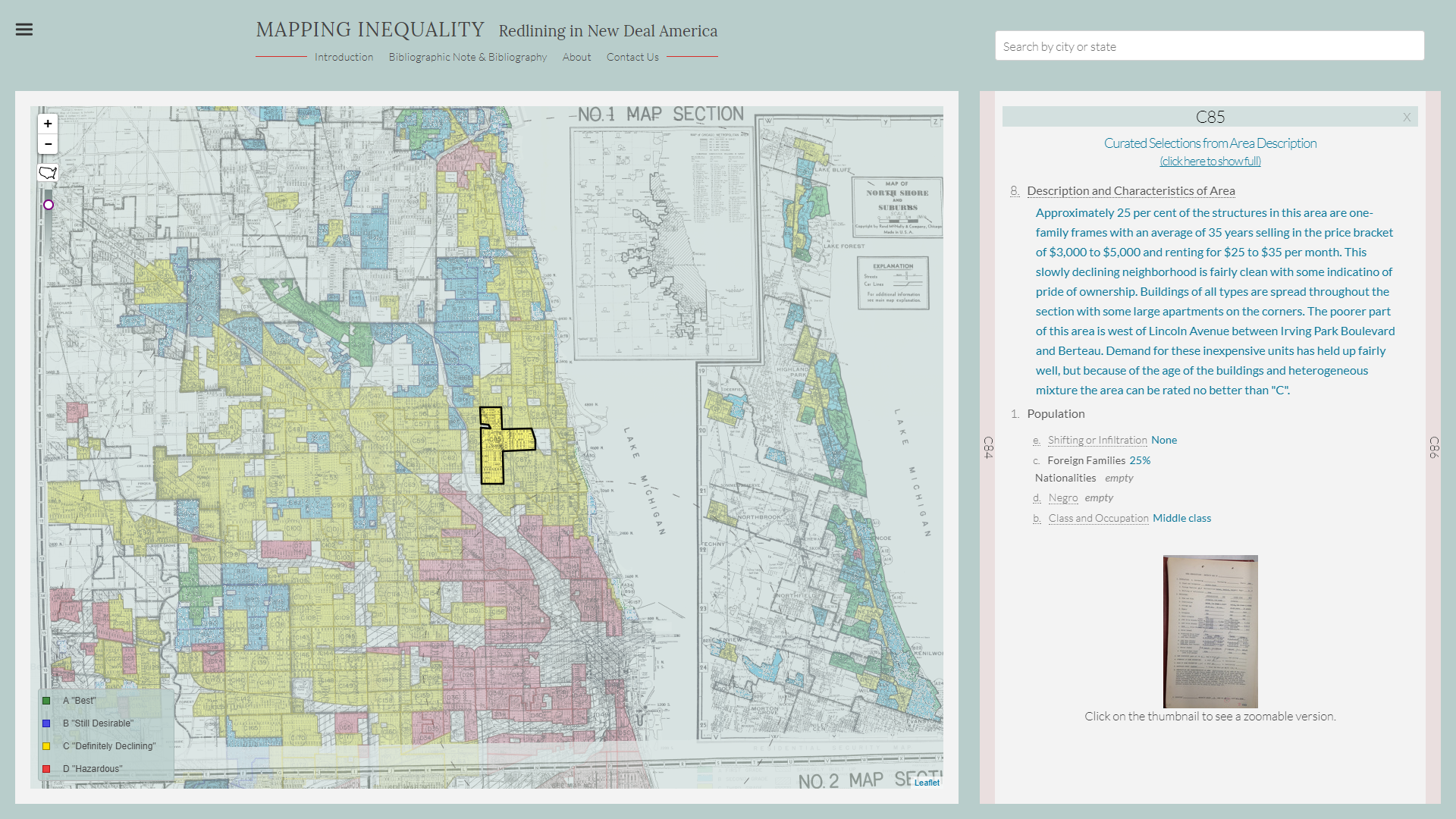
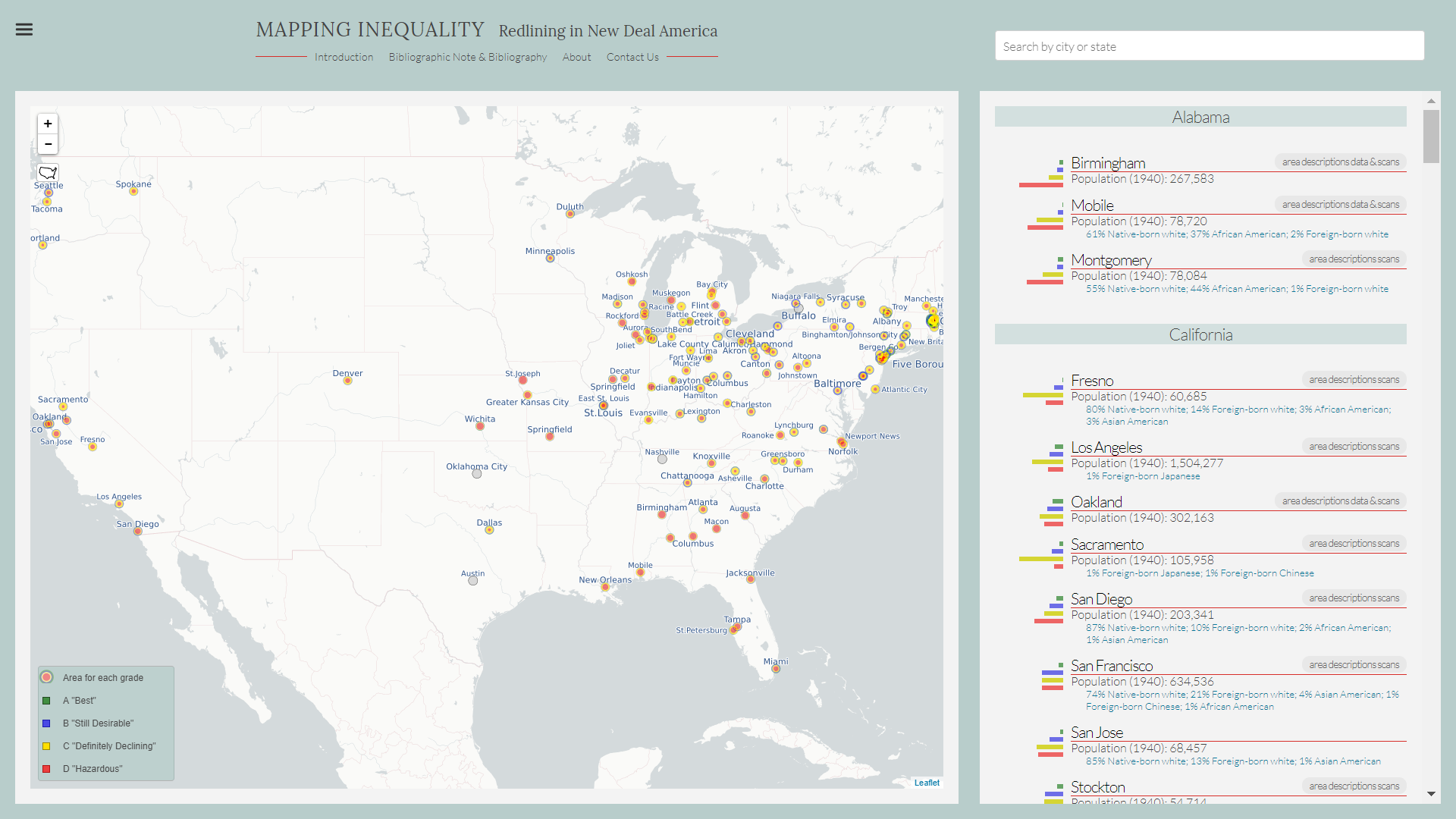
The original goal of the project was to display each city on a map of the nation. Users are able to zoom in on a city and see the security map created by the HOLC. If a user clicks on a certain neighborhood in the city, then they can view average income, average home value. Many neighborhoods will also state if there is nearby industry or railroads.
Author: Max Goldberg
http://goldbergmax.com/about/
Are the average income and home values of neighborhoods from the time of the mapping or are they modern? If they are from the time of the mapping, are they the original values or are they adjusted?
Great question! All of the data including average income and home values are from the 1930s. Some of the cities also happen to have plain text in addition to scanned images of the original security maps. Although the plain text is just transcribed from the scanned image.