Introduction
I decided to explore Robots Reading Vogue, a project created by Lindsay King and Peter Leonard at Yale University Library. This project combines fashion and data mining to produce a website that visualizes various interesting data related to the Vogue magazine. Sub-projects include word usage analysis, theme self-organization, random memo generation, and color pattern analysis. The website provides intriguing statistics that helps tell the history, management, and design of one of the biggest fashion magazines in the world.
The Black Box
Below, I will reverse engineer and explain the sources, processes, and presentation used in this fascinating DH project.
Sources: The project used the data from a project published by ProQuest and Condé Nast in 2011, called Vogue Archive, that maintains over 6TB of Vogue-related data.
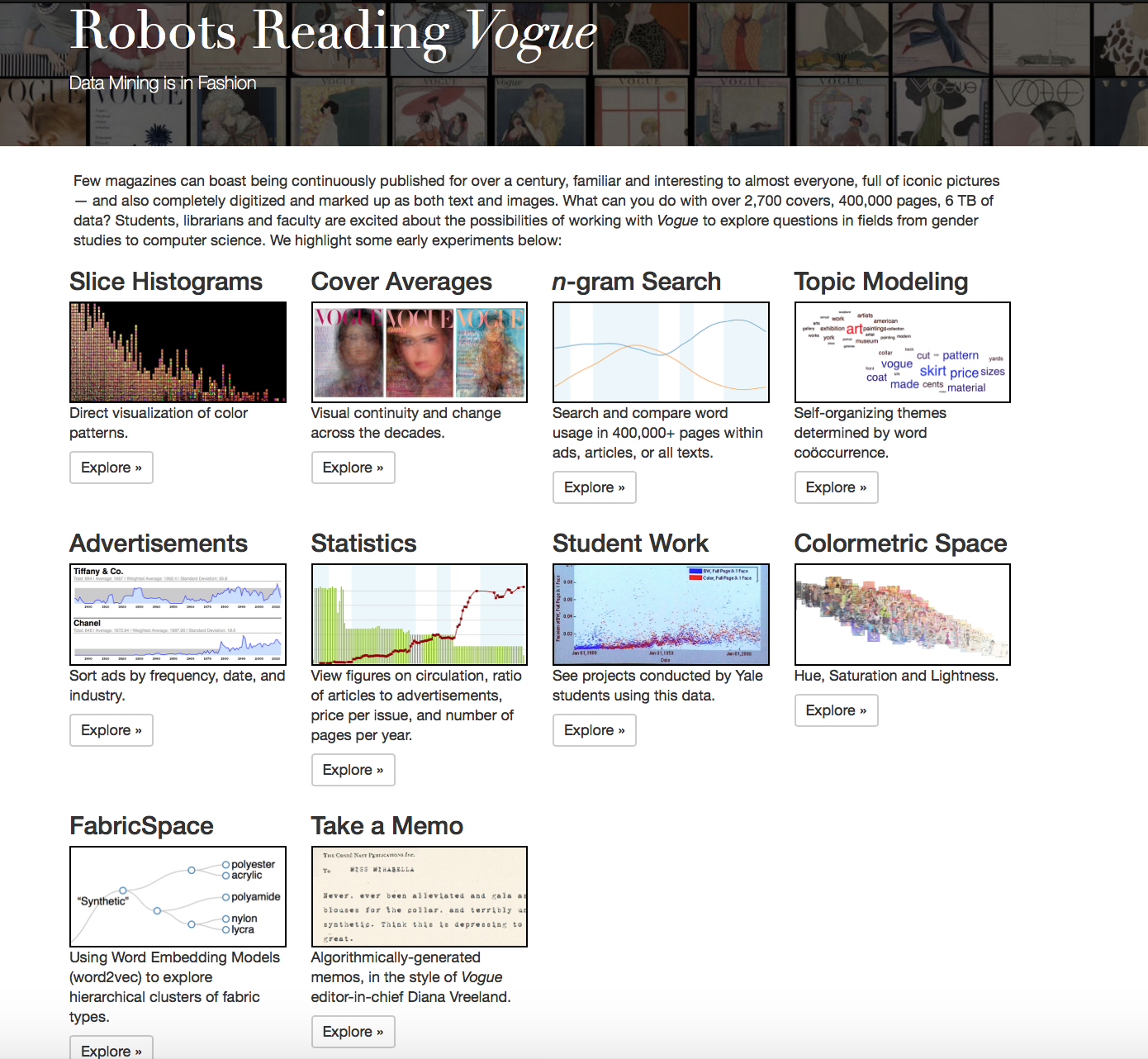
To talk about processes and presentation, for simplicity, I specifically explored the sub-project Slice Histograms. This sub-project analyzes the color pattern used in the magazine over time. It especially shows the shift from black-and-white images to more saturated images recently.

Processes: The work is inspired by a previous work by Damon Crockett. The authors sliced images in the data into a number of pieces. They then randomly selected 2500 slices of images in Vogue from each year and plot the slices based on their saturation (x) and brightness (y). In total, the authors created 110 slice histogram plots, one from each year. They then labeled the plots according to the year and combined them into a movie using the ffmpeg video encoder.
Presentation: In general, users can choose to explore one of the sub-projects. On this specific sub-project, users are given the description of the project and some examples of the frames. Users can also pause, forward, or resume the movie as they desire if they want to look at a plot from a specific year.
My blog post was about the color of Vogue’s covers over time. They found that there was a spike in the color of cover in the 1980’s. It would be interesting to see if there is a similar spike in overall magazine color in the 80’s as well as if the general trend of cover color matches the histogram in from this project.
I think this is a super fascinating project and that your analysis was very thorough. Do you think there are any other trends, other than just the move from black and white images to color, that this data about the Vogue color palette can show us? For example, do you think this data can say anything about what different colors were in style at different times?