Mapping Inequality is a 2015 project created by the University of Richmond that geographically visualizes and organizes New Deal-era data from the Home Owners’ Loan Corporation that banks at the time used to refuse loans and financial services to the poor, or to people from socially disadvantaged areas. In this post, I will reverse engineer the University of Richmond’s project using Miriam Posner’s method of sources, processed and presented.
Sources
The 150 maps the project presents, as well as the written descriptions of each neighborhood, are primary source documents created by HOLC and which were discovered in the National Archives in the 1980s.
Processed
The University of Richmond team defined the shapes on neighborhoods, matched up each map with a physical location in the United States, and transcribed or scanned the area descriptions.
Presentation
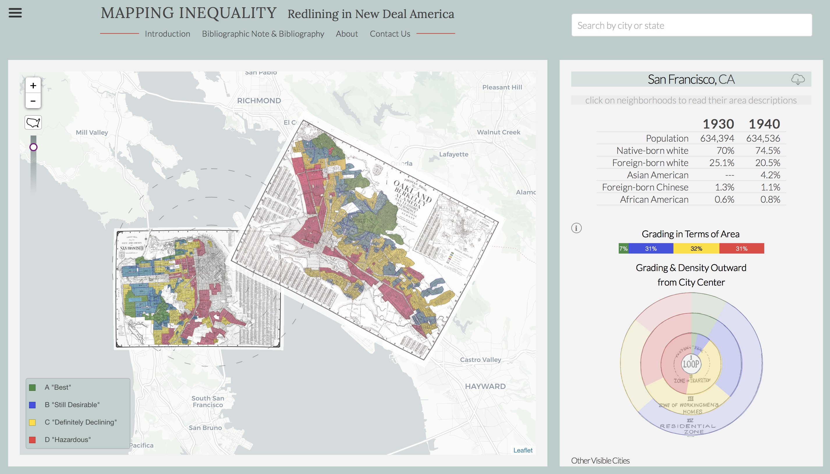
Using the mapping software Leaflet, the team showed each HOLC map in the appropriate physical location. On a panel to the right, as well as superimposed on the map itself, are concentric circles which visualize HOLC grades for neighborhoods based on the Ernest Burgess’s “concentric zone theory.”
Author: lieberkotzo
http://orenlieberkotz.org/
Picture link
oc
I find this project to be very interesting and I believe that it should be more widely popular because I think it is important for people to see if a certain neighborhood is still like that today. I feel like if I knew something like this happened in my neighborhood I would make sure that it doesn’t ever happen again!
That is pretty interesting that the population did not change much in a decade. One would think it would increase a lot every year.
This is an interesting project. I sort of wish I looked into it further now.