Mapping Inequality – A Digital Humanities Project
I decided to explore a digital humanities project, titled Mapping Inequality about redlining during the Great Depression era. This project uses interactive maps and area descriptions from 1935 to 1940 to show wealth and racial inequality in U.S cities during this time period. This information is incredibly important as it shows how policies during the Depression era have influenced the layout of modern cities.
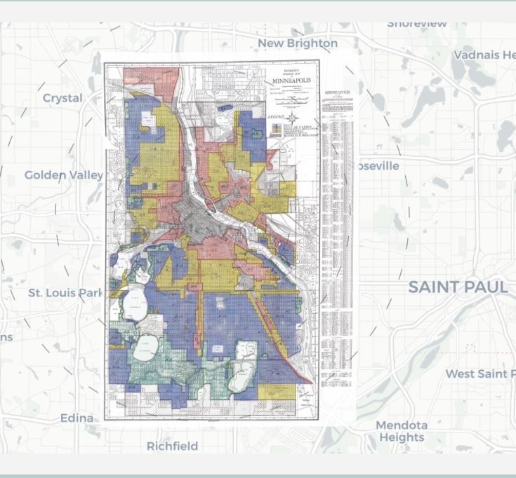
The colors represent different levels on a grading scale from “Best” to “Hazardous”.
The Black Box
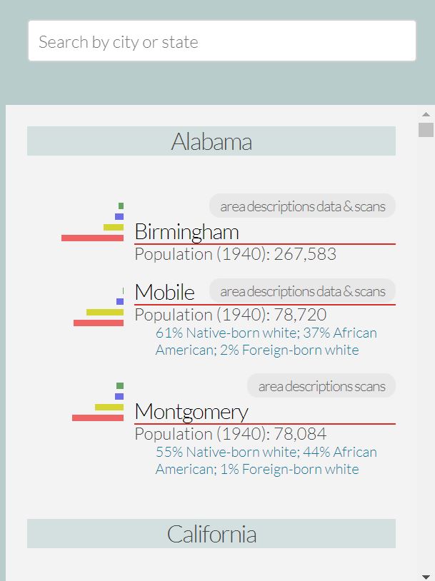
The sources or assets of this project are “security maps” and area descriptions produced by the Home Owners’ Loan Corporation as part of the New Deal. These files are currently at the National Archives. The processes (services) is the University of Richmond’s Digital Scholarship Lap, which manages the data and creates the digital maps. This URL is how the project is displayed and it shows the most updated information. Users interact with the data by clicking on the maps or typing a location, which then displays information like the breakdown of the population and characteristics about the area. Users can click on districts within each city to get more specific details.
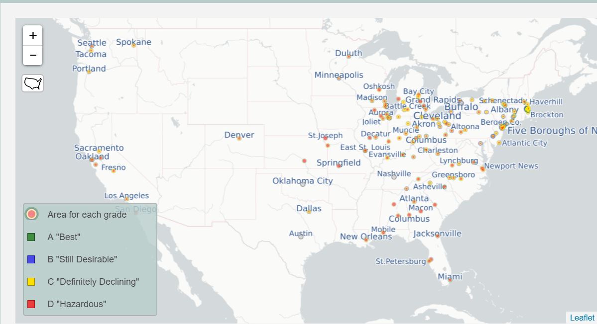
Very interesting! I noticed in the second image that the vast majority of cities are on the eastern half of the United States. I wonder if this a product of cities in the western united states not being large enough to count, or if its simply because the dataset did not include them. It would also be interesting to see if there are any differences between western vs eastern cities, and southern vs northern cities.
This is a really interesting project! I wonder how they calculated the grades: was it more subjective or based on some numerical parameters. I also agree that it would be interesting to see the differences between southern vs. northern cities.
I really like this project! Why do you think the University of Richmond team chose to visualize data using concentric circles?