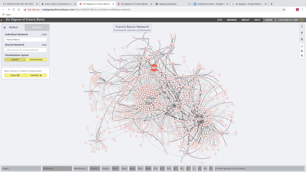
Six Degrees of Francis Bacon
Six Degrees of Francis Bacon is a hilarious project documenting the degrees of separation between the famed philosopher and other people. According to their blog (https://6dfb.tumblr.com/), the data for this site is collected by “anyone with an interest in early modern studies, digital humanities, design, interactive network visualization, history and literature, and/or historical social networks”, but anyone is able to add new data, which will be immediately incorporated into the chart. Sex Degrees is open source and allows users to freely download its dataset. The project is devoted primarily “to the social networks of early modern Britain, 1500-1700”(https://6dfb.tumblr.com/), which limits the data points somewhat.
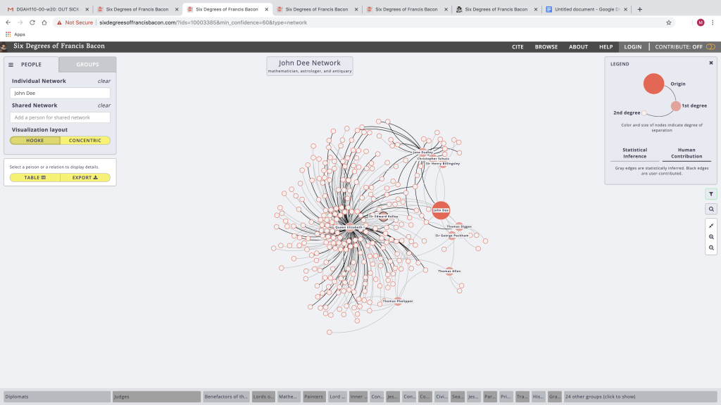
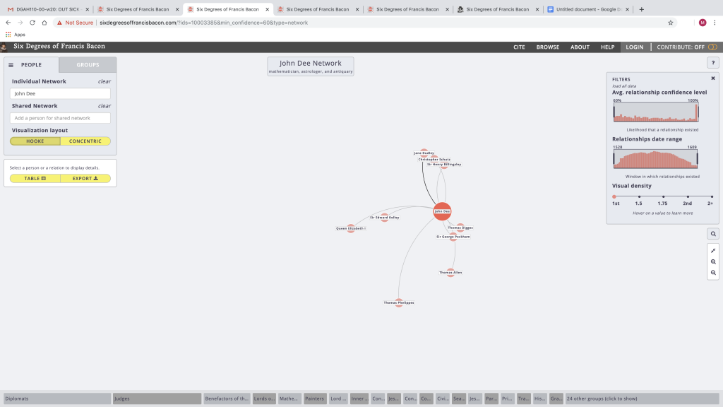
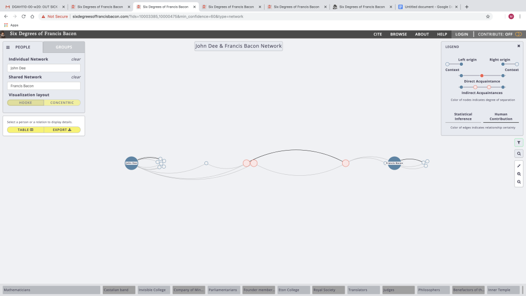
This is a really fun tool to play around with. At first it looks like a massive fractal, but you can zoom in, filter, and search people. You can also “visualize” the relationships between someone you search and other people in the dataset. I looked up John Dee because I noticed a whirlpool around Queen Elizabeth I and I know he was an interesting character who was connected to her. I was able to see his connections to multiple degrees and I was even able to map the connections between him and Francis Bacon, the majority of which were the queen and someone named Thomas Phelippes, who was apparently a spy like Dee. I don’t know if he was Dee’s boss or what but I’d be curious to know.
Though I don’t fully understand it, I know that the team used a combination of historical data and wikidata to find overlaps between particular people. The current display is a Hooke graph which is named after the guy who probably created it since there’s an old-timey portrait next to the project’s blog post on it but I don’t feel like looking him up. The reason they chose the Hooke graph is because it’s force-directed, so it looks nice and it draws the eye towards those with the most connections: ie those with the most influence and likely those who are most important politically. I don’t really get the graphs and the stuff they say about them, but apparently the team made a new graph based on Hooke’s work and called it a Hooke graph. It looks like a ridiculously large version of one of those idea or story trees they make you do in elementary school. The display of the site is a little confusing at first, with its many, many intersecting lines and dots. The filter and zoom options make digesting the data much easier. This is the kind of site you could spend hours playing around on, not realizing how much time has passed.