ArcGIS Storymaps are a useful way to incorporate maps, images, video, and text into an easy-to-read, easy-to-navigate digital platform. Maps created in ArcGIS can be embedded and they remain interactive, allowing for the same information to be presented in an easier to navigate presentation. Images, video, and text can also be easily incorporated, providing context and additional information.
In this tutorial, we will exploring this tool by creating a presentation for the maps we already created about the New York City Central Park Squirrel population.
After logging into StoryMaps, you’ll be directed to create a new story. What will open up is a very basic title slide, which you can edit the title, subtitle, byline, and background by adding a photo or video.

Scrolling down you’ll see this image…

Which will expand to this:
We are going to explore how to use some of these features.
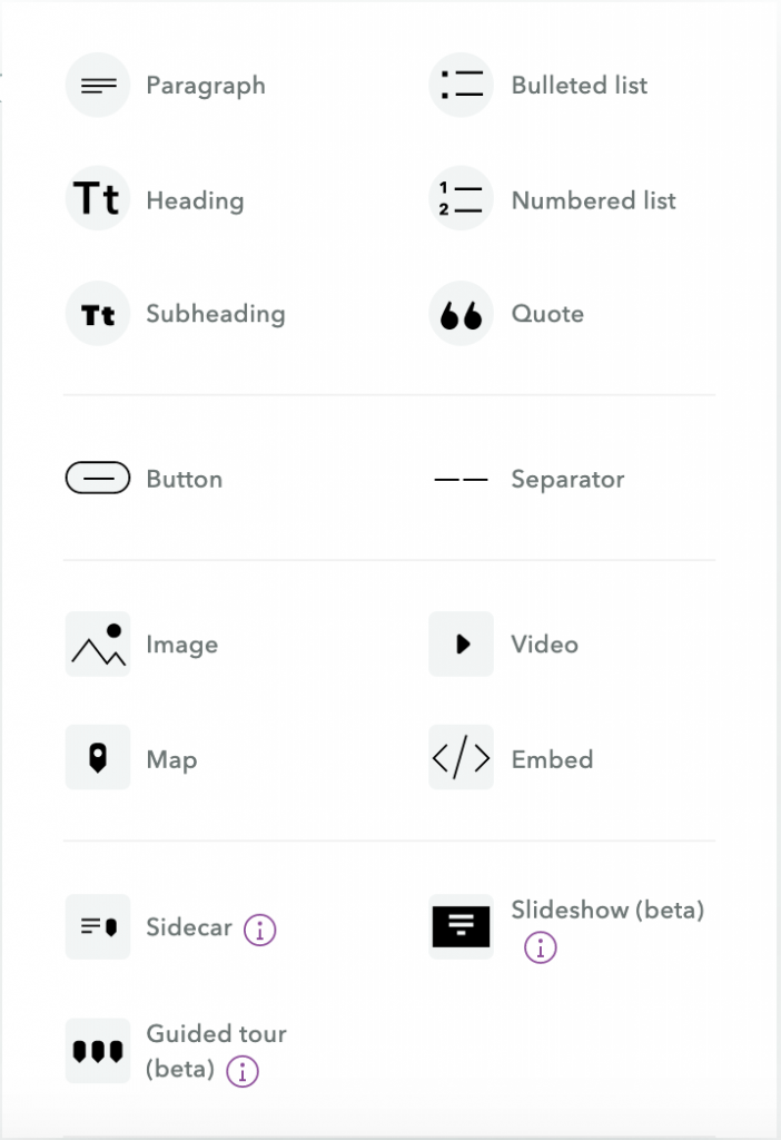
I. Text
This is one of the more self-explanatory sections, but there are some features that would be worth going into. Below are how each of the presented text options look:
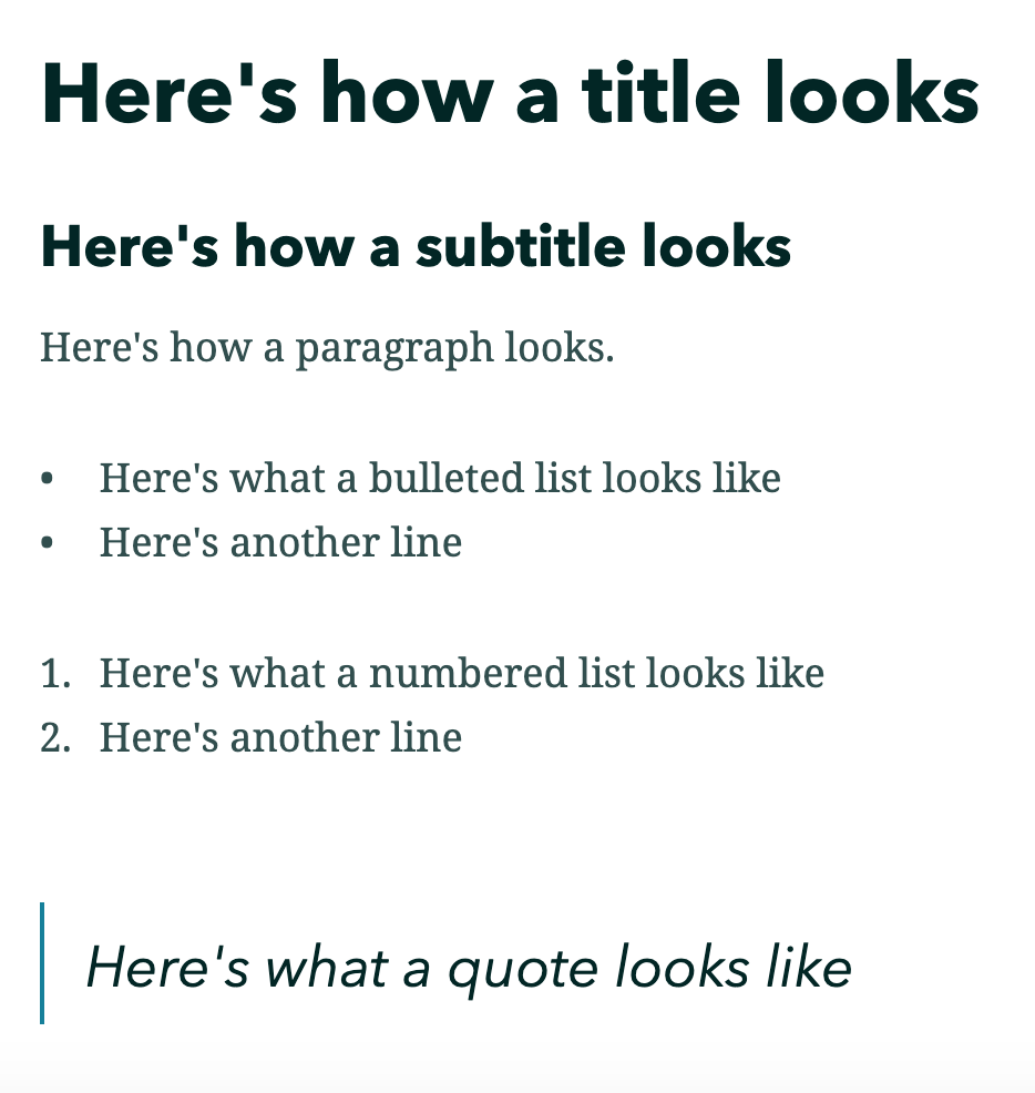
Note the quote automatically adds a vertical line next to the text and the text is italicized. All text options allow for text to be bolded, italicized, or regular.
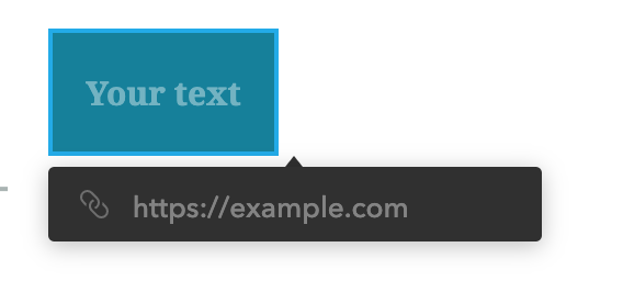
Double clicking on the text will allow you to change some features, particularly in the lists and paragraphs. This including making a hyperlink, or changing the color of the text. This function also allows the type of text block to change. For example, you can easily change a paragraph to a quote by pressing the appropriate symbol. Be aware that StoryMaps does not have an undo function, but you can change undo change by simply changing the format again.
So, to put that in practice:
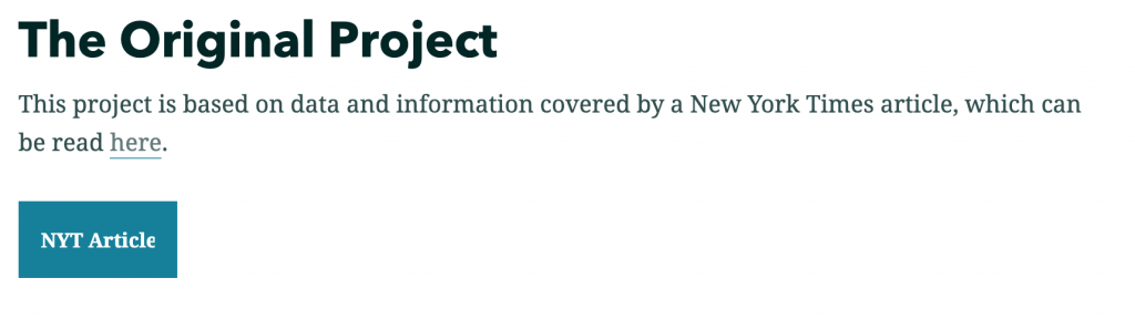
- Add a title, with the text “The Original Project”
- Create a paragraph with the text “This project is based on data and information covered by a New York Times article, which can be read here.”
- Double click on the word “here.”
- Click the hyperlink symbol, and paste the original article site. The full site can be found here: https://www.nytimes.com/interactive/2020/01/08/nyregion/central-park-squirrel-census.html?auth=login-email&login=emailhttps://www.nytimes.com/interactive/2020/01/08/nyregion/central-park-squirrel-census.html?auth=login-email&login=email
II. Buttons
Another feature is the button, which shows up in the menu below the text options. Clicking this will provide this:
4. Edit the text on the blue box to say “NYT Article”
5. Paste the link in the black box.
As of this point, the body should look like this:
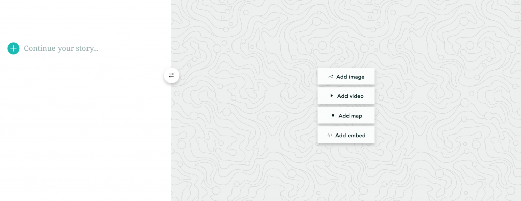
We are now going to be adding a sidebar section, which is found in the fourth (and last) section of the menu. It will look like this:
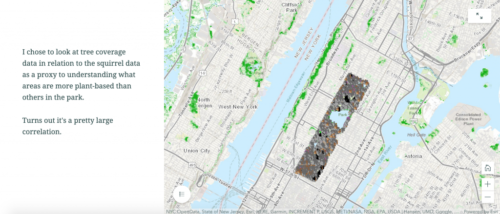
For the text portion, insert a paragraph briefly explaining what you are doing with your map specifically. Adding the map is not that much more difficult.
- Click “Add Map”
- You are redirected to your maps that you’ve created in ArcGIS. You can create an express map, but I find it easier to use maps you have premade in ArcGIS.
- Click on the map you want to select.
- Adjust Map appearances. The layers icon allows you to either show or hide the layers in your original map by clicking the eye that shows up when hovering over the title of the layer. Clicking the gear icon allows you to chose to have a legend or not. I chose to have one. Any more serious edits need to be made to the original map in ArcGIS.
- Place map.
StoryMaps can be a really useful tool. Here’s one I put together with others last term.
Additional resources have also been created by ArcGIS and Esri, the parent institutions. A more thorough tutorial by ArcGIS can be found here, while a presentation on the power of StoryMaps by Esri can be found here.