Data visualization is increasingly becoming a vital resource in presenting data and evidence in the humanities and social sciences (hence the subject area of digital humanities), where technology has traditionally not been used. For my group’s final project for the course, we knew that data visualization would be a key element to the completion of our project as we wanted to visualize the results of Carleton’s football team over the years and provide potential reasons for changes in performance. Enter Palladio…although we didn’t end up using it in the end.
Palladio is a data visualization tool developed by students at Stanford University in the early 2010s with a grant from the National Endowment for the Humanities. Palladio lets you copy and paste spreadsheets directly or upload .csv files to create new projects for yourself as well as providing a sample data set to learn how to use the tool (which will be used in the walkthrough later). Palladio also provides you with four different ways to view your data: the map view, the graph view, the list view, and the gallery view. These four views provide different ways to show your data, and will be described more in-depth during the walkthrough below. Overall, the tool is most useful for showing relationships between various data points.
Walkthrough:
At the top of the page, there’s a button to click that will take you to the load page. This page is where you can load in tabular data with either a file or copy and paste the data directly.

For the purpose of this walkthrough, we’ll be using the sample data provided by the Palladio, which is a collection of data points on people, including elements such as birthplace, gender, and place of death.

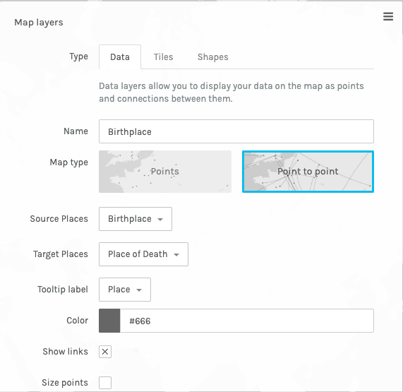
In the map tab, you can use coordinates or places on the map to show the connections between certain data points (with “Point to Point”). However, the map view is only really useful when trying to visualize geospatial data.

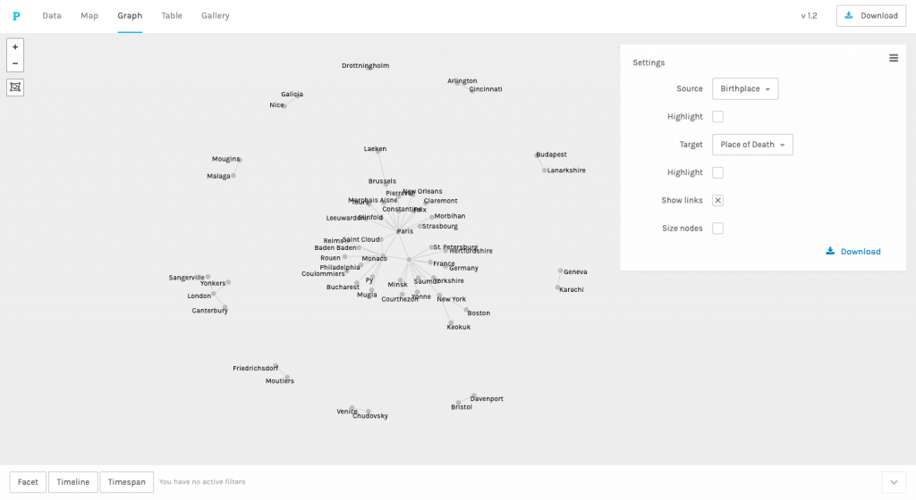
The graph tab allows users to show relationships with nodes and edges, in a similar fashion to the data visualization software Gephi. Again, the picture below uses the “Birthplace” and “Place of Death” data points. You can use checkmarks in the Settings tab to highlight which categories you would like to.
The table view within Palladio provides another tool to view the data, although it is a bit more basic. You are still able to see the connection between data points, although visually it is not as “cool.”

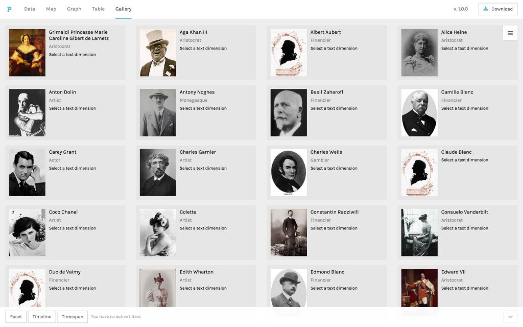
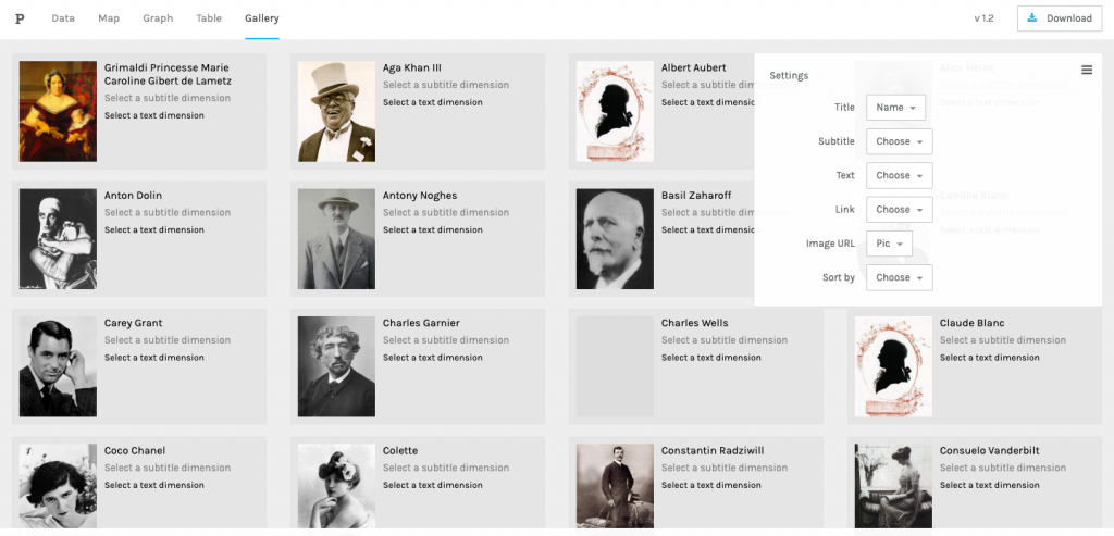
The gallery view allows data to be displayed for quick reference by the user. In the picture below from the Palladio site, you can see that users are able to upload pictures attached to data points to show (or hide) certain points in the gallery view.
If you want to export your data, you have a few options: If you want to download the whole project (see top-right of all the screenshots throughout the walkthrough), you can download your project as a .json file. In the table view, you can download your data in the specific table as a .csv. Finally, with the graph view, you can download your visualization as an .svg file.
That concludes my walkthrough of the tool Palladio. While I am no master of the program, I hope I was able to provide some insight on how to use the program at a basic level. Let me know if you have any questions (or concerns) about my walkthrough below!