Here we will explore the possibility of Social Explorer!
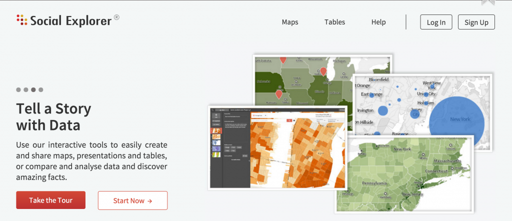
Social Explorer is a interface that provides direct and abundant contemporary and historical census and demographical data. It is highly useful since allows users to create their personal, academic or social maps for numerous purposes, to demonstrate geographical information, to analyze potential trends and causes and to recognize social or historical changes. However, unlike popular GIS like ArcGis, it is much more simple to employ and user-friendly as the graphs are highly customizable. It can accomplish so because Social Explorer, just as its name suggests, solely focus on the social aspect of US’s demographic information. Some special features of it include juxtaposed comparison of different graphs and easily recognizable categories for needed demographical data. Moreover, Social Explorer does not just generate graphs and layouts based on existing social data but also provide the users with convenient tools to annotate, create stories, create graphs or curves on the map and many other uses. Of course, these creation can also then be embedded onto anyone’s own platform. Here are the instructions:
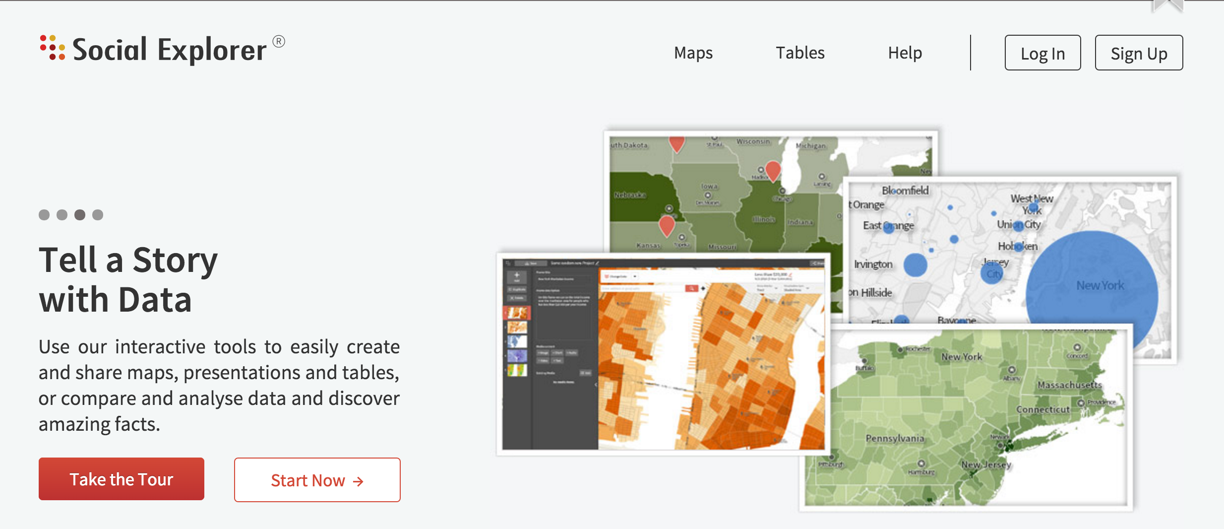
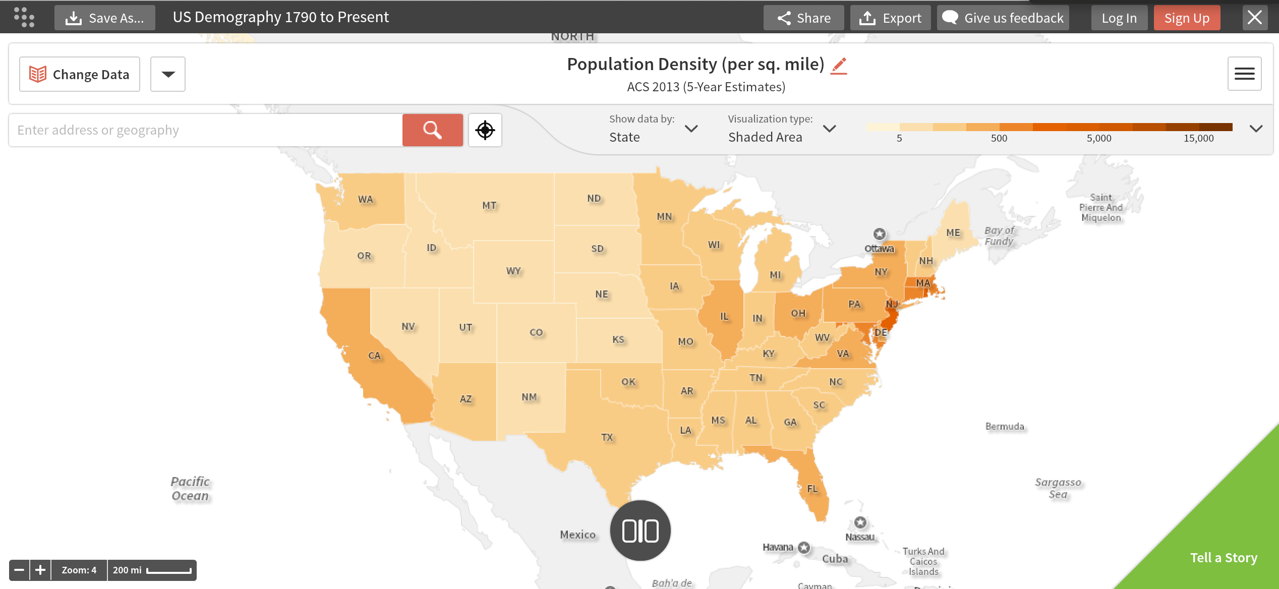
- Go on the main site and click start now. This will generate a basic population density map directly.

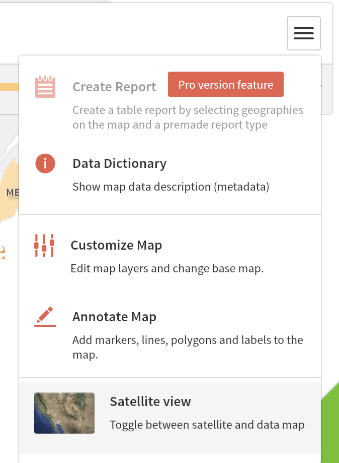
- Then, you can click on the drop-down menu on the top right corner to first “Customize Map.” You may also choose the other options in that menu afterwards for more customization and if you’re willing to purchase the pro versions, you can also create instantaneous reports.
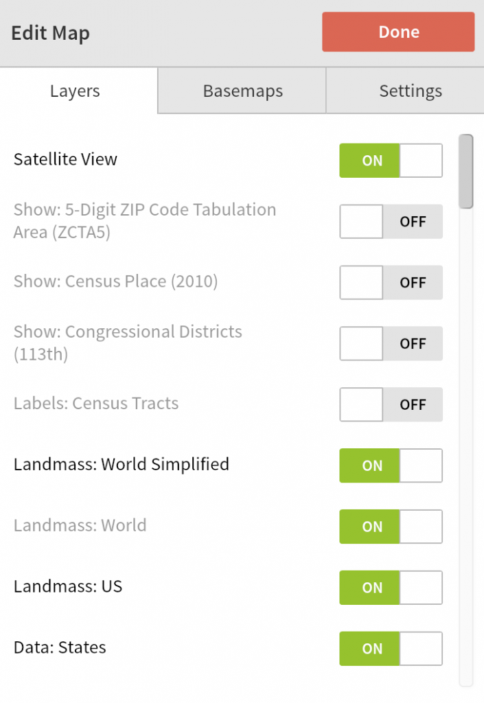
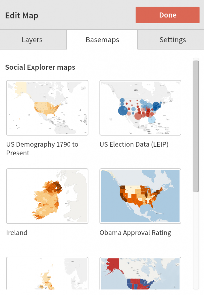
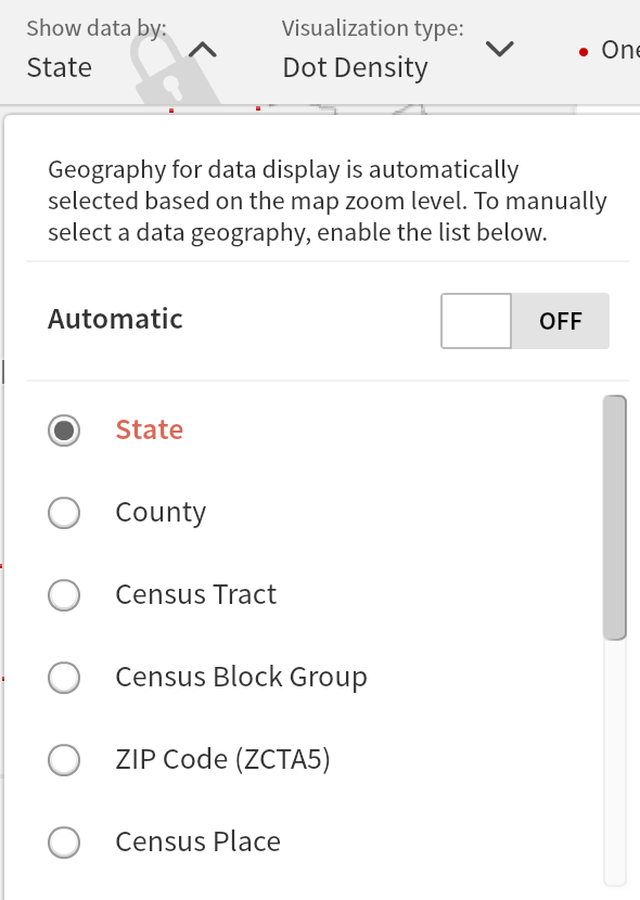
- Within the “Customize Map” option, you can change setting, set layers and choose a base-map. Let’s first stick with the default settings, layers and base-map.
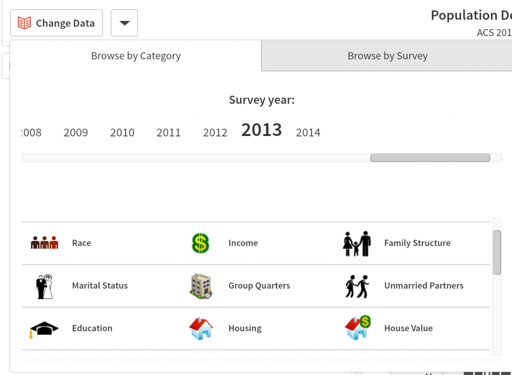
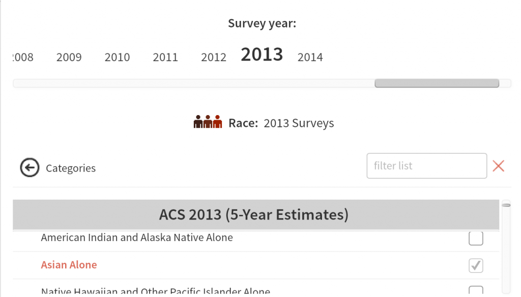
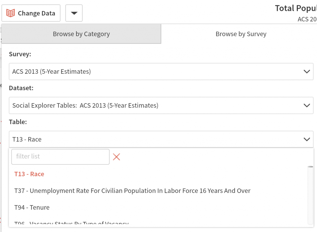
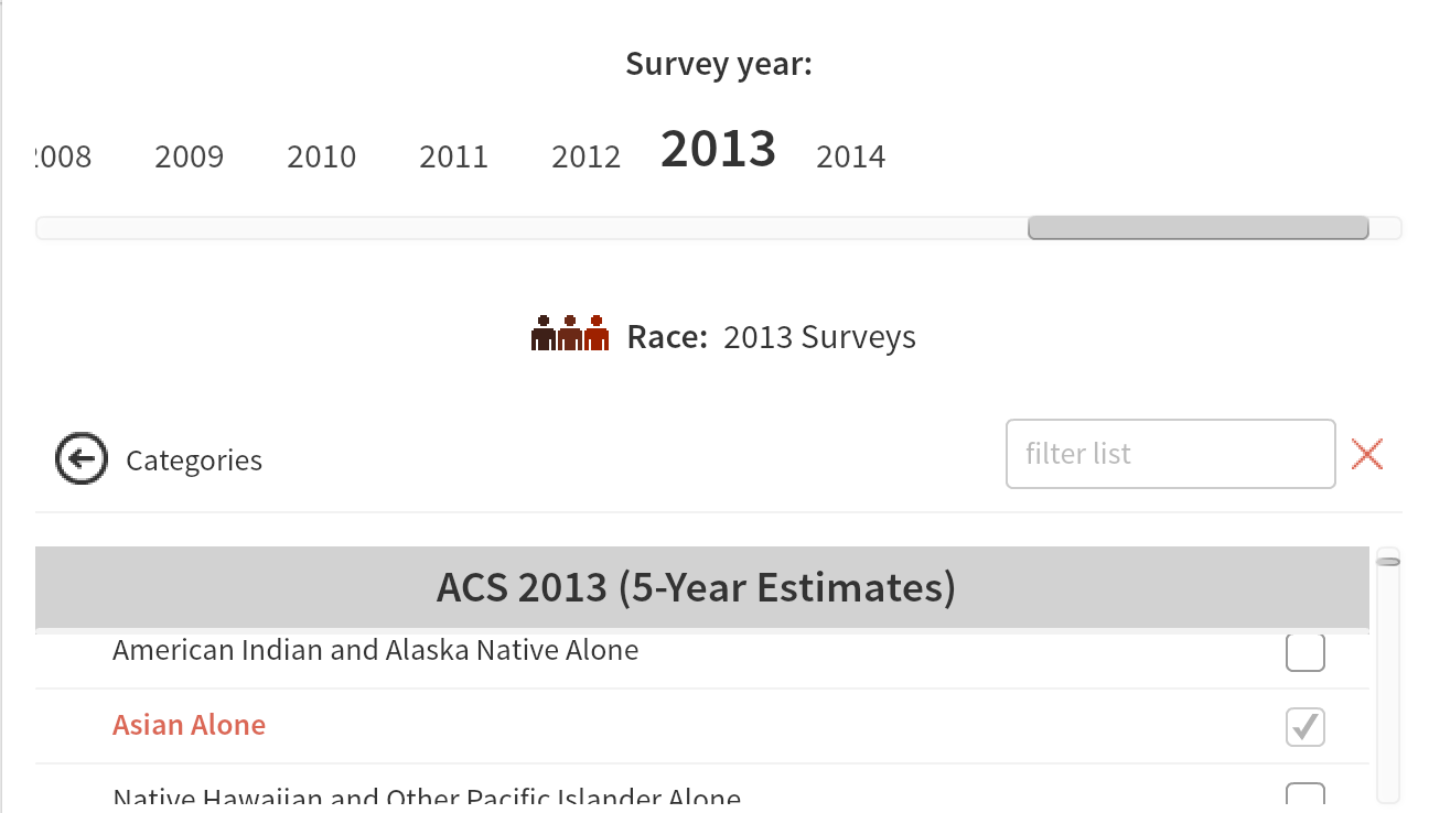
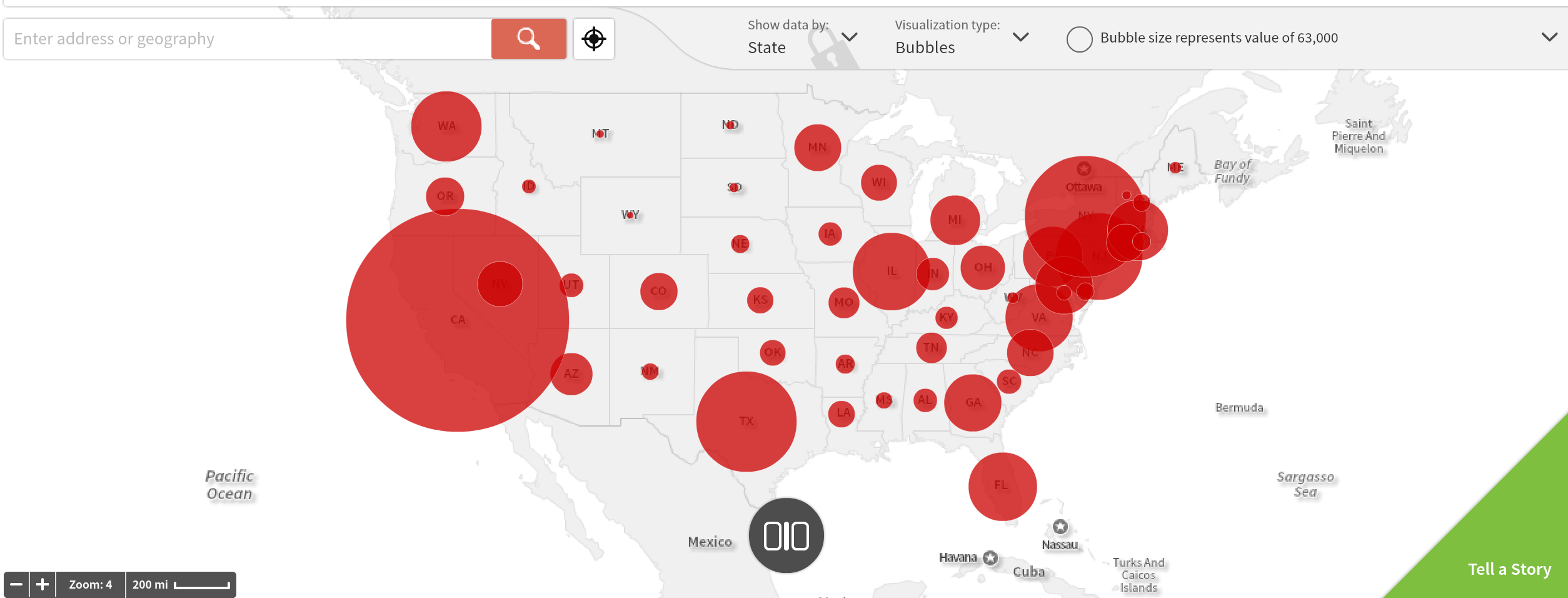
- Now, having settled your base-map, you can begin to insert data and play around by clicking on “change data.” It is also extremely simple to handle as you can choose by categories or by surveys. Much accessible information extends even to 1790s. Here, lets just choose the “asian alone” of “race” for the “2013 survey year.”
- This will generate you a result of this

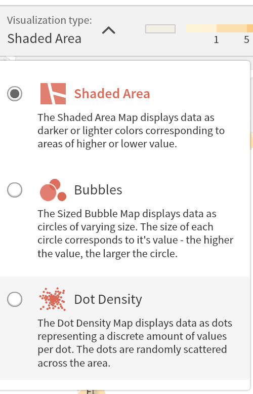
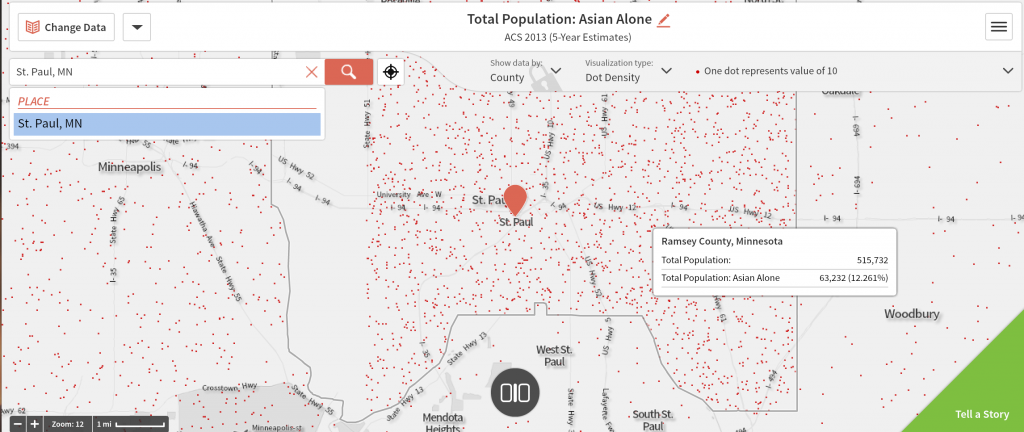
- You can play around with it more by changing the “visualize type,” show the data by different categories and alter the sizes of demographical indications.
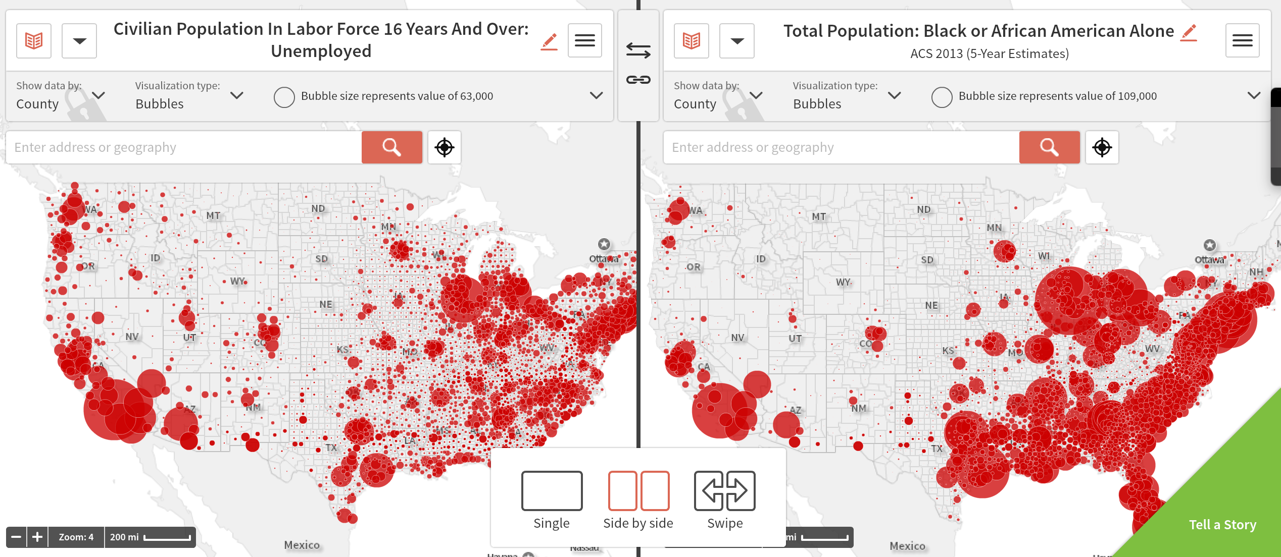
- Here, lets show the data through “county” and “dot density” and zoom in to St. Paul, MN too see its asian population.
- Now that the basic is done, you can make variation by clicking on “change map layout” at the middle-bottom of the page. By doing so, users can make critical comparison to recognize different trends, connections and historical & social changes. For instance, here, if we choose the “side by side” layout option, we can simultaneously compare to different demographies and you can see that my choice of using unemployment graph and the “Black or African American Alone” for 2013 does show, some extent, of relevance and connection. Also, if you are interested in purchasing this product, it will also grant you with another amazing feature of “Tell a Story,” which, as the name suggests, allows you to tell multiple stories regarding the demographical data. This is a very helpful tool for any DH project.

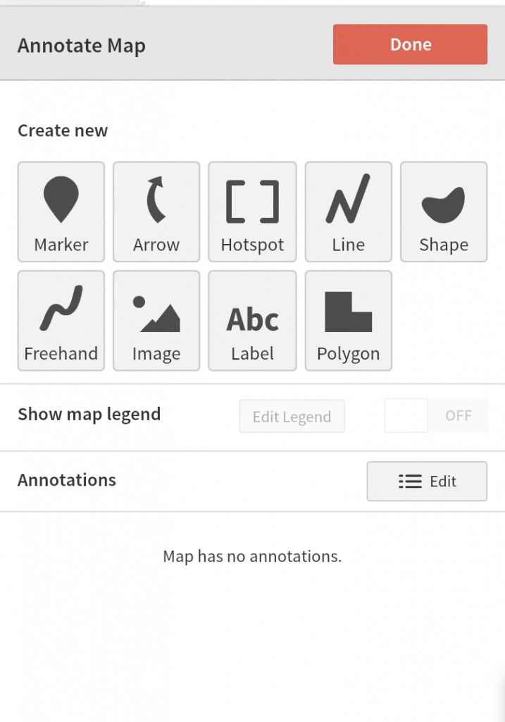
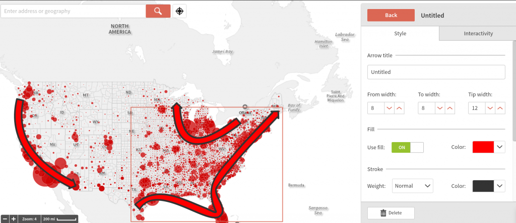
- Another significant tool to employ can be “Annotate Map” back from the drop down menu at the top-right corner. This could be a great tool to illustrate notable trends and connection. Here, by simply applying the arrow tool upon the unemployment map from 2013, we can have a clearly illustration showing that the West Coast and the entire East Coast of USA suffer the most from this issue.
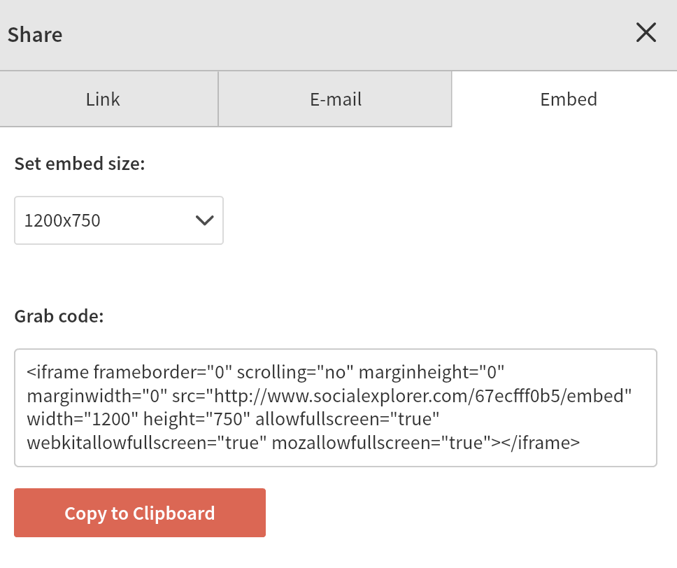
- Finally, you can embed your ultimate creation on your project.


Additional Resources:
Wilson,
This is a great tool that I had not yet heard of! It looks like a really easy and interesting way to explore, organize and publish freely accessible demographic data for the US.
Your tutorial highlights the main features of the application well, and lead us through the steps necessary to make a map and gain some new insights from comparisons of data: the chief benefit of GIS. It was sometimes hard to figure out how your screen caps related to the text, and I would have loved a concluding paragraph summing up what we’ve learned and where to go from here, but overall this was a very strong tutorial.
This looks like an incredibly powerful and customizable tool! Thanks so much for providing this tutorial.