The advent of the internet, and especially of its more socially connected Web 2.0 variant, has ushered in a golden age for the concept of the network. The interconnected world we now live in has changed not only the way we study computers and the internet, but the very way we envision the world and humanity’s place in it, as Thomas Fisher has argued. The digital technologies that we are learning to use in this class are tightly linked to these new understandings, making network analysis a powerful addition to the Digital Humanist’s toolkit. According to Fisher,
The increasingly weblike way of seeing the world … has profound implications for how and in what form we will seek information. The printed book offers us a linear way of doing so. We begin at the beginning—or maybe at the end, with the index—and work forward or backward through a book, or at least parts of it, to find the information we need. Digital media, in contrast, operate in networked ways, with hyperlinked texts taking us in multiple directions, social media placing us in multiple communities, and geographic information systems arranging data in multiple layers. No one starting place, relationship, or layer has privilege over any other in such a world.
 To study this world, it can therefore be helpful to privilege not the people, places, ideas or things that have traditionally occupied humanistic scholarship, but the relationships between them. Network analysis, at root, is the study of the relationships between discrete objects, which are represented as graphs of nodes or vertices (the things) and edges (the relationships between those things). This is a very active area of research that emerged from mathematics but is being explored in a wide array of disciplines, resulting in a vast literature. (Scott Weingart offers a gentle introduction for the non-tech savvy in his Networks Demystified series and you can get a sense of the scope from the Wikipedia entry on Network Theory.) As hackers, we are not going to get too deep into the mathematical underpinnings and rely mostly on software platforms that make network visualization relatively easy, but it is important to have a basic understanding of what these visualizations actually mean in order to use them critically and interpret them correctly.
Exercise: Your (analog) social network
The basics of visualizing a network are fairly intuitive and can be done with pen and paper.
- Draw a simple diagram of your own social network including
- 10-12 people as nodes and
- your relationship to them as edges
- Put yourself at the center and then place other people around you.
- Start with your immediate family (your kinship network) and then expand out to include extended family, friends, people you know through clubs or activities, etc.
- Draw lines to connect these people to yourself
- Now draw lines to connect them to each other.
- How many have relationships that do not run through you?
- As undifferentiated lines, these are probably not very informative, so code the lines to indicate the nature of each relationship
What takeaways emerge from your diagram?
Are there connections that surprised you or figures that emerge as more central to your network than you had realized?
- Swap diagrams with your neighbor and see if the diagram helps you understand their network more easily.
Exercise: Your (digital) social network
The relationships you just drew can be expressed in a simple data model as a “triple” comprised of a subject, a predicate, and an object. My relationship to my friend Chris for instance can be expressed as a triple in the following format:
Austin — is friends with — Chris
subject — predicate — object
Each relationship in your whole network can be represented this way as a set of triples, that allow for easily readable data storage and ready network visualization. Many DH projects make extensive use of the RDF (Resource Description Framework) specifications for modeling large sets of data as an RDF graph of triples. For our small example, we are going to recast our personal network as a set of triples and visualize it as a digital network using Google’s Fusion Tables application.
As we’ve already seen, Fusion Tables is an experimental platform for data visualization that Google has developed to allow spreadsheet data to be quickly visualized in any number of ways from traditional bar and line charts to maps and network visualizations. Google launched its first MOOC around Fusion Tables a while back called Making Sense of Data that you can still view if you want an in depth look at how to use all the features of this application. For now, we going to focus on its Network Graph capabilities.
Our first step will be to populate a Google Sheet with triples representing our own network data, and then import it into Fusion Tables and visualize it.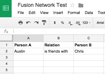
- Launch Google Drive and create a new sheet with the following three columns: Person A, Relation, and Person B
- Go through your hand-drawn diagram and translate each network relationship into a triple following the model above
(One word of caution — there are two types of relationship that can be expressed here: mutual and unreciprocated. “Is friends with” or “is a sibling of” would be mutual relationships that produce an undirected graph. Directed graphs map one-sided relationships like “is the parent of,” “is the student of” or “is in love with” by drawing a directional arrow for the edge. Both are possible and can be used, but you should be aware of the distinction as you draw up your triples and stick to one or the other.)
This data model is unlike a relational database in that you will be repeating names in order to express all of the relationships in the graph.
- Try to connect each person or node with at least two others
- Make sure you are logged in and save your sheet
Import your data into Fusion Tables
Go to the Fusion Tables start page, click on Google Spreadsheets and import your data, checking the Export box if you wish to make the data public and downloadable. 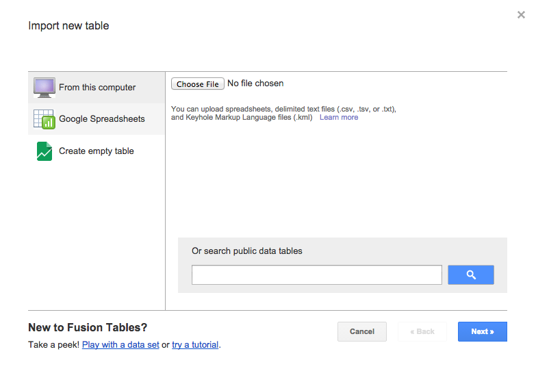
- A window should open showing your data table. You will add a new chart by clicking the red plus sign of the type “Network graph” and change the options to Show the Link Between your Person A and Person B columns.
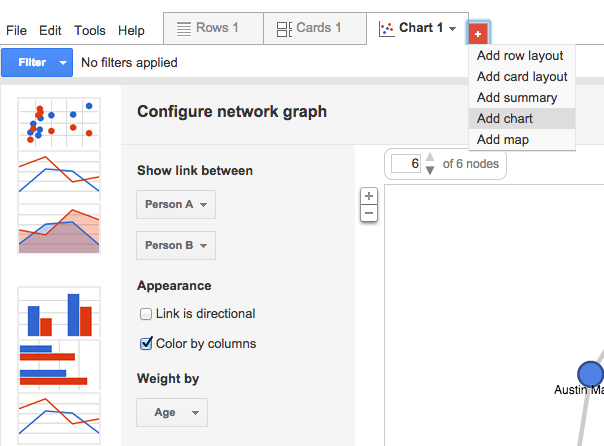
- Congratulations! You have just made a graph of your social network. Explore the limited options and apply some filters, then click and drag around the graph to see how you can change the visualization.
- For a detailed walkthrough of the Network Graph options check out Google’s tutorial, and for another more detailed walkthrough of creating a network graph in Fusion Tables see this tutorial by Iman Salehian & David Kim.
Before we leave Fusion Tables, let’s just add a few more variables to our data to see what other visualizations are available in this application.
- Go back to your data table, click Edit > Add Column and add two columns:
- A column of type Number that contains a numeric variable about each person or relationship, e.g. Age, Years Known, Wealth, whatever you want
- A column of type Location to hold Addresses
- Double click in an empty cell and begin adding the missing data for each unique individual in the Person A column (you don’t have to duplicate for repeat rows)
- The Location field will geocode your data using Google’s powerful search algorithms so you can be as precise as you want or don’t want to be, from exact street addresses, through zip codes to town names.
- When you’re done adding new data, click the plus again and add a map.
- As we saw a few weeks ago, this is a very quick way to plot point data if you just want to see where things are without getting into a hardcore GIS.
- Click the plus one more time and add another chart using the numeric data you entered to explore the options.
Assignment
Now that you know the basics of what a network graph is and how to create a rudimentary one, let’s explore some much more sophisticated network analysis DH projects. With your group, explore one or more of the following projects:
As you explore the project, consider the following questions about the nature of this network analysis:
- What (or who) are the nodes and what are the edges?
- How are the relationships characterized and categorized?
- What interactions does the project allow?
- How does this impact their effectiveness and/or your engagement?
- How was the project created?
- See if you can dig around in the documentation and discover what tools or data manipulation steps produced the outcome you see.
- Does the project combine network analysis with any other information or technique, like spatial analysis or text mining?
Next time we will be looking at more advanced network analysis software and doing a real world project using Carleton’s archives.
- If you finish early and want to get a head start, you can download Gephi and take the Quick Start Tutorial.
- If you do, post the exported image of your Les Mis network graph in a new blog post along with some comments on the process.