Understanding Robots Reading Vogue
Robots Reading Vogue is a digital humanities project done by Yale University that combines data mining with a century’s worth of Vogue covers and pages (2,700 covers and 400,000 pages weighing in at a massive 6 TB of data). With this data, Yale students and faculty have been able to run interesting experiments ranging from tracking advertisements to watching color patterns over time. For this post I will be examining an experiment focused around how Vogue covers have changed over time in regards to colormetric space.
Vogue Covers in Colormetric Space
This sub-project of Robots Reading Vogue delves into examining the patterns and trends that can be seen in the colormetric of space throughout 100 years of Vogue covers. In order to better understand this project, lets take a look at the resources, processes, and presentation that characterize this project and make it so interesting.
Resources: Behind every great digital humanities project is a great data source. This project does not break this rule. This project utilizes a dataset called the “Vogue Archive”. Launched by ProQuest and Conde Nast in 2011, the Vogue Archive offers an extensive dataset of 2700 digitized covers, 400,000 digitized pages. The 6 TB of total data offered by this dataset gives this project the great foundation needed in every impressive digital humanities project. Due to Vogue’s extensive history as a publication, it is an incredible resource for patterns that otherwise might not be so clear in publications with shorter life spans.
Processes: This project is focused on the 2700 completely digitized cover pages. Inspired by the work of Lev Manovich and the Software Studies Initiative, this project uses a tool called ImagePlot to collect visual data such as hue, brightness, and saturation. ImagePlot enables a quantitative visualization of how colorful Vogue covers were over time.
Presentation: In order to present this data, the team plotted a graph point for every Vogue cover in their dataset. The x-axis displays the year of publication and the y-axis is a quantitative measurement of color. The most colorful covers are higher on the y-axis.
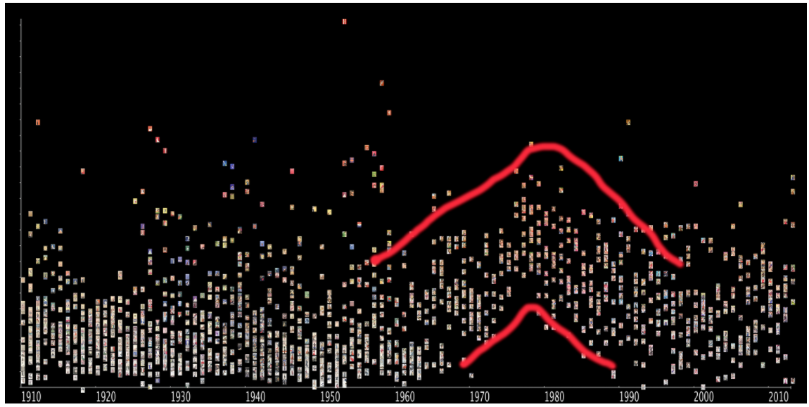
This graph does a great job of visualizing Vogue color trend from the past 100 years. the graph displays a noticeable bump in color around the 1980’s. Further examination tells use this is because during the 80’s covers frequently featured close-ups of a head.
The project also features a great tool that allows users to examine and move around the graph in greater detail. This mapping allows users to zoom out and discern historical trends, zoom in to examine a more specific time range, and view each individual cover, making this choice of presentation the perfect tool to create a meaningful visualization.
This is such an interesting investigation, I wonder why they chose to look at this, was it for the company to determine what trend they were already heading toward and continue with it, or defy it? Or if it was just for fun? Its cool to tie certain time periods with different trends.