The past decade has witnessed a proliferation of web mapping tools and platforms. These tools have long allowed the simple display of and basic interactions with spatially referenced data, but until recently, if you wanted to do any sort of analysis you had to use a desktop GIS system. That situation has begun to change, however, and there are now many solutions out there for mapping your own data alongside hosted layers from around the web.
There are a lot of open source GIS options out there (see this list for a complete rundown) and which one will be right for you depends on the needs of your project and your familiarity and comfort with coding. Today we’re going to explore some of the most common web mapping options out there and see how you can start making fairly complex maps with relatively little startup cost.
Exercise (Google Maps API)*
 Click the image at right to go to the example of a simple historic web map of Carleton College I’ve set up on jsBin.
- Explore the example, noting the following:
- The map should be centered on Northfield near campus
- There are a few key buildings in its early history marked on the map.
- Clicking on the markers should pop up an infowindow with historical information and an image
- Explore the example, noting the following:
The result is a very rudimentary historical GIS, that is not telling you about the modern world like the live Google Maps display, but rather our own curated content, displayed however we want it. So how did we make this? Let’s explore a bit using our browser’s DevTools
- Click on a marker to launch the pop-up, then right-click on the image, and choose Inspect Element
- In the inspector at the bottom, find the img tag and note its source (‘src’)
- this image actually sits on Carleton’s server, I didn’t copy the image, just linking to it.
- Now look in the CSS pane and find the div.marker rules. What do they do? Uncheck them and see what happens.
- This sort of mashup does not alter the original data at all, but with HTML and CSS we can control how it is displayed and integrated locally in our project.
- What about the JS?
- Click on the Network tab in the Inspector, and then reload the page.
- This shows you where all the different elements were loaded from and the time it took to compile the page.
- Most of the list consists of the map tile information (anything from the googleapis domain) but at the top you should see tabletop.js and Google APIs JS scripts. Those I added on purpose to handle the dynamic content.
- Let’s have a look at the code that renders this result and try to figure out how it works.
- Click on the Network tab in the Inspector, and then reload the page.
- In the inspector at the bottom, find the img tag and note its source (‘src’)
- Hover over the page and click “Edit in JS Bin” at the top right to see the source code
- I’ve commented the HTML and JS pretty heavily, so read through the comments and try to figure out how it fits together
- Change some of the map options or other parameters to see what effect it has on the output.
Note that the place mark content itself is not in this code. It is being pulled in from a Google Spreadsheet using the Tabletop.js library. Tabletop is a handy library that lets us turn a simple Google sheet into a poor man’s CMS and use it as our dynamic database backend.
- Click the Google Spreadsheet link at the bottom of the Output pane to see the data
- This sheet is where the info in our pop ups is coming from.
- Each row in the sheet gets turned into one marker, so the sheet needs to hold all the pieces of information
- (Name, Year, Image, Description)
- And also the geographic coordinates so that we can place each on our map (Lat/Long)
- Each row in the sheet gets turned into one marker, so the sheet needs to hold all the pieces of information
- There are a couple of ways to get coordinate data from a location, a process known as Geocoding.
- Here, we are using the following little JavaScript function to turn an address into lat/long right in the Google sheet
-
function geoCode(addr){ var gc = Maps.newGeocoder(); var geoJSON = gc.geocode(addr); var lat = geoJSON.results[0].geometry.location.lat; var lng = geoJSON.results[0].geometry.location.lng; return lat + ", " + lng; } - If you are working with modern data and have an address that’s accurate, this is great. Geocoders are often used for modern street addresses, but they are not totally precise and hard for historic data.
-
- Another option is Harvard’s Geographic Position Finder
- This handy tool let’s you search for any location, place a marker and then copy the Lat/Long values from a textbook
- There are other ways too, but the basic idea is if you have lat/long in a spreadsheet, most GIS applications can put them on a map
- Here, we are using the following little JavaScript function to turn an address into lat/long right in the Google sheet
- This sheet is where the info in our pop ups is coming from.
- Try adding another row to the table and then refreshing the jsBin example to see if it shows up
* This exercise is modeled after one developed by Matt Price at the University of Toronto.
ArcGIS Online
ArcGIS is the industry leading GIS platform. It is very powerful, very difficult to learn, and very expensive, since it is proprietary software created and owned by a company called ESRI.
ArcGIS Online is the company’s attempt to reach a more mass market audience. It is a cloud-basedGIS service that offers an easy way to add, store, and visualize spatial data, much like Fusion Tables. But ArcGIS Online also offers sophisticated ways to analyze data that until recently were only available in high-end desktop software, and — crucially for humanities projects — any map you create can be turned into a Story Map like the Battle of Gettysburg example we looked at last time.
As with the desktop version, ArcGIS is not free, however. It does offer a public version, but it is very limited and offers no analysis capabilities. “Subscription” accounts for organizations start at $2,500/year for 5 users — not exactly cheap. We are going to use it in this class, because we are fortunate that Carleton has a subscription and excellent support in the person of our GIS specialist, Wei-Hsin Fu. But I’ve also included information on open source alternatives at the bottom of this post.
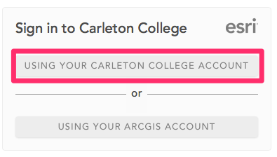
Logging in to your College Account
- In your email account, you should have received a message from ArcGIS Notifications.
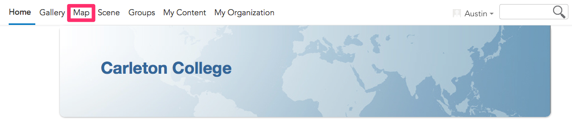
- Follow the link in the email to the Carleton College ArcGIS Online homepage (or go directly to carleton.maps.arcgis.com). You will be prompted to sign in to the account. Choose the Carleton College Account option and enter in your account information on the following page.
Creating a Map
-
-
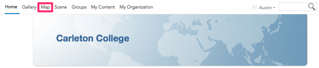
- In ArcGIS Online, click on the Map tab at the top of the page to bring up the main map editor window
- Explore the main map interface. A few things to notice
-
- There are three Guided Tours to get started (we’ll go over these in detail, but you have some built in help here)
- The main operations you can perform are listed across the top menu. What can you do with a blank map? What can’t you do yet?
- Note the relationship between the scale bar and the zoom control as you navigate around the map
- What data do they give you by default?
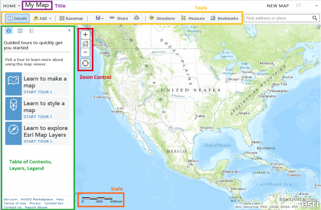
-
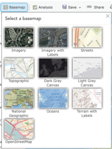
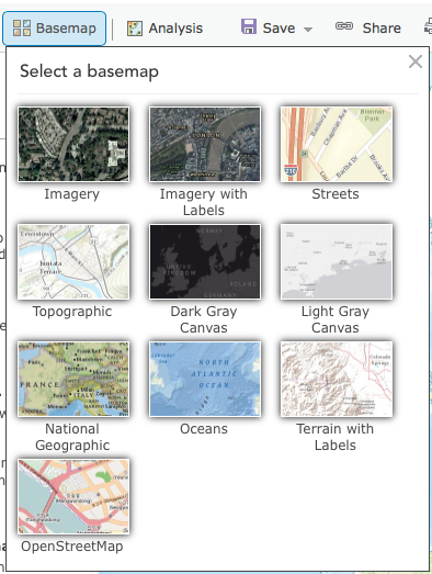
- Click the Basemap tab and explore the options. Pick one that is fairly neutral as a background to our data.
- In ArcGIS Online, click on the Map tab at the top of the page to bring up the main map editor window
-
Getting Data to Map
- For today’s exercises, we are going to use a dataset that is, at least thematically, relevant to our interest in the early history of Carleton and Northfield. Our dataset can be accessed in the shared folder at this link. (The file, early-colleges.csv, is part of Lincoln Mullen’s historydata datasets on GitHub.)
- Download the CSV and open it in Excel or a text editor to see what you will be mapping.
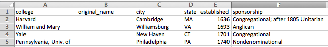
- What information does this file hold?
- Where is the spatial data? What kind of spatial data is there?
- Where might it have come from? How reliable do you think it is?
Upload and Map our Data
Now lets add our data to the map. There are two ways to do this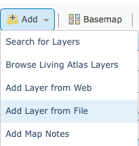
- Click Add and choose to Add Layer from File then navigate through your computer to find the file you want. Note the types of files they allow you to upload
- You can import a zipped shape file (ZIP: the default ESRI format for desktop GIS that is widely recognized by other GIS and web mapping platforms)
- a comma, semi-colon, or tab delimited text file (CSV or TXT: this kind of tabular data is the most common way to collect your own information and will be portable just about anywhere, not to mention about as future proof as you can get
- a GPS Exchange Format (GPX: this is data upload from a GPS tracker, say following a route you ran or biked that was logged by your phone or another GPS enabled device)
- Drag and drop a file onto the map window
The second option is much easier and quicker, but either way, find “early-colleges.csv” and upload it. You should be presented with the following import options

Like Google’s Fusion Tables, ArcGIS Online is going to try to geocode your data and provide latitude and longitude coordinates for any place references in your data set by comparing them to a gazetteer (a place-based dictionary) somewhere. It should have correctly recognized the city and state columns as Location Fields
- Click Add Layer and see how it did.
- Click on a couple of the points on your new map at random to verify if they look correct. The geocoder is pretty good, but ArcGIS does not provide much in the way of error checking and you can’t easily tell what it got wrong just by looking. Buyer beware!
Symbolize and Visualize the Data
By default, the application will try to figure out some pattern in your data and will suggest an attribute to symbolize by. Already, we can see the benefits of a more robust GIS over the simple uniform symbols used on the Fusion Table map.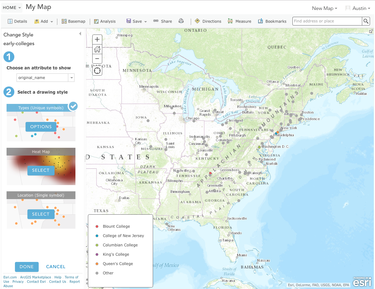
- Explore the style options down the left hand column.
- How do the data look if you choose a different attribute to show?
- How do the single symbol, heat map, and types options differ? Which is most appropriate for these data?
- Explore the various symbolization options under the Types (Unique symbols) drawing style.
- Figure out a map display that you are comfortable with and press DONE when you are finished.
Now that you have mapped some data, what else can do with it?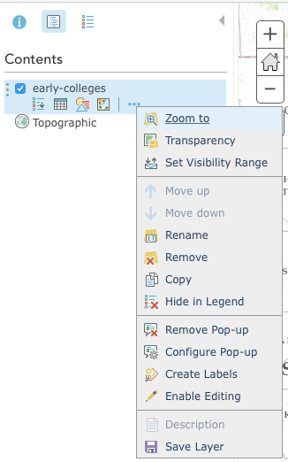
- Check out the options below the layer and see if you can do the following
- Show the table of the data. How is it different than or similar to the original CSV?
- Create labels for the points that use an appropriate value from the data table, and change the style to your liking
- Configure the Pop-Up to show a Custom Attribute Display and combine the data from several fields into a sentence.
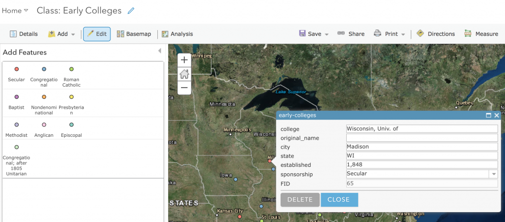
- Enable Editing by clicking the “Edit” button in the top toolbar
- Change the value of a point already in your dataset, by clicking a feature on the map and editing the attribute table
- Add a new feature like Carleton College to the data set by finding the correct location, clicking the proper type from the Add Features box and clicking in the right spot on the map.
- Fill in the attribute values as appropriate.
So what? Asking and Answering Questions
We’ve got a map, but what does it tell us? What can we learn from it that we couldn’t learn from reading the data in a table?
One of the greatest benefits of a GIS system is that we can compare different types of data based on their geographic proximity and spatial relationships. ArcGIS online allows access to a multitude of other datasets hosted on its own servers and around the internet. Let’s see how our data look compared to other information. Can we make it tell other stories of interest?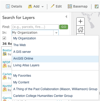
- Click Add again, but this time choose Search for Layers
- See if you can find some boundary layers, population data, or land cover information that seems to have a relationship with the colleges that might be meaningfully interpreted.
You might also search the internet for other GIS datasets that might be fruitfully compared.
- For instance, the Railroads and the Making of Modern America project has several data sets available for the growth of railroads
- Go to their data download page and get the shapefiles for the railroad system
- You’ll need to Zip (compress) the individual year folders in order to upload them, but once you do see if there is any correlation between the growth of railroads between 1840, 1845 and 1850 and the spread of the colleges.
- Go to their data download page and get the shapefiles for the railroad system
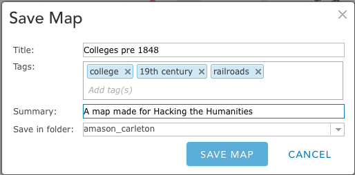
Save and Share your map
Click Save on the toolbar to title your map and save it to your account. You will need to enter in a title and tags. The map description is optional. Click Save Map when you are satisfied with your descriptions.
You can share a link directly to this map view, but you can also publish a nicer looking layout to share publicly.
- Click SHARE on the top toolbar. A new window will pop up. Choose to share this with “Everyone” and then click on Create a Web App.
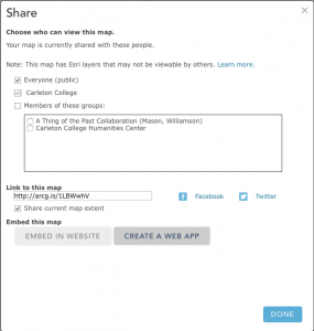
- In the next window, chose the format of the web application. There are many options and you can preview them by clicking on “Create” then “Preview”. Once you find a template you like, click on “Create” then “Create” again.
- On the next screen, enter a title and summary for your application (it can be the same as your map title and description). Click SAVE AND PUBLISH.

Congratulations! You’ve made a live interactive web map!
Assignment
- Create a new blog post on your personal WordPress site and embed the new map.
- Write a few sentences explaining what it is and how you made it
- Address what the additional data you added does to contextualize your map and tell a story.
- Address any issues with your map. Is it lying?
Open Source Alternatives
Carto
Carto is a “freemium” service, that offers an entirely cloud-based all-in-one mapping service. You can upload your data, perform analyses, and publish from their servers to the web through a very simple and clean user interface. They also offer one of the best styling interfaces around with many nice looking templates and the ability to tweak them or roll your own using the equivalent of CSS for web mapping that is called, appropriately enough, CartoCSS. And it’s all open source!
One of the big benefits of Carto is their “torque map” feature, which allows you to animate your data with minimal effort. In the map below, I’ve uploaded the same early-colleges.csv dataset and animated it so that colleges pop up in the order of their founding.
We won’t go into detail on CartoDB here, but I encourage you to explore on your own with the same data or a different dataset to see how this tool compares with ArcGIS Online.
Lincoln Mullen has put up a great getting started with Carto tutorial that you can use to create an account and follow along, and Carto itself has an extensive series of tutorials to explore its features in more depth.
WorldMap
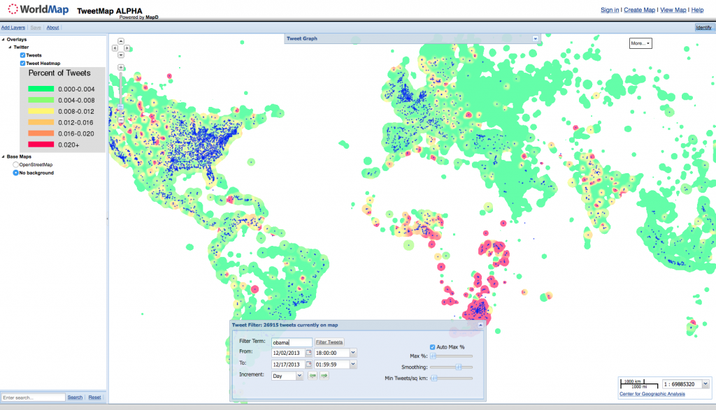
WorldMap is an open source project developed by the Center for Geographic Analysis (CGA) at Harvard with the aim of filling the gap between powerful but hard to learn desktop GIS applications and lightweight online map viewers. You can easily create your own map layers in standard, exportable formats, and you can also view the many maps created by others, including Africa Map, the project that launched the program, and a Tweet Map, a great example of a “big data” geographic data mashup.
WorldMap also hosts its own instance of MapWarper, which will let you georeference an image for free.
Resources
-
-
- Web Mapping Services tutorial
- a very detailed rundown of Web Mapping Services, including what they are, how they work and a comparison of what services and JavaScript APIs are out there from the good folks at the Geographic Information Student Collective.
- The University of Minnesota’s USpatial group regularly puts on workshops up in the Twin Cities
- Their Training Page offers the full downloadable materials for all of their workshops, which you can use to follow along and learn at your own pace.
- Web Mapping Services tutorial
-