Intro
The Wordline project, wherein we sought to track student attitudes through Carleton’s turbulent second years by analyzing word frequencies in the Carleton, is now complete. You are cordially invited to explore the finished product at:
http://dustinmichels.com/wordline/
Under the findings page you can see the graphs we produced and discussion about what they could mean. Erika and Alice did an excellent job of collecting and curating data and Pallav did an excellent job of getting that data into interactive charts like the one below.
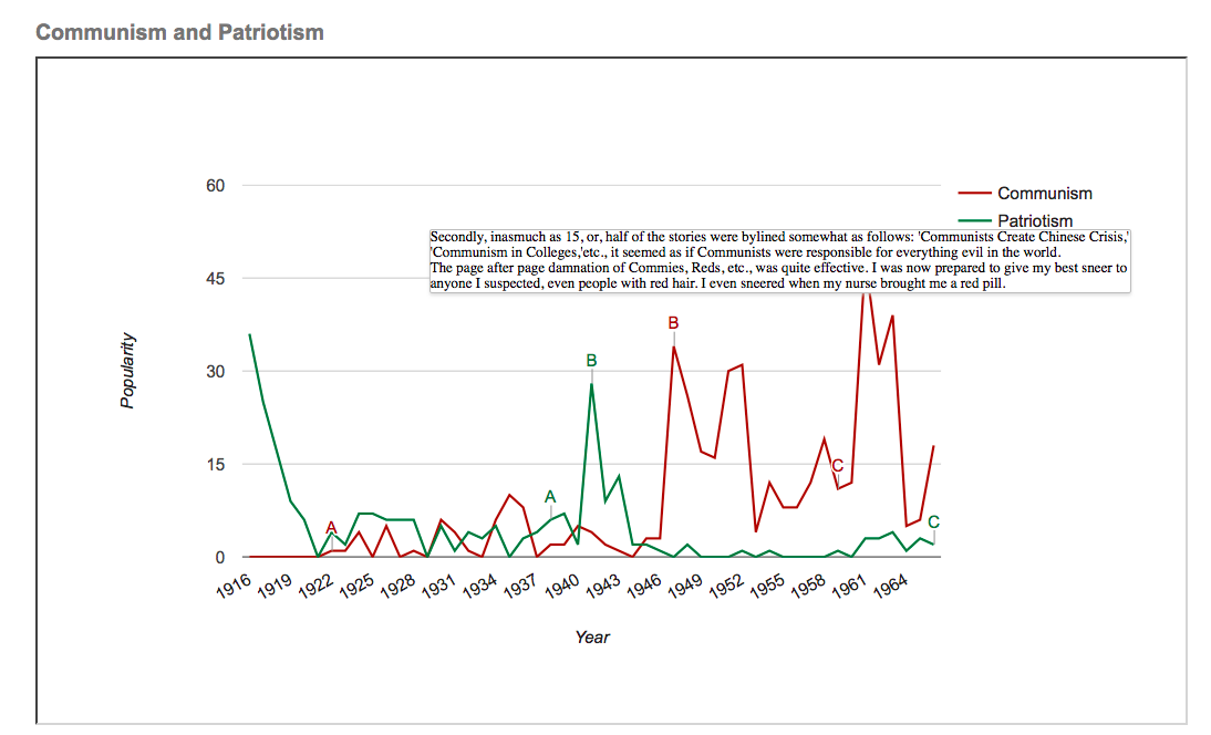
Not only does this chart clearly illustrate the trends, but it also allows a user to mouse over a point (marked A, B, C) to see an excerpt from a relevant Carletonian article from that year. We felt this was important because it helps keep the data rooted in reality; we didn’t want to totally loose sight of the content of the articles by reducing them to numbers.
Once the charts were created, I (Dustin) set to work displaying the information on our website. A few things to highlight about the final website:
Responsive Homepage + Header + Buttons
The website features a responsive homepage that offers one jumping off point–one way of finding desired information–as well as a sticky header that offers a more organized, hierarchical way of finding the right page. We also used a plugin to put buttons at the bottom of pages, so that a user wouldn’t get stuck at the end of a page, but rather have another way to continue exploring the side.
Free Content
The site uses a lot of free content, like the icons above, which we made sure to attribute to its creators (as shown below.)
There is a lot of wonderful content on the internet people create with the intention of sharing. We have tried to pay the sharing forward, by making the code behind our charts and the word frequencies data we collected readily available.
Findings
In the end, we believe our investigation was able to:
(1) Animate the changes in conversation and attitude that accompanied important changes, on campus and beyond.
For example, we saw a spike in discussion about alcohol just before prohibition was enacted, and we saw a steady rise in the use of the word “communism” throughout the 50s and 60s.
(2) Show a decline of formality and tradition.
Over this period, we clearly see discussion of church go down, as discussion of alcohol goes up. We see the word “arboretum” exchanged for the endearing “arb.” And we see more discussion of dance!
For a more detailed discussion of findings, see the findings page of our website.
Team Wordline,
I really like your project and I greatly admire the tenacity you showed in manually exracting detailed and high quality information from a closed proprietary search interface like Arcasearch.
The trends you discovered are very interesting in terms of both internal Carleton campus life (gender relations, colloquial language) and national or international affairs, the communism vs. patriotism graph being particularly arresting in this regard. I also really liked how you compared the Carletonian dataset with the wider data in Google’s Ngram viewer and found that some words like “church” were similar in both, while for others Carleton followed its own path.
There are a few areas where I think some more explanation might be in order, however, particularly regarding the War and Peace chart. How did you decide that “war” would be indicated by those four words and not others? Draft in particular seems problematic, since I imagine its distribution would see a significant spike in the 1960s, whereas others like “killed” would not. Similarly, “church” seems like an odd outlier in the “peace” category. That said, overall I thought your choice of terms and your insightful discussions of the patterns your wordlines revealed were excellent.
On the presentation side, your responsive home page looks great, and I really like some of the navigation features you added like the buttons to follow a logical path through the content. There are, however, a few areas for improvement I might suggest to enhance your site even more and really make it an engaging and informative resource.
1. There are a few blank pages that break the flow of information, which should either be filled with content or removed from the navigation
2. The site as it stands now is extremely text heavy in relatively small font, and I fear that visitors will not give your insights the attention they deserve. I would suggest that you reformat some posts following the practices you all used well on your blog entries for the course.
3. Your embedded charts look good, but they do not currently link to the underlying code. You say on your methods page that you used github gists and bl.ocks.org and that readers should “Feel free to test this out by looking at the bl.ocks pages for each of our graphs,” but there are currently no links!
4. Finally, I love that you added the blog posts laying out your vision for the project, and it would be great if you included all of the relevant posts as well.
With these changes, you would elevate an already great project to true excellence. Well done team!
Austin,
Thank you for the feedback, and for catching a few errors associated with the final website. If you check back now, you should find all these errors remedied. All pages are now operational, source code is available on the resources page and above each chart, the discussion page has been reworked and expanded to include a ‘limitations’ section, all relevant blogs have been added to the site blog, and an effort has been made to reformat pages for readability.
The theme we used is not great for displaying paragraph text, but by adding more buttons, more links, more images, and some richer formatting, I think the pages became easier to read. We also added a widget sidebar to most pages that allows users to access the gallery through another avenue, and creates some variety on text-heavy pages.
The point about our choice of “war” and “peace” words is valid; we were interested in studying some word bundles in addition to single words, but these particular bundles were not constructed in a sufficiently methodical manner.
Thank you for the praise and the constructive criticism; enjoy the revised website!
Dustin,
It looks great! The changes you made really round out the site a bit more, especially the Discussion page, which nicely lays out what you were able to do, the challenges you faced, and the areas for improvement.
I have one last suggestion that is really nitpicky, but since you seem to enjoy the design elements, I thought I’d let you know in case you want to fix it. The site looks great on a PC, but the charts are a set size and so they dwarf the text on a mobile device…
iframes are tricky to make responsive, but there is a standard way to do it in CSS by wrapping the iframe in a div with a given class and setting rules for that wrapper div and the iframe itself so that the iframe scales as you resize the page. The method is written up well on this blog post.
If you want to give it a go for your charts, you would need to add a div and some CSS rules to your WP site, AND you would also need to add a few CSS rules and extra js libraries to your charts code, since Google’s Charts API is notoriously difficult to make responsive.
I’ve added the necessary lines to this example on bl.ocks.org which should redraw responsively as you resize the window, and the commented edits can be seen in the code.
Again, no need to do this if you don’t want to, I just thought you might like to know how! Great work.
Austin,
Thank you for pointing out the mobile display issues and pointing me towards those tutorials. I’ve decided not to dive in and fix it right now since I’m very busy during this finals period, but the lessons are very helpful and I hope to play with responsive sizing more in the future.