
Robert K. Nelson(University of Richmond), LaDale Winling(Virginia Tech), Richard Marciano(University of Maryland), and Nathan Connolly(Johns Hopkins) are the main contributors to this project, and they argue real estate redlining was created to systemically devalue the presence of racial and ethnic minorities in the United States during the New Deal period. The goal of this open access project is to show redlining impacted racial and ethnic minorities in the United States during the 1930s and 1940s through an interactive map from primary government documents linked to each area. The data is archived data from the Home Owners Loan Corporation (HOLC), the public-private partnership organization to help Americans with their real estate needs after the Great Depression.
This digital humanities project shows how racial/and national discrimination played out in the real estate market in large cities across the country. Redlining is where real estate brokers devalue areas where racial or ethinc minorities lived. The process lowers real estate through strategically putting undesirable buildings like sanitation dumps or an underfunded schools new the minority-targeted neighborhood.
The academic fields I can this project in conversation with is history, sociology, political science, economics, urban political economy, and law. Moreover, I believe broader public and specialists can benefit from this research. It is a good the public knows about systematic racism in America, as it still lingers today. For academic specialists, this website holds data that is easy to analyze, which help scholars make conclusions on events from the past so we won’t repeat these discriminatory policies.
o Sources
The primary source for this project were real estate records from the Home Owners Loan Corporation (HOLC), the public-private partnership organization to help Americans with their real estate needs after the Great Depression. The site also provided pictures of the original documents for viewers to see where the data for the site comes from.
This is from Class
o Processes (services)
The main ways the data HOLC data is processed through digitization and transcription. However, the information was on paper with human handwriting, so I can imagine the authors of this site had to transcribe some of the records given.
o Presentation (display)
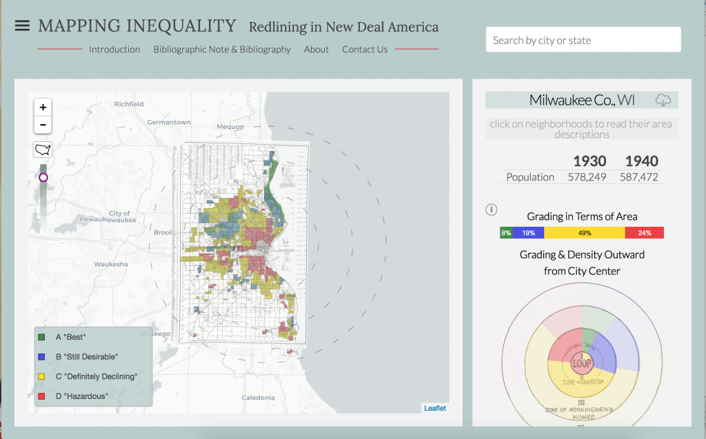
The data is presented in three ways. The first way is through an interactive city map where users can click/hover on to find more information on that specific area. The map was colored based on its real estate desirability grade from HOLC, which is another visual representation of redlining in the 1930s and 1940s. Green” Best,” Blue “Still Desirable,” Yellow “Definitely Declining” Red “Hazard”( Image #1).
The next data presentation was a colored circle that corresponded to the color map. The colored ring shows the percentage of each colored area in a city. For example, Chicago has more red areas compared to Minneapolis. The pattern is most likely because more African-Americans and ethnic minorities migrated to Chicago compared to Minneapolis (Image #1).
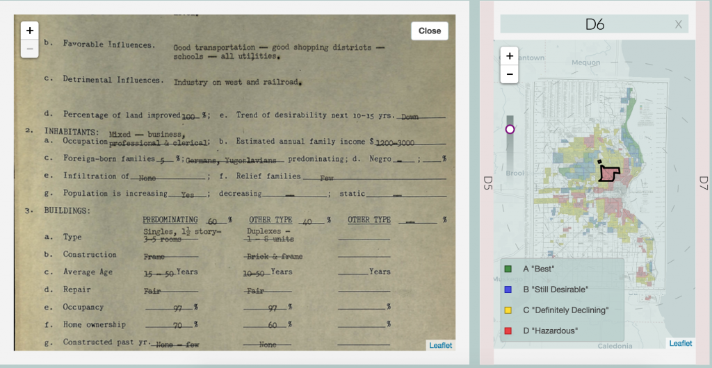
Lastly, there is an option to ask for more detailed data on the area you are interested in analyzing. The option shows a complete data table on the area selected like racial demographics, average age, construction, main occupations of residents, etc (Image #2).

Hey Kwaku!
This is a really cool project. I’m not usually one to self-advertise, but here’s a link to my project analysis
Glad someone wrote about this project! I was really interested in it but couldn’t get it to work in my browser. It reminds me of the local effort by Mapping Prejudice to document racist housing covenants in Minneapolis.
Nice write up Kwaku! This is indeed a great project that has received a lot of attention. Your post describes the project well, but reserves judgement. Are there areas you think it could improve?