
Today I explored one of Yale University’s digital humanities projects, “Robots Reading Vogue,” which analyzes trends in advertising, word usage, cover art, and circulation among Vogue magazine from 1892 to present day. The site, whose tagline boasts, “Data mining is in fashion,” has gathered data from the Vogue Archive in order to “explore questions in fields from gender studies to computer science.”
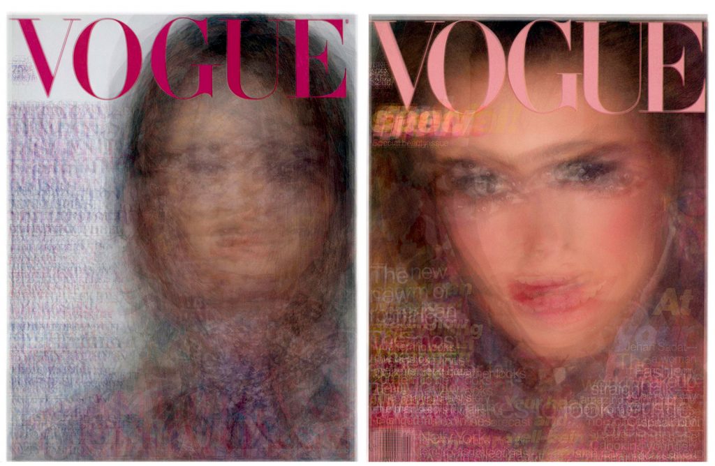
After a few minutes of casually browsing and interacting with the charts and graphs on the “Robots Reading Vogue” site, I began to wonder how on earth 2700 covers, 400,000 pages, and 6 TB of data organized, analyzed, and presented to display clear trends in society, culture, and fashion? To answer this question, I turned to Miriam Posner’s system of breaking down digital projects into three identifiable categories: sources, processes, and presentation…
Sources – The “Robots Reading Vogue” about page explains that the data for this project was gathered from Vogue Archive, a database of every issue of Vogue magazine (US edition) from 1892 to present day.
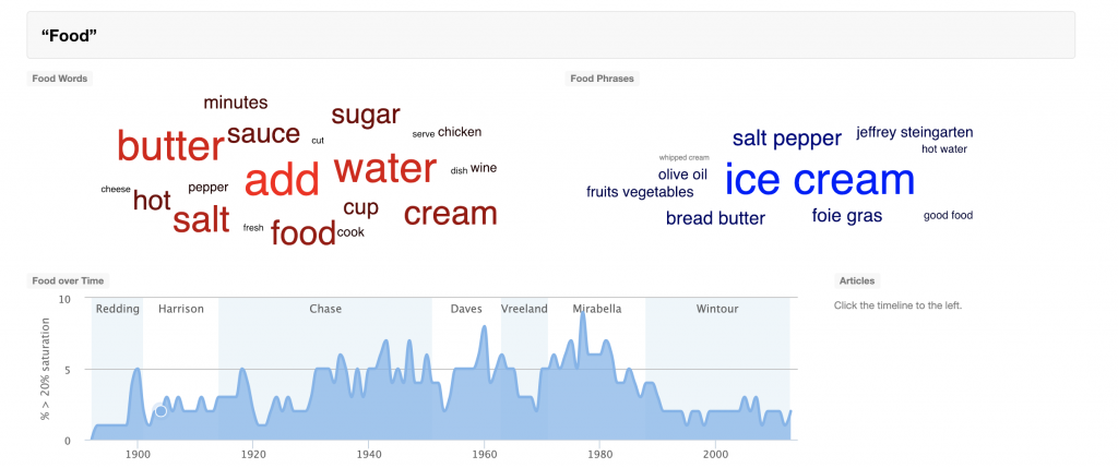
Processes – Each project page, from Advertisements to Cover Averages, on the website explains and links to what software or programs were used in its creation. For example, the webpage for the Topic Modeling project, which shows the popularity of words, grouped into large categories such as “Art,” “Food,” and “Travel,” have changed over time, states:
The topics on this page were generated by a computer program which automatically “read” all of the articles ever published in Vogue, and grouped together those words which were clustered more frequently than a random distribution would predict.
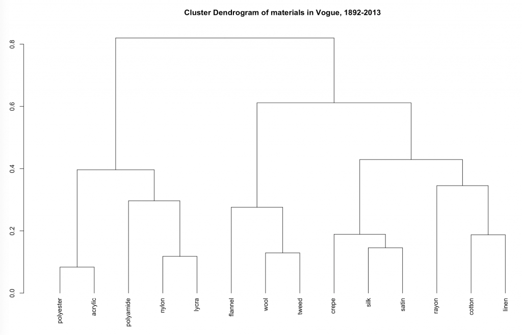
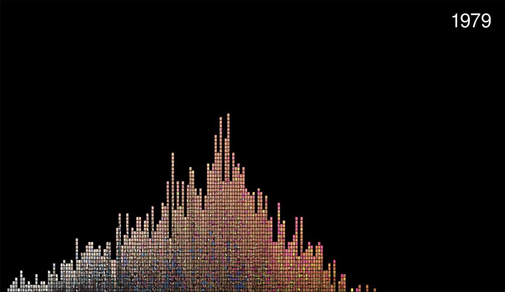
Presentation – Each of the ten projects on the “Robots Reading Vogue” site presents its findings in a different way, the most common being a traditional bar or line graph, in which one can overlay multiple data sets onto one graph or toggle between how the data was processed (by average year, standard deviation, etc.). However, other projects take unique approaches in their presentation, such as FabricSpace, which uses tree diagrams to show how the fabrics used in the Vogue model’s garments have changed since the 19th century, and Slice Histograms, a project that has created a series of non-traditional bar graph of sorts to illustrate how the color used in images throughout the magazine varies over time.
By using Posner’s method of breaking down digital humanities projects into three stages, I was able to better understand how and why the “Robots Reading Vogue” project was created. Overall, this project is extremely fun, interactive, and easy for anyone from a fashion expert to your average web user to explore.

I wonder if the editors of these articles ever look at these kind of studies just because they want to see what common themes come up. But this is awesome because we can see the different keywords that come up and see the trends the magazine uses.
Very nice post Emilee — thoughtful critique and clear layout with lots of images and links make for a very compelling read. I especially like how exploring the site prompted new questions for you.