
Many historical accounts, novels, or documents can be better understood and analyzed when displayed visually, rather than as a plain block of text. Imagine you are reading 100 Years of Solitude and quickly become confused about the various characters all named Aureliano, Aracadio, and Buendía; a chart to divide the generations and depict character relationships would be super useful. Now imagine Hiram Bingham has hired you to determine what Machu Picchu was used for in the 1400s; the ability to create a floor plan of the lost city would be very helpful. Luckily, a platform to create maps and charts such as these exists. Lucidchart is a free online platform for creating flowcharts, diagrams, timelines, floor plans, and everything in between.
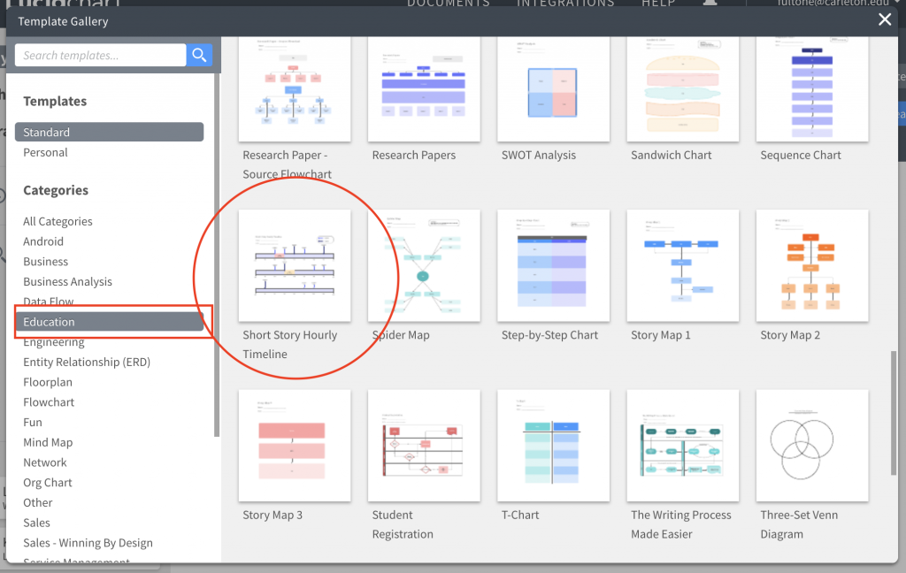
To use Lucidchart, you must first make an account, by clicking “Try LucidChart for free,” at the bottom of the screen. After doing so, you will have access to hundreds of free templates, ranging from web-page wireframes to family trees. While there are nearly thirty template categories, I have suggested a few below that are most relevant to digital humanities projects:
- Education (specifically: Cause and Effect, Cluster Chart, Fact and Opinion, Family tree, Sequence of Events Chart, Hourly Timeline)
- Flowchart Templates
- Business Analyst (specifically: Analytical Hierarchy Process, Cause and Effect Diagram, Decision Tree, Fishbone Diagram)
- Floor Plans
- Mind Map
- Others (specifically: timeline, daily schedule)
- Venn Diagrams
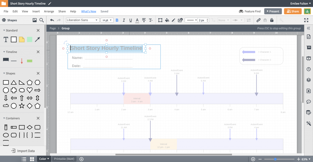
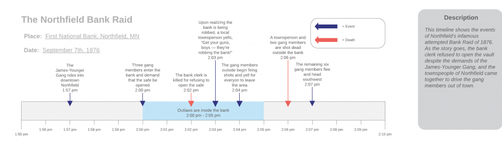
For this tutorial I will use the Short Hourly Timeline template, located within the Education category, to construct a minute-by-minute account of the Northfield’s infamous attempted Bank Robbery of 1867.
Upon selecting a template, a new project will open, and you will be greeted with many options for editing and constructing your timeline. Simply double click anywhere within the existing timeline to edit the template content. Click on the timeline itself to adjust the date and time interval of the timeline; I changed mine to be “09/07/1867” from “1:55pm” to “2:10pm.”
To collect data points for my timeline, I read two accounts of the bank robbery: from Northfield Historical Society and from the Defeat of Jesse James Days official website.
To get started:
- Add a milestone to the map by dragging a red arrow from the “Timeline” section of the left-hand toolbar onto your map
- Add an interval to the map by dragging a green rectangle from the “Timeline” section
- Once all milestone and intervals have been added to your map, try color-coding them into groups of events, by using the paint bucket tool in the top toolbar. Edit the timeline’s key in the upper-right-hand corner to reflect the meaning of your color selections.
- When you are finished with your project, select File > Download As > and select your desired file type (PNG, PDF, JPEG, etc)
Below is the timeline I created to show the Northfield Bank Raid:
Additional Tips and Tricks:
- LucidCharts works like GoogleDocs, in that it allows you to share your project with others, and allow collaborators to edit, comment on, or view your document. Just navigate to Share > Add Collaborator within the top-most menu bar while editing a project.
- The right-hand menu bar is collapsed by default, but you can expand it to have access to Version History, Page Settings, Comments, Themes, and creating additional Layers in your project.
- Want to learn more? Lucidchart has 40 tutorial videos on YouTube to help get you started. Additionally they offer a Beginners Guide to Lucidchart on their webpage.

This is a very professional way of creating charts and presentations. I followed your tutorial and it made the process super quick and easy. I can see myself using this program in other courses for class discussions or presentations.
This is an easy to follow tutorial and it was really time efficient. I can see myself using this tool to display data for my senior comps poster and work beyond Carleton. What are the limitations of this tool? I realized it is not the best for analyzing data as other data visualizations tools on the market.