The Details (Week 7)
Progress
Last week we visited the archives to obtain a better glimpse of the architectural plans as there is a limited amount that had been digitized and found online. We spoke with Nat Wilson, who let us see architectural plans from the time period we are researching and gave us a brief history of how some buildings came to be. He also presented us with more digital versions of maps that we had overlooked. While have yet to start the building process, we have finalized the our plan of how we want to display our project, and made changes to the argument we are pursuing.
Our Visit to the Archives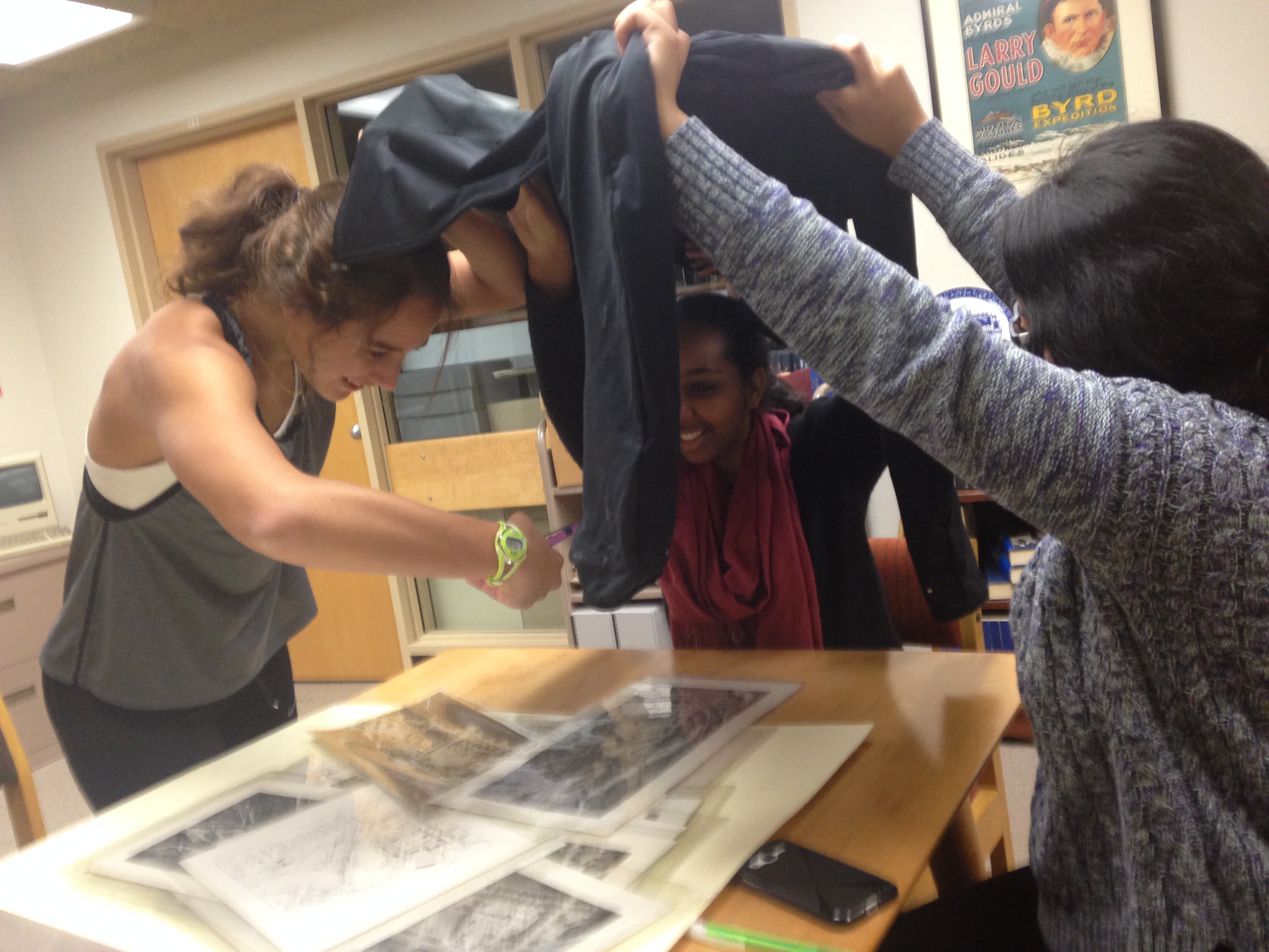
Taking pictures of the plans we found. We used a jacket to prevent reflections from the flash.
Problems and Solutions
Our argument has shifted from designing a broad overview of similarities and differences between a selection of architectural plans to investigating the difference between proposed resources for different genders over time. In addition, we decided that our initial plan of 3D modeling specific buildings areas in various architectural plans would not meet support our argument, and, moreover, it would not quite create the most interactive and educational user experience that we are seeking for our project. Therefore, we have shifted many tools and techniques we are using to build our project in order to change this.
Tools and Techniques
We will take photographs of the maps located in the archives and download the ones that are already digitized from the online archives. We will document the metadata for the images in an excel file however, we will not use excel to arrange our story map data. Instead of adding the data as a CSV file to ArcGIS, we will add the new layer by using the Notes feature. This allows us to make our points on the map polygons that are the same shape of the buildings. This allows the user to simply click on the building rather than a point dropped somewhere on top of it.
To create the Story Map, we will need to include the images of the campus plans. To do this and be sure the buildings are in the correct coordinates on the map, we will use Map Warper. We will export the Map Warper data and add it to our Story Map in ArcGIS as a Tile Layer.
After this is done, we are able to export the map into a couple different web applications. One web application shows 2 maps: one on top of the other, with a slider the user can move to compare them. You can see an example of this particular application here. A similar web application option involves overlaid maps where users can view a small circular area of the map that is “underneath” the one they can see. Users can drag around the circle to discover and make comparisons between the maps.
We will host these web applications on a WordPress site.
Updated Timeline of Deliverables:
Our project is still on track! Here is what’s to follow:
Metadata of sources put into an excel document: by class next Friday, October 30th.
Create a rough draft of the historical facts we want to use: by class Tuesday, November 3rd
Create our various maps on ArcGIS: Thursday, November 5th
Assemble our project’s site: Sunday, November 8th
Buffer time for problem solving: Sunday, November 8th-Thursday, November 12th
Finalize our site: Thursday, November 12th
Team What If,
It seems like you have made good progress and are moving towards what should be a very interesting and informative final project. I think ditching the 3D models in favor of a swipe or spyglass map is a good move and will let you focus on the argument and the aspects you are interested in. A few thoughts and questions.
–Are you going to work with several different versions of alternate Carletons, e.g. the 1921, 1925 and 1960s plans, or pick just one? If you are going for multiple ones, I would suggest multiple maps and apps, with each one comparing the proposal to the modern campus, and each embedded on its own page with a narrative essay on your final WordPress site.
–In your timeline you have only allotted two days for making the web maps, and other deadlines seem tight as well. It might be best to divide the work and have some people starting on the mapping, documentation, etc. now so that you can all arrive at the end with plenty of lead time.
–For example, if you haven’t already you should decide who will host the project on their server, and start setting up the WordPress instance sooner rather than later.
–Also, be sure to include a bibliography of the primary and secondary sources you draw on to contextualize the information in the scanned maps.
Can’t wait to see what you produce?
Team What If,
The changes of plans, I think, is for the better. I think it’s super interesting that you’ll be looking at how resources offered for different gender. I think it’ll be super interesting to look at how that was in the mid 50 years of Carleton’s years and comparing it to how it is now. Especially with all the resources that Carleton has now created for gender neutral, transgender and other who don’t fall under the “traditional” gender identification.
Since my group was considering a similar project, I was particularly interested in reading your update. Sounds like you ran into similar dilemmas, and are making decisions that further differentiate your project, which is very exciting! I also very much appreciated the photo of you guys taking photos – I had to do something similar when I ventured to the first floor! Looks like you are working hard and having a blast!