A Social Network of Carleton College during the First World War
Today we are going to try out a real-world network analysis project and attempt to reconstruct the social network of Carleton College around its 50th anniversary in 1916. This was a turbulent time for Carleton, since the US was engaged in World War One, and many Carls past and present went to Europe to fight. Carleton itself was destabilized in the fall of 1918, when the Carleton-St Olaf Unit of the Student Army Training Corps was formed and took over the men’s dormitory as a barracks.
The school was small enough at that time that everyone probably knew everyone else, so the social world was relatively restricted, but we obviously cannot interview people to ask who their friends were. Of course, Facebook didn’t exist in 1916, so we can’t easily download a list of friends to start exploring.
So how are we going to construct an historical social network? Well, fortunately, the Algol Yearbook was first published in 1890 and all issues since have been digitized by our helpful librarians and made available through the library catalog. During the war the yearbooks went on hold, and so the volume published in 1919-1920 contains several years’ worth of data. As the yearbook committee wrote in their Forward:
SINCE the last appearance of the Algol, in the fall of 1916, Carleton has passed from days of peace and normal activities, through the unrest and sacrifice of war, to those of triumphant victory, bringing readjustment, and preparation for even greater progress than before. To the classes of 1919 and 1920 has fallen the peculiar task and privilege of recording Carleton life, not only on the campus, but in military forces of the nation and battleships of our fighting forces, during these eventful years. This book, we hope, will be more than a record, more than a list of names and facts, more than a celebration of victory; it is intended to be a simple expression of appreciation, a permanent memorial, to those who, clad in the Khaki and Blue, served their country in her time of need.
The yearbook won’t exactly tell us who was friends with whom, but they do list the complete class lists for a given year (providing all the individuals that will be the nodes in our network) and also all of the organizations on campus with their member lists. We can assume that people who belonged to the same organization interacted regularly and construct relationships (the edges of our network) based on these affiliations.
This is called an affiliation network and can be a powerful way of exploring connections and influence, as illustrated by the graph of regional networks of railroad directors below. Ours will allow us to construct a bimodal network graph of individuals and organizations in Carleton’s wartime history, from which we can derive a one-mode network of connected individuals based on their co-membership in these clubs. The result should allow us to ascertain who were the most central individuals at Carleton that year, who formed bridges between different communities and other useful network metrics.
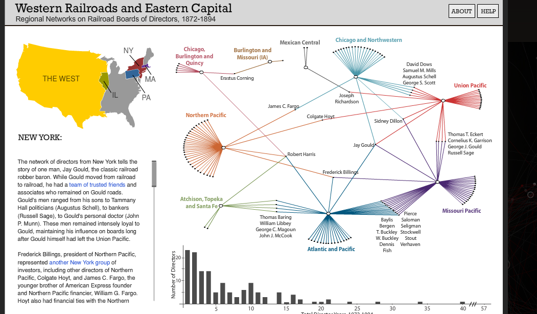
Networks of Boards of Directors of Western railroads, from “Railroaded” by the Stanford Spatial History Project
There are many sophisticated ways to perform this type of analysis (here’s a good Stanford tutorial on doing so with R, and here’s a tutorial for using Palladio at the great Programming Historian).
But we are hackers here and are going to use easy, off-the-shelf tools: Google Sheets to collect our data collaboratively in the cloud and the free NodeXL template for Microsoft Excel to visualize the network. (Microsoft Excel itself, is of course, not free, but so widely available that this tool should be accessible and of use to most readers.)
Exercise: Data Collection
First, we need to extract the lists of students and their membership affiliations from the yearbook. The volumes were OCRd, but the process is far from perfect, making automatic data extraction difficult. We will need to do a good amount of copy/pasting and hand editing to get these lists into shape.
- Go to the 1919-20 Algol in the Carleton Digital Collections and explore the item
- The interface allows us to view the PDF images and the scanned text
- Go to page 82-83 which lists the Senior Class, and
- Click the View PDF & Text button to see what I mean about the data quality
- The original includes a lot of white space and multiple columns for formatting, which does not translate very well into a clean table formatted CSV, our ultimate end goal. These yearbooks were also scanned as two-page spreads, which caused the OCR to freak out and mix up values from both columns.
If it were cleaner, we might be able to automate some of the data cleaning process by using a python script and regular expressions, or a tool like Open Refine, but alas, for a project of this scale, this would be more labor than it is worth.
So we’ll need to do this the old fashioned way with manual copy/pasting into spreadsheets. We’ll try to speed it up, at least, by dividing the labor among us.
Getting our Data
We are interested in names of students and their organizational affiliations, and you’ll notice that all of this information is right here for the Senior Class. Great! Unfortunately, it is only there for the Seniors and Juniors, but not for anyone else.
We are going to gather our data from Book 4 of the Yearbook: Literary Societies and Other Organizations. These lists contain full names, under each heading, and often class year, and they include underclassmen and -women as well. Plus, these “literary” societies were as close as Carleton came to Greek fraternities and sororities, and since they served a similar social function they are especially relevant to our social network analysis.
- Download the PDF to your local machine so that it is easier to work with.
- Open the PDF in Preview or Acrobat
- Go to page 161, Book 4 and pick a society.
- Highlight the text and see what the underlying OCR will let you grab at one go. Chances are the class years will get all out of whack, so you’ll probably need to copy names individually.
- Go to our NetworkAnalysisDataCollection Google Sheet
- You’ll see that I’ve set up a Master List sheet with the following columns
- Name
- Organization
- Class
- We’ll all populate this at the end, but to avoid stepping all over each other, we’ll each make a separate sheet for primary data collection
- You’ll see that I’ve set up a Master List sheet with the following columns
- Duplicate the Sheet
- Rename it to the Name of your Organization
- E.g. Adelphic Society
- Rename it to the Name of your Organization
- Now the hard part:
- Copy all the names to Name column
- Add the Class year where appropriate
- Fill in the name of your organization for each row
- Clean the data if necessary to get rid of any extraneous characters
- You might find Google’s Find and Replace using regular expressions useful.
- For instance, you could do a find/replace swapping out something like
.s(a period followed by whitespace) for
\n(a new line, or carriage return).
- For instance, you could do a find/replace swapping out something like
- The result should be a single list containing the names of all members of the society with their class year
- You might find Google’s Find and Replace using regular expressions useful.
- Now lets compile the Master List
- Copy your data into the Master List sheet below that of others
Data Cleaning
Since the yearbook compilers were not thinking in terms of machine compatibility, they often recorded names differently in different lists, e.g. “Hannah M. Griffith” in the class list might show up as “Griffith, H.M.” in a member list.
To make our graph meaningful we would need to create an Index of Persons from the Index of Names we just created. This is a standard step in prosopographical research (that is, research on a group of named individuals). For an example of a major DH project underway to distinguish persons from names in the ancient world, see the SNAP:DRGN project.
To do this properly, we would construct a database with unique IDs for each name, linked as foreign keys to a new table listing unique persons, along with new fields describing the rationale for our decisions. We don’t have the time for that in this project, so we are just going to assume that if the initials match, we have the same person
We will just try to get as accurate as we can.
- Once everyone’s data is entered, we will sort it alphabetically by name to put all the similar names together.
- Use the Google =UNIQUE formula to check for slight differences
- Go through the list of names, and replace each instance with its equivalent
- Repeat until cleaned
- Go through the list of names, and replace each instance with its equivalent
- Resort the list based on Organization
Exercise: Affiliation Network in NodeXL
NodeXL is a free extension that gives Excel the functionality of a network analysis program, allowing you to store, analyze and visualize networks.
Now that we have all of the yearbook data collected in our sheet, we need to turn it into a format that NodeXL can read. The simplest of these is an edge list, which consists of two columns containing the node names, where each row is an edge connecting those two vertices.
The Orgs sheet you created above will be our edge list, which we can use to make a bimodal display of our affiliation network data in NodeXL.
- Download and install NodeXL Template from this site
- Follow the installation instructions and launch a blank template
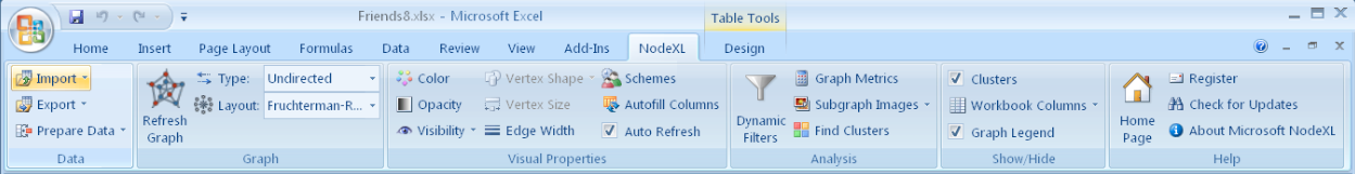
The NodeXL ribbon of tools added to Microsoft Excel
You should now have a form to begin filling in, and a new NodeXL ribbon of tools at the top of the Excel window (like the image above).
- Copy and paste the edge list of all your people and organizations into the Edges tab’s first two Vertex Columns
This detailed introductory tutorial by Derek Hanson and Ben Schneiderman will give you a step by step guide to using the program. The Serious Eats Analysis section beginning on page 27 provides an example of working with bimodal data like ours.
Follow the instructions in the tutorial linked above to test out NodeXL’s capabilities. Try to figure out how to do the following
- Generate a graph,
- Generate graph metrics
- Particularly degree
- Add styling and color to vertices and edges
- Add labels
- Change the layout
- Experiment with good options for visualizing a multimodal network (hint: try the Harel-Koren Fast Multiscale option)
What insights can you glean from this visualization?
Is it helpful to see the affiliations in this way?
Do any individuals or organizations stand out as particularly isolated or well connected?
Exercise: Person-to-Person Network
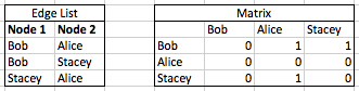
We are not just interested in the indirect connections through affiliations, however, we also want to see how co-membership creates direct connection between people. In order to transform our bimodal network into a person-to-person unimodal one we need to turn this edge list into a matrix. A network can be represented as a binary matrix wherein a connection is indicated by a 1 and no connection receives a 0. The following two tables represent the same network information, showing directed relationships between Nodes 1 and 2 (note that Alice’s row contains all 0s, since she never appears in the Node 1 list).
To get a matrix like this for our data, we would put the Organizations along the top axis, and enter 1s wherever people were members and zeroes everywhere else. Doing this by hand for a large dataset would be very time consuming. Statistical packages like R have functions that will do these transformations for you, but it can also be done using Excel’s Pivot Table feature to generate the person-to-affiliation matrix and the SumProduct function on the result to connect people to people based on the number of organizations they both attended.
If you want a model download the excel file below to see how everything listed below works together.
Creating an Affiliation Matrix
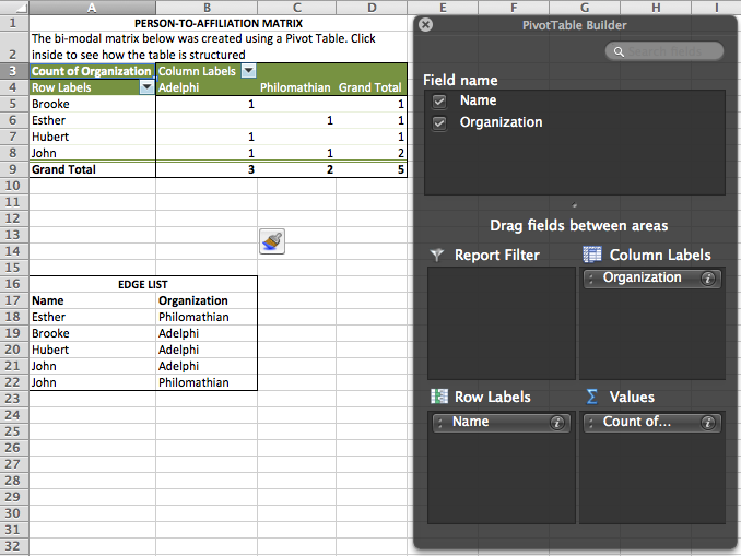
- Put your cursor in the data range for your edge list and select Pivot Table from the Insert or Data menu
- Drag the field names into the areas indicated in the image, so that
- Names label Rows,
- Organizations label Columns,
- Then drag Organizations into Values as well, so that Count of Organization fills in the matrix.
- The result should like like that below
- Drag the field names into the areas indicated in the image, so that
Great, we’ve got a matrix showing a 1 (true) wherever a given person is affiliated with an organization and nothing (false) where there was no affiliation. This is just a different way to represent the same data that was in our edge list. But we want to see how people were connected with people, not the groups, so we need to do some matrix math.
Specifically we are going to compare the records of every two people in our matrix and if make use of binary math to see where their membership in groups overlaps. We’ll make a new matrix that has the people’s names across both axes, and the values in this new matrix will indicate how many affiliations the people at each intersection shared.
Make sense? Sort of? Hopefully it will make more as we step through the process in the exercise below.
Creating a Person-to-Person Matrix
The first step is to create a new box for our data that has the names on both axes, not just the vertical. So we’ll copy the names over to a new range, and also transpose them across the top.
- Copy the names (and only the names) from the Pivot Table into a new empty column to the right of the Pivot Table.
- For example, my pivot table takes up columns A through D, so I pasted my names into column F.
- Click in the cell above and to the right of the top name (the first cell of the column headings), choose Edit > Paste Special… and check the Transpose box to copy the same list across instead of down
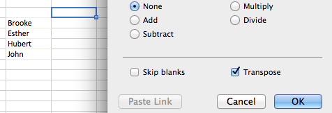
- You should now have an empty matrix with names across both axes
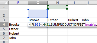
To fill this grid, we need to use some advanced Excel features: named ranges, and nested formulas. The formula we will be using is complex and looks like this:
=IF($G2<>H$1,SUMPRODUCT(OFFSET(matrix,MATCH($G2,names,0)-1,0,1,COLUMNS(matrix)),OFFSET(matrix,MATCH(H$1,names,0)-1,0,1,COLUMNS(matrix))),0)
I will try to break it down a bit. If you don’t care about how this works, feel free to skip this section!
- The main component is SUMPRODUCT, which will take as input two rows of our person-to-affiliation matrix, multiplying each set of values together and adding the results. 1X0 or 0x0 gives us a 0, but wherever we have two ones in the same column (i.e. the people in those rows belonged to the same group) 1×1 = 1.
- If the two people attended multiple groups, those 1s are added together, giving us a weighted value in our new matrix: 1s for one co-membership, 0s for none, and higher number for multiples.
- SUMPRODUCT takes two ranges as inputs, and to select them we have two OFFSET functions
- OFFSET(reference,rows,cols,height,width)
- This looks in a range of cells (reference), starting a certain number of rows (rows), and columns (cols) away from the reference point, and returns a selected range of (height) and (width) cells.
- In our example, the reference is the named range “matrix”, which will return a range 1 row high and the width of our “matrix” range (COLUMNS(matrix)). The number of rows is provided by the output of another function
- MATCH(lookup_value,lookup_array,match_type)
- This returns the position of the “lookup_value” in “lookup_array”, which in our case is matching the name in the current row in our new matrix ($G2 in the example above)
- MATCH(lookup_value,lookup_array,match_type)
- The second OFFSET is identical to the first, except it will match against the name in the current column of our matrix (H$1) above
- OFFSET(reference,rows,cols,height,width)
- Finally, we wrap the whole thing in an IF function
- IF(logical_test,value_if_true,value_if_false)
- This makes sure the names in the current row and column are not equal to each other ($G2<>H$1), and runs the function only if true, otherwise returning a 0
- Why? Because otherwise we would get very high values across the diagonal since each person obviously shared membership with themselves in each group they belonged to!
Phew! Got all that? It’s a lot, I know, but if you name the ranges correctly and set the values for your first cell, you should be able to copy the formula into the rest of the blank cells and Hey Presto! a weighted person-to-person matrix should appear.
Using Named Ranges and Modifying the Formulas
- Name your ranges so that the formula will work
- In your Matrix sheet, select the binary values (omitting the Grand Totals!)
- Put your cursor in the name field at top left and type “matrix” then hit return
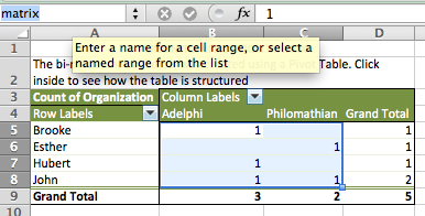
- Put your cursor in the name field at top left and type “matrix” then hit return
- Select the list of names (omitting the Row Labels and Grand Total)
- Put your cursor back in the name field and type “names” then hit return
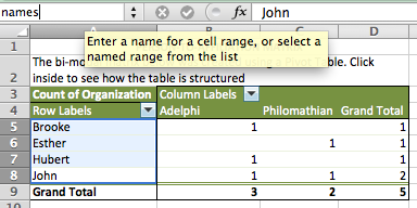
- Put your cursor back in the name field and type “names” then hit return
- In your Matrix sheet, select the binary values (omitting the Grand Totals!)
- Almost there! Now for the formula
- Copy the full formula above
- Double click in the top left cell of your blank person-to-person matrix and paste the formula
- Before you hit return
- You need to change the values of $G2 and H$1 to select the first names on each axis
- In my example, I would need to change BOTH $G2s to $F4s, and BOTH H$1s to G$3s
- Make sure you keep the dollar signs in place, so that the labels remain selected
- In my example, I would need to change BOTH $G2s to $F4s, and BOTH H$1s to G$3s
- You need to change the values of $G2 and H$1 to select the first names on each axis
- Copy the cell you just entered the formula in and paste it in the rest of the range and you should see all the values magically populate
- Finally, we can output this matrix as a csv file and import it into NodeXL
- Copy the whole matrix you just created including labels (e.g. F3:J7 above)
- Add a new sheet called CSV
- Click cell A1
- Edit > Paste Special…
- Click on the Values radio button and hit OK
- Got to File > Save As
- Choose Format: Comma Separated Values (.csv)
- Copy the whole matrix you just created including labels (e.g. F3:J7 above)
We are finally ready to load the person-to-person matrix you created above into NodeXL
- Go to NodeXL > Import > From Open Matrix Workbook… and import the csv file you just made
- Generate a graph and explore visualization options.
You did it! Give yourself a pat on the back. That was hard work.
Assignment Tutorial Blog Post (Due TUESDAY, 11/10)
For this assignment, create a step-by-step tutorial as a blog post demonstrating a particular technique, tool, or other helpful how-to discovery you’ve made over the past several weeks in this course.
Pick a DH tool that we haven’t discussed yet and figure out an interesting use case for it (or, vice versa, pick a use case and figure out a potentially viable DH tool or methodology). You can highlight a technique that you have discovered in class, or in the preparation of your projects, as long as it is not one we’ve all covered together already. If you’re stuck for ideas, the Dirt Digital Research Tools directory offers an extensive list of software for academic uses.
Once you have an idea, create an online tutorial for the rest of us and the wider world to start paying forward what you’ve learned in the course and becoming the “local computer expert.” For examples, you can look at some of the posts for this class, think back on all those SketchUp resources you’ve looked through, or see the software posts on the Profhacker blog.
Your tutorial blog post should include:
- An introductory paragraph explaining clearly
- what the tool or technique is and
- why or in what context it would be useful
- A step-by-step walkthrough of how to accomplish a specific task using the tool that contains
- At least 5 steps
- EITHER screenshots illustrating the steps where appropriate
- OR a screencast video in which you record your actions while speaking about the process into a microphone
- A link to at least two further resources like the software’s documentation or other tutorials around the web
For screen capture software, if you Google “how to create tutorials screenshot” you’ll be overwhelmed with options.
- At the basic level, you can use the
- Grab keyboard shortcuts on a Mac to accompany your text (this is what I usually do)
- or the Snipping Tool in Windows
- If you want to annotate your screenshots there are a number of fancier tools to do so, among them:
- For video screen recording, there are also numerous options out there including.