This week we are going to explore the basic principles, and some concrete examples, of data visualization. You might think that data viz is something only scientists and quantitative social scientists are allowed to do, but there are an increasing number of excellent resources for visualizing and analyzing qualitative data.
For today’s class, we are going to start by generating our own qualitative survey data set that we can use to try out some data viz techniques.
Fill out the quick five-question survey below:
h/t to Miriam Posner for the framework for this exercise
Edward Tufte is widely considered one of the world’s leading data visualization gurus, and has been called everything from the “Leonardo da Vinci of data” to the “Galileo of graphics.” Tufte will be our guide as we think through what good visualizations say and how bad data displays can lie and distort or even undermine your intended argument.
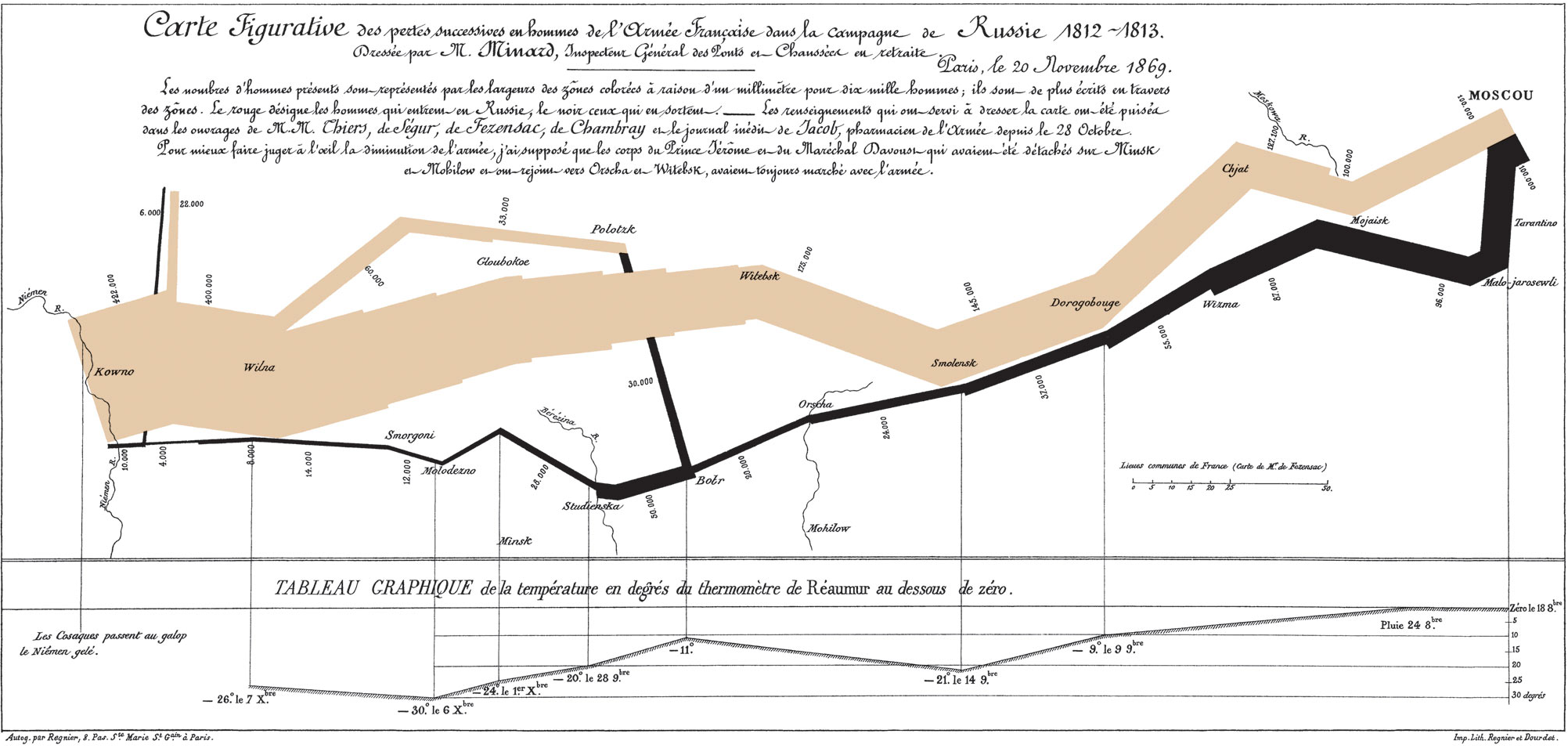
The Minard Map
It may well be the best statistical graphic ever drawn.
—Edward Tufte, The Visual Display of Quantitative Information (1983)
The Classic Discussed
This chart is famous for being a sterling example of data viz done right. In stark colors, simple lines, and minimal accompanying text, it not only tells a story, but offers an historical argument as well. Read the blog post below to be guided through the elements of the chart in an English translation.
- Michael Sandberg’s analysis on his DataViz History blog
- This is part 5 of a 10+ part deep dive series into Minard’s map. If you want more, see all the entries tagged Minard on his blog.
Does Minard’s map live up to the hype?
Do you agree with the glowing praise?
Improving(?) Minard’s Map
Even though it is often praised as the epitome of information design, many people have attempted to improve on Minard’s map. In groups explore one of the static or interactive variants below.
Is your version better/more informative than the original?
Static variants (Do they add anything?)
- Menno-Jan Kraak’s variant from his 2013 book Mapping Time (Figure 3)
- An annotated version by Michael Sandberg
Interactive variants (Does it help to be able to manipulate the map?)
- A custom coded instance at http://www.masswerk.at/minard/
- An instance using the Neatline plugin for Omeka
- And the developer’s discussion of his process on the Scholar’s Lab blog
Questions
- Why is this considered such a landmark visualization, if not the best ever?
- What are the key features that make it stand out?
- How would you improve on it, if you were to take a stab?
Keeping it Honest: How Not to Lie with Pictures
This may well be the worst graphic ever to find its way into print.
—Edward Tufte, The Visual Display of Quantitative Information (1983)
We’ve already discussed how not to lie with maps, but it’s easy to do with visualizations as well. One of the biggest issues that Tufte stresses in his seminal work is how to stay honest with infographics. One of the easiest errors to make, for instance, is to scale the radius of circles, or one axis of two dimensional shapes, which results in massively larger areas than your data actually warrants.
- Explore
- this gallery of images illustrating “The Lie Factor”
- Think about how the literal measurements of the images contradict the implicit argument the graphic is trying to make.
- You can also explore the r/dataisugly subreddit for some good examples of bad data viz
- this gallery of images illustrating “The Lie Factor”
- Explore some more of Michael Friendly’s gallery of the Best and the Worst of Statistical Graphics
- What mistakes did you not think of before that you might want to avoid?
- What examples might you like to emulate for your own projects?
- Why?
Animation (unlocking the 4th dimension)
As we think about data viz for historical topics in particular, it is often the case that animation provides the most intuitive way to visualize change over time. Below are some classic examples of animating data viz in order to tell a story or make an argument.
Isao Hashimoto’s “2053”
What story does this video tell?
What are the data?
Why is the presentation so effective?
Google Motion Charts (Gapminder)
One of the most impressive data visualization breakthroughs of recent years was Hans Rosling’s invention of Gapminder: an application that really unleashed the “fourth dimension” of time and allowed data to be animated in an immediately understandable and powerful way. His TED talk below illustrating global health data with the tool is legendary.
Google bought the technology and made it available for all to use as Motion Charts. You can use the API or create a Motion Chart from data in a Google Sheet.
Exercise: Visualizing Some Data
For the rest of class, we are going to explore different data visualization principles using the sample data set we generated at the outset.
- Go to the Data Viz Questionnaire Spreadsheet we collectively filled out and examine the data
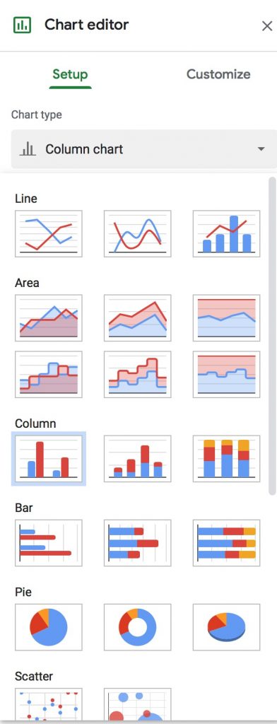
- Explore the visualization options in Google Sheets by
- Selecting all or a portion of the data
- Choosing Insert > Chart from the menu
- Exploring the numerous types of charts that it is possible to create right from your spreadsheet
What can you do with this data in a spreadsheet?
What can’t you do?
What questions can you ask?
Spreadsheets work well for quantitative data, but in order to explore more complicated issues of qualitative data, we need better tools.
- Download your own copy of the data as a CSV and save it to your local computer
Basic data viz with online tools
One of the easiest ways to get a quick sense of what your data can tell you is to upload it to a cloud based platform and see what patterns emerge.
NB: always make sure that your data are not sensitive or restricted before uploading them to third party services.
- Upload to our old friend WTFCSV and see what you can see?
- For a more sophisticated option, upload to RAWGraphs.io
- Choose from their menu of options and find some charts that work with our data
- Alluvial diagrams are often a good choice for qualitative data as they show connections between like options
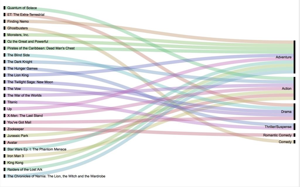
What interesting connections do you see between the things that different people in our class like?
Was a data visualization necessary to find this pattern or communicate it?
One of the most useful ways to visualize data that shows connections like these is through Network Analysis.
Network Analysis 101
The advent of the internet, and especially of its more socially connected Web 2.0 variant, has ushered in a golden age for the concept of the network. The interconnected world we now live in has changed not only the way we study computers and the internet, but the very way we envision the world and humanity’s place in it, as Thomas Fisher has argued. The digital technologies that we are learning to use in this class are tightly linked to these new understandings, making network analysis a powerful addition to the Digital Humanist’s toolkit. According to Fisher,
The increasingly weblike way of seeing the world … has profound implications for how and in what form we will seek information. The printed book offers us a linear way of doing so. We begin at the beginning—or maybe at the end, with the index—and work forward or backward through a book, or at least parts of it, to find the information we need. Digital media, in contrast, operate in networked ways, with hyperlinked texts taking us in multiple directions, social media placing us in multiple communities, and geographic information systems arranging data in multiple layers. No one starting place, relationship, or layer has privilege over any other in such a world.

To study this world, it can therefore be helpful to privilege not the people, places, ideas or things that have traditionally occupied humanistic scholarship, but the relationships between them. Network analysis, at root, is the study of the relationships between discrete objects, which are represented as graphs of nodes or vertices (the things) and edges (the relationships between those things). This is a very active area of research that emerged from mathematics but is being explored in a wide array of disciplines, resulting in a vast literature. (Scott Weingart offers a gentle introduction for the non-tech savvy in his Networks Demystified series and you can get a sense of the scope from the Wikipedia entry on Network Theory.) As hackers, we are not going to get too deep into the mathematical underpinnings and rely mostly on software platforms that make network visualization relatively easy, but it is important to have a basic understanding of what these visualizations actually mean in order to use them critically and interpret them correctly.
Network Analysis DH Projects
Now that you know the basics of what a network graph is, let’s explore some much more sophisticated network analysis DH projects. With your neighbors, explore one or more of the following projects:
- Using Metadata to Find Paul Revere
- “Corruption and Reform,” by Brian Sarnacki
- “Mapping the Republic of Letters,” Stanford University
- “Homestead Nebraska,” Rebecca S. Wingo
- “Using Palladio to Visualize Ads,” Clare Jensen, Kaitlyn Sisk, Aaron Braunstein
- “Getting Started with Palladio,” Miriam Posner
- “Introduction to Network Analysis and Representation,” Elijah Meeks and Maya Krishnan
- Six Degrees of Francis Bacon
- Inventing Abstraction, MOMA
- Introduction to Network Analysis, Thomas Padilla
As you explore the project, consider the following questions about the nature of this network analysis:
- What (or who) are the nodes and what are the edges?
- How are the relationships characterized and categorized?
- What interactions does the project allow?
- How does this impact their effectiveness and/or your engagement?
- How was the project created?
- See if you can dig around in the documentation and discover what tools or data manipulation steps produced the outcome you see.
- Does the project combine network analysis with any other information or technique, like spatial analysis or text mining?
Sidebar: Cleaning Data
For the rest of the class, we are going to follow along with Miriam Posner’s Gephi tutorial to see how Network Analysis works in practice.
But first we need to convert our spreadsheet of survey data into an edge list that Gephi will understand.
Next time, we are going to spend a lot of time cleaning a dataset to make a Timeline visualization, but today we are going to just get started using a fantastic tool called OpenRefine to transform our data into a format that can be used for Network analysis.
Specifically we will be using a technique to Transpose cells across columns into rows
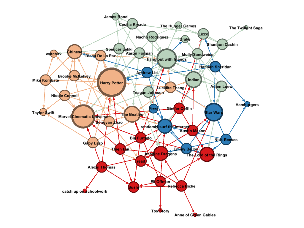
UPDATE: Our Network Visualized
We ran out of time last class, but this is what our network looked like after I got it into Gephi and ran a few analysis steps on it.
- Sized by average degree (number of edges)
- Colored by community (modularity calculated)
What do you make of this visualization?
Does it tell you anything that our other viz didn’t?
Resources
We’ve already explored some easy entry visualization environments, but here are some more very impressive tools and languages to check out:
- Tableau Public (an online visualization studio where you can upload your data and produce impressive, easily shareable data viz)
- D3.js (the current reining king of interactive online visualization)
- R graph gallery (R is a statistical package that generates very nice visualizations with very little code)
Choose one and check it out to see what people are creating.
- What works well with these visualizations and what could be improved?
- If you don’t have the JavaScript or R chops to create one of these currently, how might you implement the design decisions in programs you know?
Download or join a service and see if you can create something.
- Upload some of your own data, or download data sets from around the web
- One interesting source is JSTOR for Research, which aggregates all the scholarly literature housed by JStor
Assignment: Final 1 (Project Pitch) — DUE TUESDAY 2/25
Form a group of 3-4 and chose or invent a project. Collectively write a blog post on the course blog, stating the following:
- Members of the group
- The definition of the project topic and objectives for what you plan to produce
- The proposed methodology:
- What data do you hope to use and how do you hope to find it?
- What tools and techniques will you use to gather sources and store your data?
- What analyses or transformations will you conduct on those data?
- How will you present the results and integrate the digital assets you create as an interactive final product?
- The proposed timeline of deliverables
- And finally, a link to one or more DH projects that you think might make a good model for what you plan to do.
Create a unique tag for your group to tag all your posts going forward.
On your own blogs, write a brief message outlining your personal interests in the projects and what you hope it will achieve, and link to it from the group’s post