Before we get into the heart of Spatial Humanities, we are going to continue to learn by doing through work on our collective class project of creating a hybrid digital/analog 3D model of Carleton’s Campus.
As with all DH projects, there are many steps to this process. Last week, you already been gathering your sources. You’ve selected a building to model, searched the archives for historic images of them, and gathered their metadata in a spreadsheet. The next steps we’ll take today move on to the processing stage of DH project building:
Choosing a building as yoursResearching the building in the archives to find images and historical information about it- Building a collective website on the buildings’ history
- Making a digital map of campus
- Laser cutting a physical version of the digital map
- Refining a 3D model of your building
- 3D printing a physical version of the digital model
- Putting it all together by placing the building models on the map and linking them to the online information
Metadata & Omeka 2.0
We’ll accomplish the first task by importing our spreadsheet data into Omeka to better leverage the data and metadata.
Then we’ll start looking at how to make digital maps, which we’ll pick up next time.
Populating Omeka
Omeka is a content management system and web publishing platform, much like WordPress or Drupal.
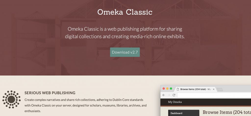
A few things set Omeka apart and make it a favorite for DH projects
- It was created by humanities scholars specifically for humanities projects, unlike most other platforms that have had to be hacked for humanist scholarship. Specifically, it was built by the folks at the Center for History and New Media (CHNM) at George Mason University, who also developed Zotero.
- It has robust support for metadata, by default the Dublin Core specification, a set of categories widely used by libraries, museums and cultural heritage organizations.
It’s primary use is in building collections—of documents, artifacts, images, etc.—and then organizing them into categories and allowing you to build Exhibits that tell a story from your primary sources.
Accessing our Repository
The repository we’ll be using for this project is one I set up through my Reclaim Hosting server:
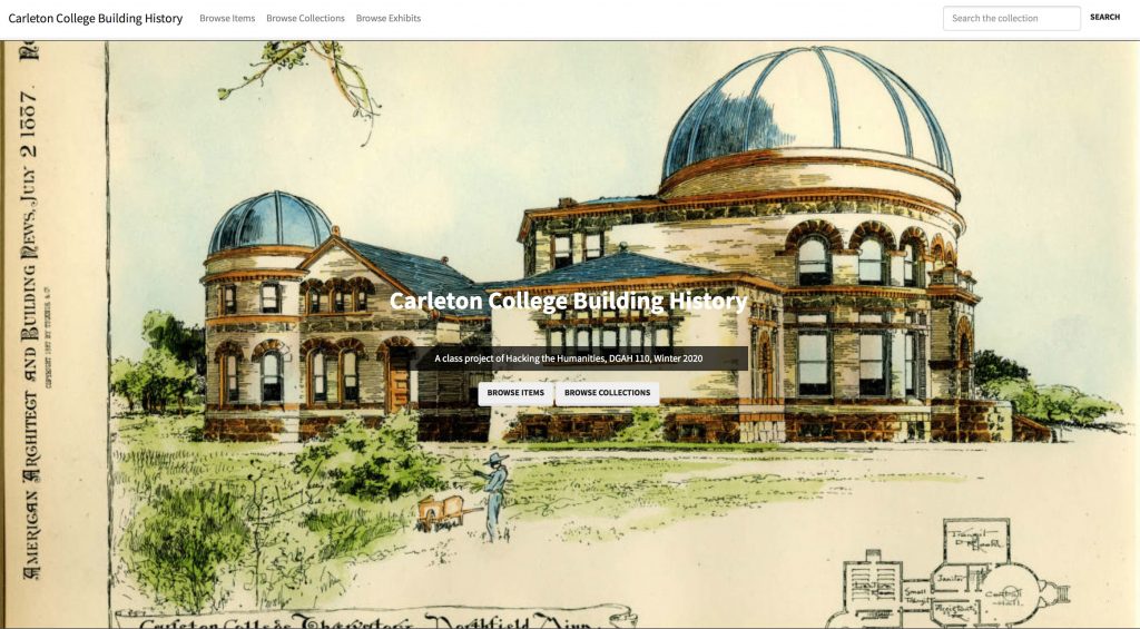
Carleton College Building History (https://campushistory.medhieval.com)
Click the link above to explore the front end of the website.
- How is the site organized?
- How is it similar to, or different than, the sites we’ve interacted with before?
- What ways are there to navigate around and find the content you desire?
You should have received an email invitation to join the site, and you can follow the link there to create a password and log in.
If you did not receive an email
- go to the login page and hit the forgot password link
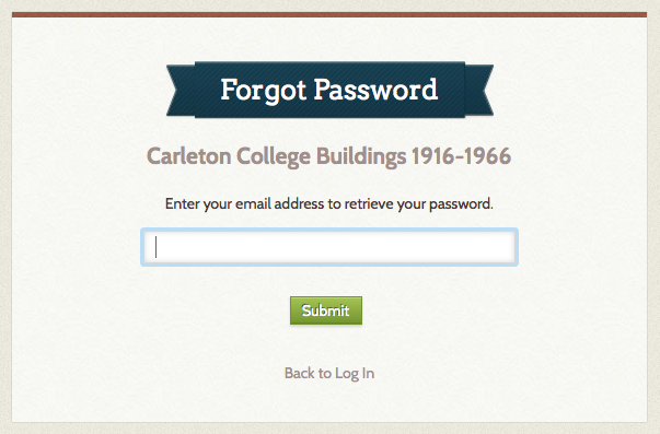
- Enter your Carleton email address and follow the link in the email you receive to set a password and log in
Once you’re at the backend, have a look around and compare this view of the repository to the front end.
- What can you do as an admin that you couldn’t do as a user?
- How is the organization similar to our different than WordPress?
Adding content to Omeka the slow way
Adding an ITEM to Omeka is similar to creating a POST in WordPress, but with more attention to metadata fields and less formatting control.
Choose an item from your research and follow the instructions at Miriam Posner’s tutorial to Add an Item to Omeka
- Copy and paste all the field data from the spreadsheet in the appropriate fields
- Upload your image to the Files tab
Does the way the site thinks make more sense of the research you did and the way we organized the data?
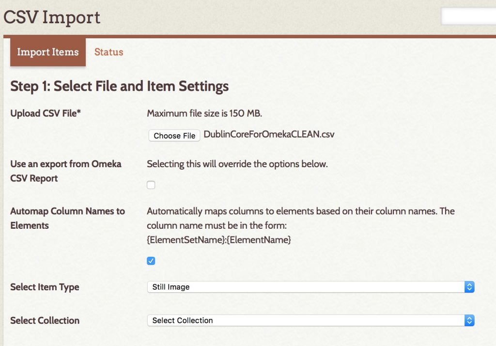
Adding data the FAST WAY with CSV Import
Adding items and uploading photos one by one is SLOW.
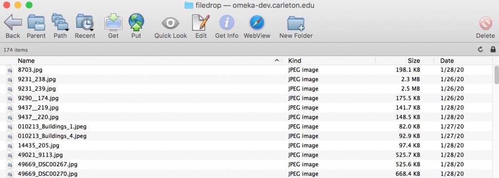
In order to get our data in faster, we are using the CSV Import plugin to add the files from our shared Google drive folder and automatically associate all the attached metadata in our spreadsheet.
I will walk through the steps of this process together to add the rest of our images.
The process is not perfect and there are some files that didn’t come through. Try to find your sources and see how well you did entering your information.
We will have much more joy by cleaning our data first in Sheets, Excel, OpenRefine or other options.
UPDATE
Since our live in-class demo failed completely, I had to clean the data a bit to get it to work following these steps.
Clean Data in Google Sheets
- Add each contributor’s name to tags
- Sort by Tags to remove blank rows
- Add default Rights statement to all images that didn’t explicitly state otherwise:
We encourage the use these materials for research, teaching, and private study according to our Terms of Use, available at https://apps.carleton.edu/digitalcollections/about/terms/
- Search for all images in folder

- FTP files to publicly accessible web folder
=IF(EXACT(".jpg",RIGHT(S57,4)),S57,CONCAT(S57,".jpg"))
- URL Encode filename to convert spaces and parentheses into entities and concatenate with host URL
=CONCAT("http://omeka-dev.carleton.edu/filedrop/",ENCODEURL(R2))
- Result is a set of direct links to accessible files that Omeka will import, e.g.
http://omeka-dev.carleton.edu/filedrop/Scoville%20Memorial%20Library%20-%20Main%20Room.jpg
You can see the cleaned Google Sheet here and the Downloaded CSV here if you’re curious
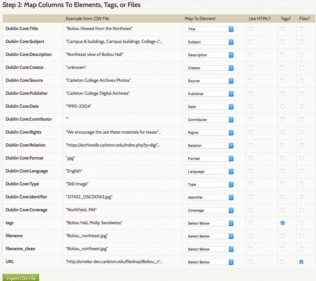
CSV Import Plugin
- Use Omeka CSV Import plugin and Automap Column Names
- Confirm Column Names match and check boxes for tags and file URL columns
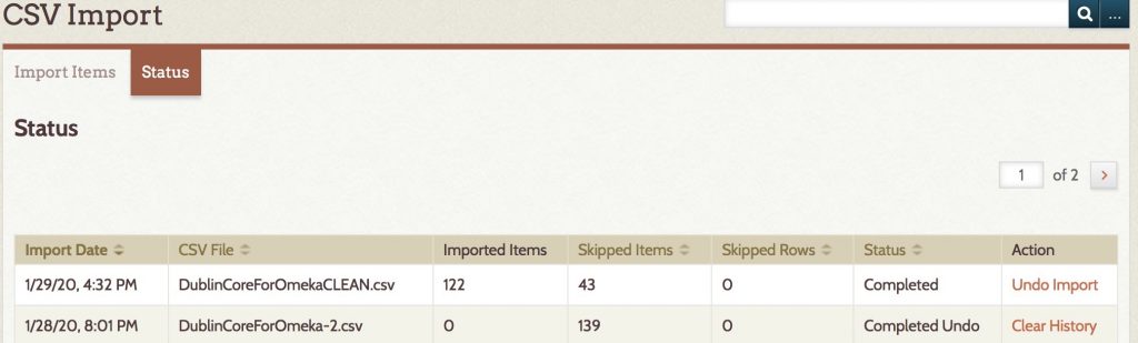
SUCCESS (or at least improvement)!
Only 43 items skipped instead of 139.
YOUR NEXT STEPS
- Check your items and make sure they’re there.
- Add any of yours that broke using the Add Item form or let me know if they all failed and we can try to re-upload a subset.
- Clean and Edit your Items to
- Fix any missing data
- Add them to a Collection
The easiest way to clean in Omeka is by searching from the Admin side for your building or name tag and then batch editing all the items. See the Omeka User Manual page on Batch Editing for how-to.
Creating Collections and Exhibits
The primary ways you organize data in Omeka are to tag items, organize them in collections, or create Exhibits from them. These terms mirror their counterparts in the museum world.
- Collections are thematic groups of items and each item can be in only one (think one room in the museum’s permanent collection)
- Exhibits are more flexible and are how you — as curator of your online museum — tell a story by combining items with text and organizing them in new ways. Items can be in multiple exhibits.
In-class Exercise
- Find all of the items you have uploaded and fix them, if they’re broken.
- Create a New Exhibit for your building
THIS WILL SERVE AS THE MAIN “SITE” FOR YOUR BUILDING- add at least one page with some descriptive text
- and add a gallery to show all the images associated with that building
See my example gallery on Willis Hall as a model, and check out the resources below if you need help.
Omeka Resources
For a good introduction to Omeka, see Johanna Drucker’s Omeka 101
For more overall introduction to Omeka and instructions on setting up free accounts with Omeka.net, see these two tutorials from Miriam Posner at the Programming Historian site:
For information on CSV import, customizing themes, Neatline and more, check out this fantastic and detailed Omeka admin guide for getting started up Omeka.org with the most common and useful plugins from Nicole Riesenberger et al. at UMD.
Spatial Humanities
For the next two weeks we will be exploring the spatial humanities — a vibrant and increasingly popular area of digital humanities research. Humanities scholarship is currently undergoing a “spatial turn” akin to the quantitative, linguistic and cultural “turns” of previous decades, and many are arguing that the widespread adoption of Geographic Information Systems (GIS) technology and user-friendly neogeography tools are fundamentally reshaping the practice of history and other disciplines. Yet while these powerful computer tools are certainly new, the mode of thinking “spatially” is not unprecedented, and may in fact be seen as a move away from the universalizing tendencies of modern western scholarship towards more traditional understandings of the lived experience of place, emphasizing the importance of the local context.
In practice, much of this scholarship involves creating maps — an act that is not without controversy. Maps are conventional representations of space that come laden with the embedded cultural worldviews of their makers. Maps are also highly simplified documents that often paper over contested or fuzzy boundaries with firm lines; it is hard to express ambiguity with maps, but it is very easy to lie with them.
The familiarity of widespread tools like Google Maps and Google Earth might fool us into thinking these are unproblematic representations of space, but it must be remembered that all maps contain embedded assumptions and cannot be taken at face value. Maps produced in the course of humanities scholarship are not just illustrations but arguments, and they must be read with the same level of critical analysis that you would apply to articles or monographs.
(For more concrete suggestions along these lines, see Humanizing Maps: An Interview with Johanna Drucker.)
Example 1
One area of historical research that saw an early adoption of GIS is economic land use. A good example is Michael McCormick’s book on the Origins of the European Economy, which layered many different types of evidence against each other in a GIS to argue for a much earlier origin to Europe’s medieval economy than had been accepted previously. McCormick has since made his database publicly available and continues to add to it with collaborators at Harvard, as the Digital Atlas of Roman and Medieval Civilization.
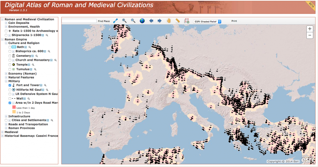
The DARMC provides a rich resource and a good introduction to the potential of GIS to reveal patterns and connections through the spatial layering of disparate datasets. It also offers a good orientation to the basic layout of most GIS systems, with a map view window on the right and a list of layers on the left that can be turned on and off.
Explore the DARMC.
- What layers have been included?
- What patterns show up when you juxtapose cultural, environmental and economic data in this way?
- What connections do you see?
- The developers recently made the decision to separate the layers into four distinct maps (compare the list at right with the image of the old version above).
- What potential patterns might be lost as a result of this decision?
- Are there any problems you foresee with the arguments this decision makes?
- Also take the opportunity to explore the measurement tools at the top of the window to interrogate the spatial attributes of the data.
Example 2
The quantitative data compiled in projects like the DARMC can help address many historical problems, but they don’t necessarily answer more qualitative research questions concerned with the lived experience of the past. For this objective, we must move beyond birds-eye-view 2D maps of spatial distributions and attempt to visualize particular places at particular moments in time. Such “geovisualization” — the digital reconstruction of past landscapes — is another booming area of scholarship that allows us to virtually experience a place as it might have been, and also has the potential to answer important scholarly questions.
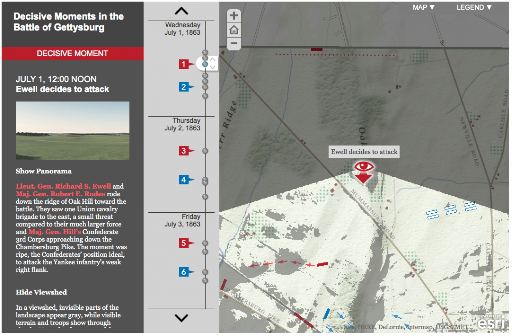
Anne Kelly Knowles’ digital reconstruction of the Battle of Gettysburg is an excellent example of this potential that uses a combination of digitized information from historical maps, documentary accounts and environmental data on the physical geography of the battlefield to answer the question of what the generals could see during the battle and how those sightlines influenced their decision making.
- Read the brief introductory article at Smithsonian magazine and then explore the “story map” in detail.
- How does the map combine geographic and temporal information?
- Does it effectively give you a sense of the experience of being on the battlefield?
- What does this reconstruction offer that more traditional publications could not?
- What could be improved in the representation?
Group Exercise: The Varieties of Maps
(Exercise borrowed from Lincoln Mullen)
The next step is to become familiar with as wide a variety of maps as possible, including digital maps and analog, maps that have been made by scholars and maps that have not. Below is a list of online mapping projects.
In a group, pick three projects from the list to explore and compare. Your aim is to gain familiarity with projects involving maps and mapmaking, both by scholars and on the web generally.
- American Migrations to 1880
- Atlantic Networks Project
- Atlas of the Historical Geography of the United States
- Counties Blue and Red, Moving Right and Left
- Digital Harlem
- Digital Harrisburg
- Flowing Data: Coffee, Pizza, Burgers
- Geography of the Post
- Going to the Show
- Hestia: Home for Geospatial Analysis of Herodotus’s Histories
- Hidden Florence
- Histories of the National Mall
- History Pin
- Holocaust Geographies Collective
- How Your Hometown Affects Your Chances of Marriage
- Hypercities
- Locating London’s Past
- A Map of Baseball Nation, Baseball’s Second-Place Favorites: Go, Mets
- Mapping the Republic of Letters
- Mapping the State of the Union
- Mapping Texts
- Map of Early Modern London
- Mapping Gothic France
- Mapping the Medieval Townscape
- Mapping Poverty in America
- Midterm Elections
- Murder Map
- NYPL Map Warper
- Orbis
- PhilaPlace
- Pelagoios
- Pleiades
- Stop and Frisk is All But Gone from New York
- Railroads and the Making of Modern America
- Ben Schmidt, Mapping ship logs
- Spread of U.S. Slavery, 1790–1860
- Stanford Spatial History Project
- Travelers in the Middle East Archive
- Visualizing Emancipation
As you look through these projects, consider the following questions or prompts.
- What categories do these maps fit into? Start to envision a taxonomy of maps by considering the purposes of the maps, their audience, and their interfaces, among other axes of comparison.
- What is the grammar of mapping? In other words, what are the typical symbols that mapmakers use, and how can they be put in relation to one another?
- Which maps stood out to you as especially good or clear? Why?
- Which maps were the worst? What made them bad?
- How do scholarly maps differ from non-scholarly maps?
- What kind of data is amenable to mapping? What kinds of topics
- What accompanies maps? Who controls their interpretation? What is their role in making an argument?
- How do recent web maps compare to maps made online in the past few years? Are any of them broken? How can maps be made sustainable?
- Which of these maps are in your discipline? Which maps might be helpful models for your discipline?
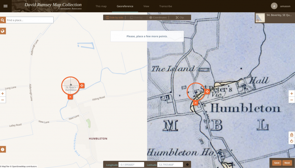
Exercise (Georeferencing)
In order to reconstruct past landscapes like the Gettysburg battlefield, the first step is often digitizing the data recorded in a historic map by georeferencing (or to be more precise georectifying) that image — that is, aligning the historical map or image with its location on the earth in a known coordinate system. There are many ways to do this, and traditional desktop GIS software is still often the most precise, but we will start with a cloud based solution requiring no complex software.
The David Rumsey Map Collection is a vast archive of scanned historic maps, mostly covering North and South America. They have enabled a crowd sourcing technique to get the public to help georeference these images for use in GIS applications. The previous version was very buggy and not very accurate, but they have made improvements recently in version 4.
Georectify a historic map
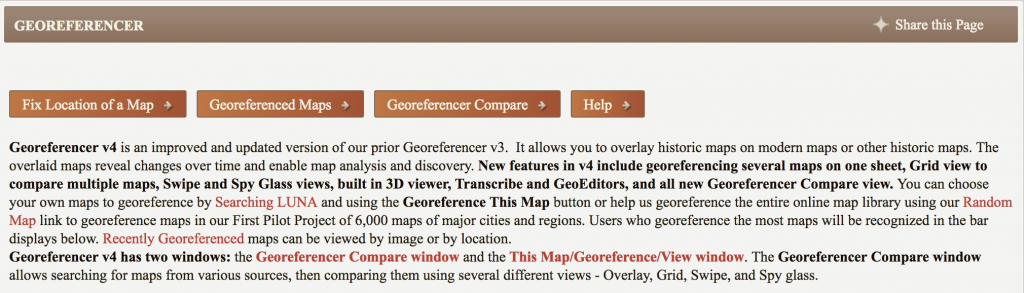
- Go to the David Rumsey Georeferencer page
- Use the “Fix Location of a Map” button to find a random map to georectify
- You can use the Next button in the bottom right to page through some more options if you don’t like the first
- NB: You may need to sign up for a free account if you don’t accept the first couple they offer you
- Once you’ve found a map that interests you, use their tools to
- Search, pan and zoom to find locations in the image
- Set control points (at least 5 are recommended) by identifying the same place on the image and a modern map
- Clip the map area
- Save to rectify the map
- When you are finished, you will see the map overlaid on a basemap of the world and can compare your work to other historic maps of the same place
If you need additional instruction, there are detailed steps on the Georeferencer HELP page
Assignment
- When you are finished, get the sharing link and post your thoughts on the process along with the link to your work in a COMMENT ON THIS PAGE.
- Did this process change your understanding of the spatial DH projects you explored earlier?
- Continue to work on your Omeka Exhibit and get to know this platform better.
- Note areas where you would want more formatting control
OPTIONAL: this theme is being developed by one of our Digital Scholarship Interns and if you have changes you would like to suggest you can post an issue on the Github Repository
- Note areas where you would want more formatting control
Resources
Lincoln Mullen of the Center for New Media and History at George Mason University has developed a fantastic resource for getting started with mapping for the humanities.
The Spatial Humanties Workshop site he developed will give you a detailed introduction to the different types of maps you might want to make as a digital humanist, the software and libraries that are out there to use, and most importantly the academic issues and theoretical questions that are raised by mapping humanities data in a digital space.
NB: Another great tool for online rectifying is MapWarper, which lets you upload your own maps and align them to modern geography.
For an alternate tool, follow these instructions from Lincoln Mullen to Georectify a map with MapWarper
32 replies on “Spatial Humanities: GIS/Mapping 101”
It is indeed very hard to locate ancient maps because they are firstly very roughly drawn, and secondly not in the right scale. You could see my locating result is an inclined image because the original image is in a very unrealistic scale. However, the overall shape of the Istanbul city and adjacent shores were depicted so that I could still find valid locating points.
https://davidrumsey.georeferencer.com/maps/0a873584-9761-55d8-9111-0209977b0ebc/view#371204869462
This was pretty easy. A lot like the crowdsourcing stuff we did earlier. I guess I never realized how much work went into examining and matching each specific map. I never assumed work didn’t go into it I had just never thought about it before. Crowdsourcing and being able to zoom and compare is such a great way to do it! Also how inaccurate printing could be (the color didn’t line up with the borders in the map I worked on.
https://davidrumsey.georeferencer.com/maps/4bb9684e-1798-5f42-a911-5fd8b5609514/view
I thought this was a great crowdsourcing project which was very similar to the other crowdsourcing projects we had looked at. I had never thought about the work that would be required to correct maps like this and make them easier to interpret. I thought that overall this is a good way to recieve help on tedious tasks but I wonder how they adjust for accuracy, maybe utilising several different georectified maps to come up with the most accurate version.
Here is a link to my work
I think it was noteworthy that I refreshed until I found a map that I was comfortable using, which depended on if I recognized the geography depicted or there was written information (in English) that signaled to me where in the world the map was focusing on.
Another important aspect of my experience is acknowledging the fact that two maps that are supposedly depicting the same place but do not match. Mapping itself is fallible, as is my ability to georectify. I noted that as I added more points the program was able to guess approximately where the point was supposed to be, but it wasn’t completely accurate. I imagine as more points are added the more accurate the georectifying gets, but it is dependent on how accurate my points are to begin with.
https://davidrumsey.georeferencer.com/compare#494087942951
It is really interesting to see the historical map to line up with the real map. The process is actually really easy. However, when I doing this, I felt how tedious it is if we enter all the data manually to make a big map. I wonder if there are easier ways to do it. The historical map I worked on was pretty much the same as the current map, and it overlapped very well with it, especially after I overlaid it. Overall, I think this map would definitely give historians an intuitive comparison between old and current Landon.
https://davidrumsey.georeferencer.com/compare#
Rather than Austin’s map of Buffalo, I worked on a map of the entire United States . This provided different challenges because of the lack of street-level precise points to map onto. I chose known geographic markers such as the inlets to bays or the ends or rivers to try and be a specific as possible, but felt as if there was room for improvement still. I believe this project might work better for smaller scale maps, which reminded me of the pint Austin brought up in class about the scale maps are intended to be viewed at.
Very ambitious of you to go for a larger map! What specifically were the challenges of the large-scale? How did your focus on geographic features rather than cities alter your experience?
Here’s my map! I had a hard time with it at first because I don’t speak German. Nearly all of the city names were written in German regardless of what country the city was actually in (the city of Ljublana in Slovenia was labeled on the map as “Laibach”, eg.) I think this map was a forgiving one for me to start with because the scale is so large; I could just line up major cities (which presumably haven’t moved) and did quite well. Later I tried a more local map of a county in Scotland and it was a nightmare! It was an old enough map that things seemed to have moved around and the georeferencer was really ticked with me when old points didn’t match up with new points.
David Rumsey’s Georeferencer is a very interesting showcase of the variety of crowdsourcing projects. Not only does the software adequately intrigue us into tinkering with the program for a bit, but also the geography of maps ranging back to illegible ancient scripture-like documentation is what truly grasps volunteers into trying to map the area to the real world. As for the software, I found that the more points you began to plot, the map starts to incline and tilt making the overlay look horrendous. Here is my map of the northern part of South America: https://davidrumsey.georeferencer.com/maps/460c3915-1033-5c76-9788-b809c78487e8/georeference
I had a lot of fun matching up the historic map of my hometown, Los Angeles, to the modern one. Wurman and Passonneau’s map is from 1966, which means that it was probably created within a decade of my paternal grandparents growing up in LA. I found it very easy to connect points to landmarks that I knew, such as the Coliseum, UCLA, the Santa Monica Pier, Wilshire and Santa Monica Blvd., and even my own house. I don’t think this project changed my understanding of other spatial DH work because each project is unique and has different purposes and methods. Spatial data is useful and pleasing to view, making it a valuable technique to convey humanities questions to a wider public audience on the internet.
My map can be found here:
https://davidrumsey.georeferencer.com/maps/604aef46-3737-5ac6-bcc8-2ae1a9fe41c9/view
It was so cool that you were able to map your hometown! Did you see any differences between the maps, even if the time span isn’t that far off (1996-2020)?
Actually, the map was from 1966. So there were definitely differences but many of the streets were actually exactly the same which sometimes took me by surprise. However, I think some of the freeways are newer and don’t show up on the historical map.
link Here is my map.
Not a huge fan of the process. I found that it took a really long time and I was still unhappy with the results. I found that the built in search function was useless, and I spent most of the time comparing the modern map to google maps so I could locate specific points I had found on the historic map. Interesting stuff, but could benefit from some technical improvements to smooth out the process.
This was a very tedious and nitpicky assignment to do. I think it was gratifying to see the end result relatively match up at the end; however, I do know that it was most likely still many, many miles off from being completely identical. It was frustrating to do on a laptop because the mousepad made it difficult to be accurate as well as zoom and toggle easily. It is also frustrating to think that I tried to be as accurate as possible and that from far away the two maps lined up, but up close I know that they were way off. This one was a little different from the one I looked at before because it was combining two maps together and was more focused on the specific location of each point, whereas the other maps did not seem as focused on the exact spot the point was at. The David Rumsey georeferencer shows more specific information, but is definitely harder to navigate.
https://davidrumsey.georeferencer.com/compare#985620236907
Working on creating contours for the map was a rather entertaining task. I think it can very easily become a thoughtless process, however, in the end, once the maps become “overlay-able”, the differences and similarities of both images can be highly informative. My map of Minnesota and Dakota ended up not being perfectly marked, I’m not sure why, but I’m guessing it could be a software issue. Because of this, I was not sure how much I could rely on comparisons between the two maps, but overall, this assignment did help me understand a bit more about GIS!
Forgot to leave a link to my map
Here is a link to my map my map! The content of this map was intriguing as a preliminary exploration of what we now view as an infographic inclination in its attempts to graph statistical information in a visual way (the early use of pie charts, or half pie charts overlaid on a map so that the information is easier to digest).
One of my earlier tribulations with the website was that I was given a location which was, from my perspective and knowledge base, hard to find: Borneo. The corners of the original map show Australia in the corner for reference, which is helpful. However, I had trouble zooming haphazardly around to find the exact archipelago on the geographical map. I naively tried to use the ‘search’ function to find Borneo, but it didn’t work. I also tried with larger, more popular search terms, such as Australia, but the search function did not seem to work either. For this reason, I think that this might be a weakness of the website for more difficult and microscopic locations. Maybe I was using it wrong…
I had to tackle the state of Wisconsin for my map. It was difficult to match specific points of the border so instead I used physical geographical features like lakes and rivers to map the state. I like the fact you could zoom in as it allowed greater accuracy. My map was not perfect but it matched up, it was very satisfying process. Furthermore, it was helpful since my geography of the US is quite poor.
https://davidrumsey.georeferencer.com/maps/1bb79d27-4af3-5e4f-97f4-ce5230ef372b/view
I tried to post a comment earlier but I’m not sure if it worked so I’m posting again! I mapped the entire US and had a lot of fun digging up good landmarks to reference on both maps. Although my final product was not perfect, I think it was still valuable to figure out how to use the technology. I had to fiddle with the contour function for awhile until I figured out how make it hug the the edges of the map. All in all, I think it was a good experience and I liked how it made historical documents open to the public.
https://davidrumsey.georeferencer.com/compare#map/d7de6ace-dea6-5b3f-b584-4d08e861252c
I found that the most difficult part of the process of georeferencing a map was finding a map of a place that was somewhat recognizable. I had to skip through several maps before I was able to find one with a place that I could recognize. Once I found a map that I could understand, I found that it was actually pretty easy to work with the interface. It took me a moment to figure out how to move the points, but other than that I figured out almost instantly. Overall, I think that it was a fun and easy experience and it was nice to know that I was contributing to a Digital Humanities project.
The map I worked on.
After countless refreshes trying to find a map in English (my German skills appear to be lacking in the sense that I know absolutely no German), I landed on a map of California, my home state! Once I had a clear, easy-to-navigate map, the process was fun, albeit tedious. Trying to be precise for each of the points was a learning curve, and it was hard to stay motivated to make it perfect before I could see the overlay. However, once I succeeded, I was mesmerized by the effect – I feel like there is much to be learned from the comparative overlay view in terms of both urban change and changes in topography. I will say, it did take a few tries to make it as close to the same borders of the modern map. Additionally, once I’d made a few points, it was sometimes difficult to try to change the predicted point to its more accurate location. Nevertheless, I found the process extremely valuable, and I feel that it helped me gain a greater understanding of spatial humanities.
This is my map: https://davidrumsey.georeferencer.com/maps/f67b173f-8dc8-5807-8c43-5c21462869a9/view
Surprisingly, I really enjoyed georeferencing the map of Indiana. I never thought working with maps would be fun but seeing how the modern map came together with the old map was pretty amazing. I think this activity gave me a better understanding of spatial DH projects and the nuances that come with working with maps.
https://davidrumsey.georeferencer.com/maps/79dda5eb-b1d8-5192-9fdd-75268ce5688a/view
In class, this website was very frustrating. I kept looking around and seeing people overlaying US or UK maps, while I scrolled through endless amounts of maps written in Latin. I had no idea where any of the places were, so I just kept scrolling. After class, however, I was able to find a partial map of France which I was successfully able to overlay. Once I found a map I could understand, the process was fairly simple. That being said, my map is slightly warped because of the likely zoning changes France has made since the map was made. I feel like this is a common problem in trying to bring archival data into the modern world, however, so I don’t blame the georeferencer for this problem!
Here is my map: https://davidrumsey.georeferencer.com/maps/d8391f4b-3a36-5aeb-9266-22f30647472c/view
I felt as though mapping modern maps with historical layouts was a difficult task. While I was given a more accessible city (Pennsylvania), I found the process to be arduous, especially when the given map had landmarks or locations that no longer exist. After getting comfortable with the click and zoom functionalities, I was able to attempt a decent (in my opinion) overlay of Philadelphia.
https://davidrumsey.georeferencer.com/maps/b56446d0-d85e-5de9-85d8-158fed4bfaf1/view
I thought the assignment was extremely fun/unique. Never thought people in the old days could make such accurate map of Missouri/Arkansas. Though the scale was a little off, the map fits almost to a tee when it was overlaid, was super neat! It’s tough work though, digitizing these map onto modern world since some of the locations no longer exist (cities), but all in all it’s a fun little project. My map can be found
here !
I found this activity to be interesting, but also tedious. I made a map of Colorado, which is one of the easiest states to map because of its perfectly square shape. However, in order to get the map accurately overlayed, I had to add six points. This made me realize how tedious this kind of work can be, and gave me a greater appreciation for the large-scale spatial DH projects. Overall, my experience with this project was enriching.
Link:
https://davidrumsey.georeferencer.com/maps/2ab1a238-375a-5f2f-a29d-36431ecdca1f/view
For whatever reason, I got four straight Australia maps when I got onto the software, so I gave in to the demands of the machine. The process itself was fun, and the overlay tool, once the map was set, was pretty cathartic.
Here is the link.
Overall, I found the mapping to be pretty easy, it was just locating the same locations and marking it. But cropping got to be an issue as I tried to crop as much of the unnecessary map out as possible. The screen kept on freezing for about 10 minutes until everything seemed to fix itself. Despite the fact that I think I did a rather good job at aligning the points the maps are still not exactly consistent which might be a result of time and differing scale.
https://davidrumsey.georeferencer.com/maps/377854e6-7e79-5723-bd94-a4e226520c7a/view
I thought crowdsourcing for spatial digital humanities projects is a very helpful tool to get the manual work done. There are some issues that it presents; I had a heart-shaped map of New York’s subway system at first, and it was not accurate at all. I do not have the skill to adjust it in a way that would be helpful to the project, so after 20 minutes of fiddling with it, I switched maps. Crowdsourcing this project also isn’t very accessible. It may be because I am new to the discipline of digital humanities, but I would never run across any of these projects on my own. Overall, I think crowdsourcing spatial projects is great, but it presents unique challenges like user/experience quality and inefficiency due to inaccessibility.
https://davidrumsey.georeferencer.com/maps/b7db6ae7-2537-5e1a-8754-3d06f5217e0c/view
Here’s a link to my map: https://davidrumsey.georeferencer.com/compare#951749412731. When I was doing geo-referencing, I skipped the first 5-10 maps because they had very hard-to-parse meta-data on the places that they are representing. This deepens my impression on the importance of meta-data. Meta-data are essentially the context of an event: when, where and who. Without these information, data itself is just so hard to use. I see my classmates mentioned crowd-sourcing. I think metadata is even more important in this setting. Most of the crowd are not experts and they need good metadata to do the work – for example, in this case, I’m part of the crowd doing geo-referencing.
I did geo-referencing for a historic map of Canterbury, I almost gave up but I managed to find five points. It’s quite fascinating to see how with just 5 pointers, you can map the past to the present.
So far, I’ve only interact with a map as an outsider, with geo referencing I feel like a contributor.
I don’t know how this works but I can totally see the applications and usefulness of this applied to see how civilizations have developed spatially. Link to my map: https://davidrumsey.georeferencer.com/maps/55a1aca6-a858-500d-83cd-629a754ee45b/georeference
I didn’t struggle too much with georeferencing a map! I was given a map of the eastern United States and Central America, and although the historical map wasn’t perfect, with some well-placed referenced points I think I was able to match the historical map to the modern map pretty well. This project definitely gave me a better idea about how spatial DH projects work, and I can see the purpose of this project.
https://davidrumsey.georeferencer.com/maps/e7a60b79-c1eb-59e8-99c4-ae9dce62a166/view#392475470423